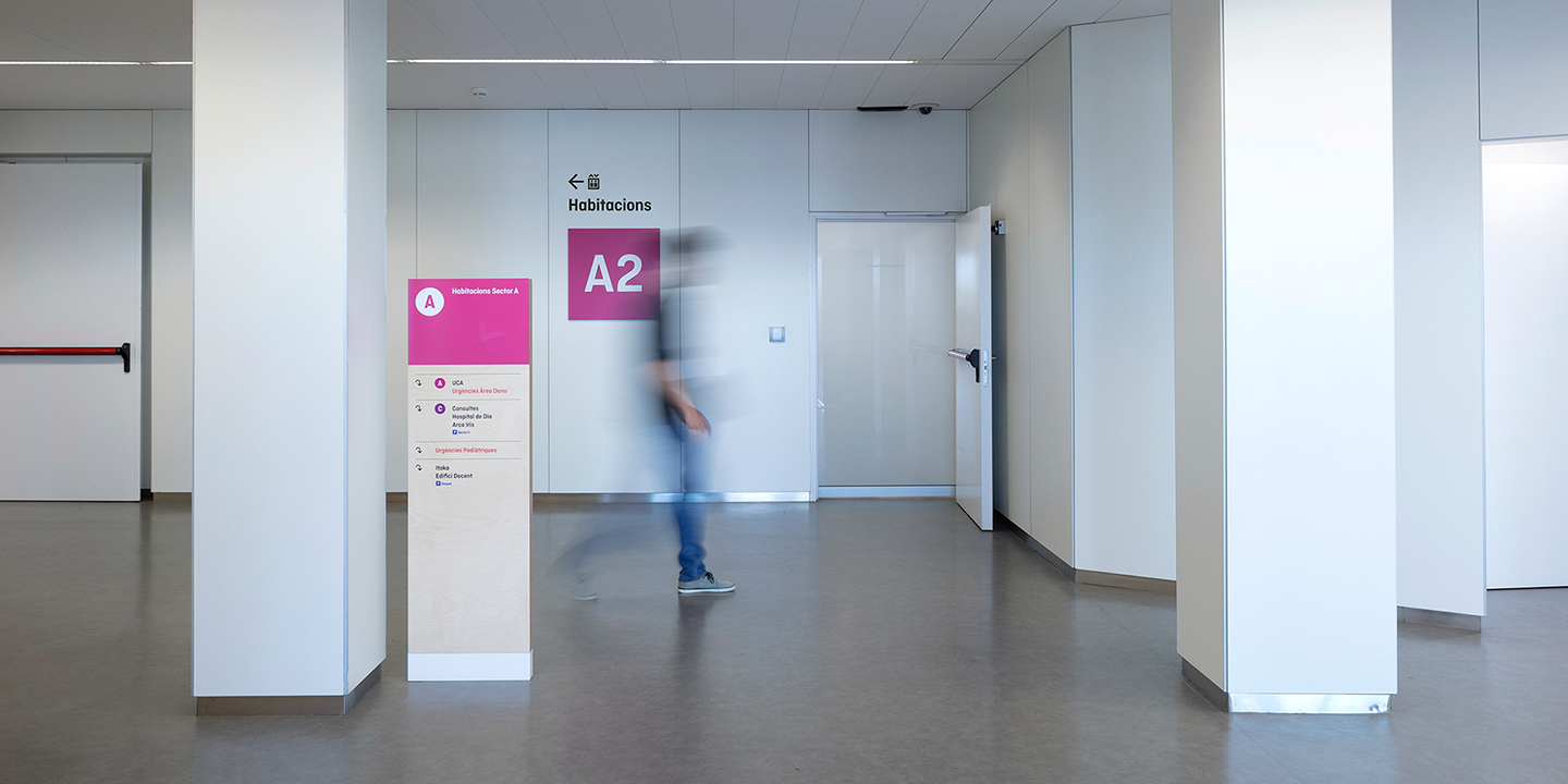
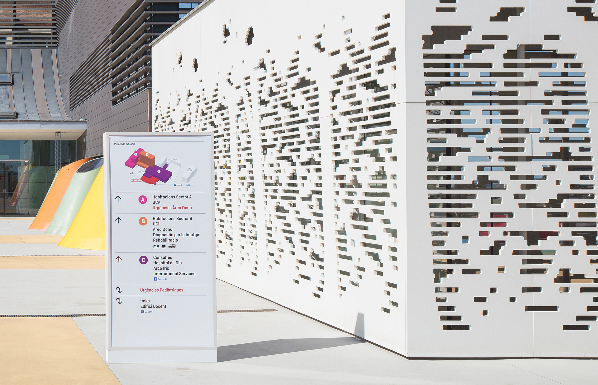
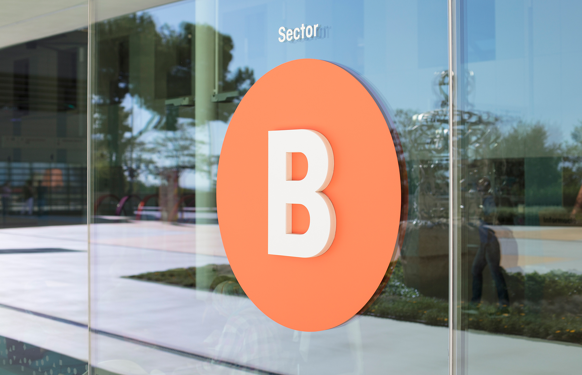
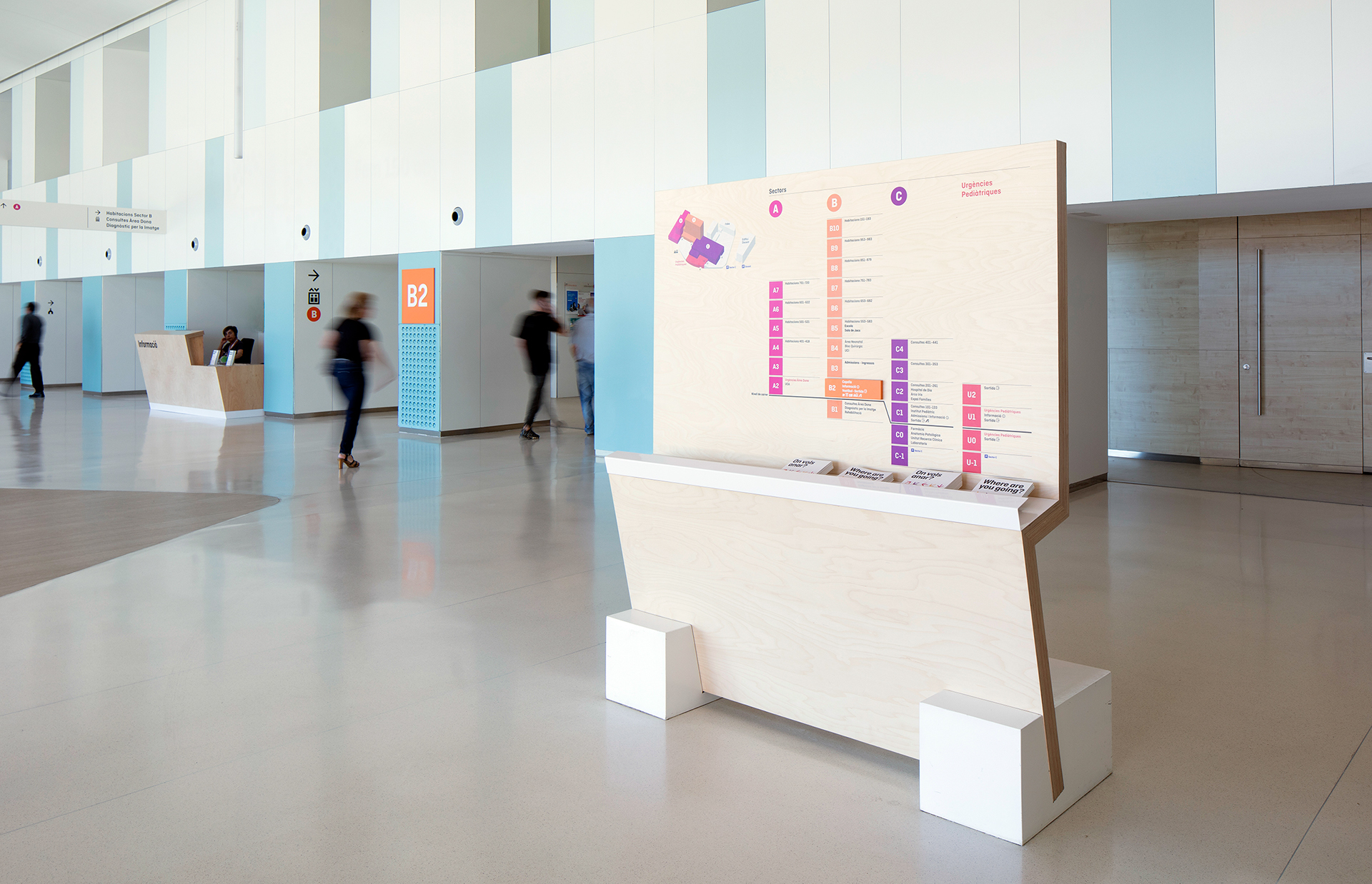
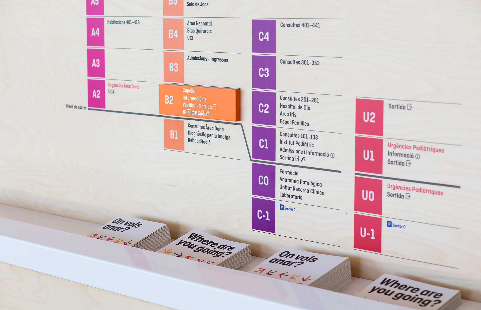
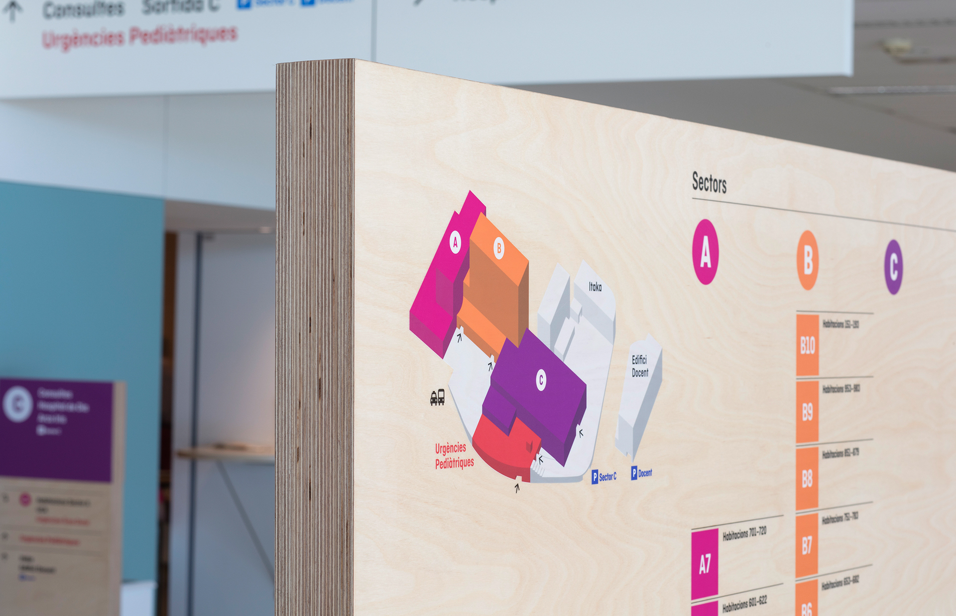
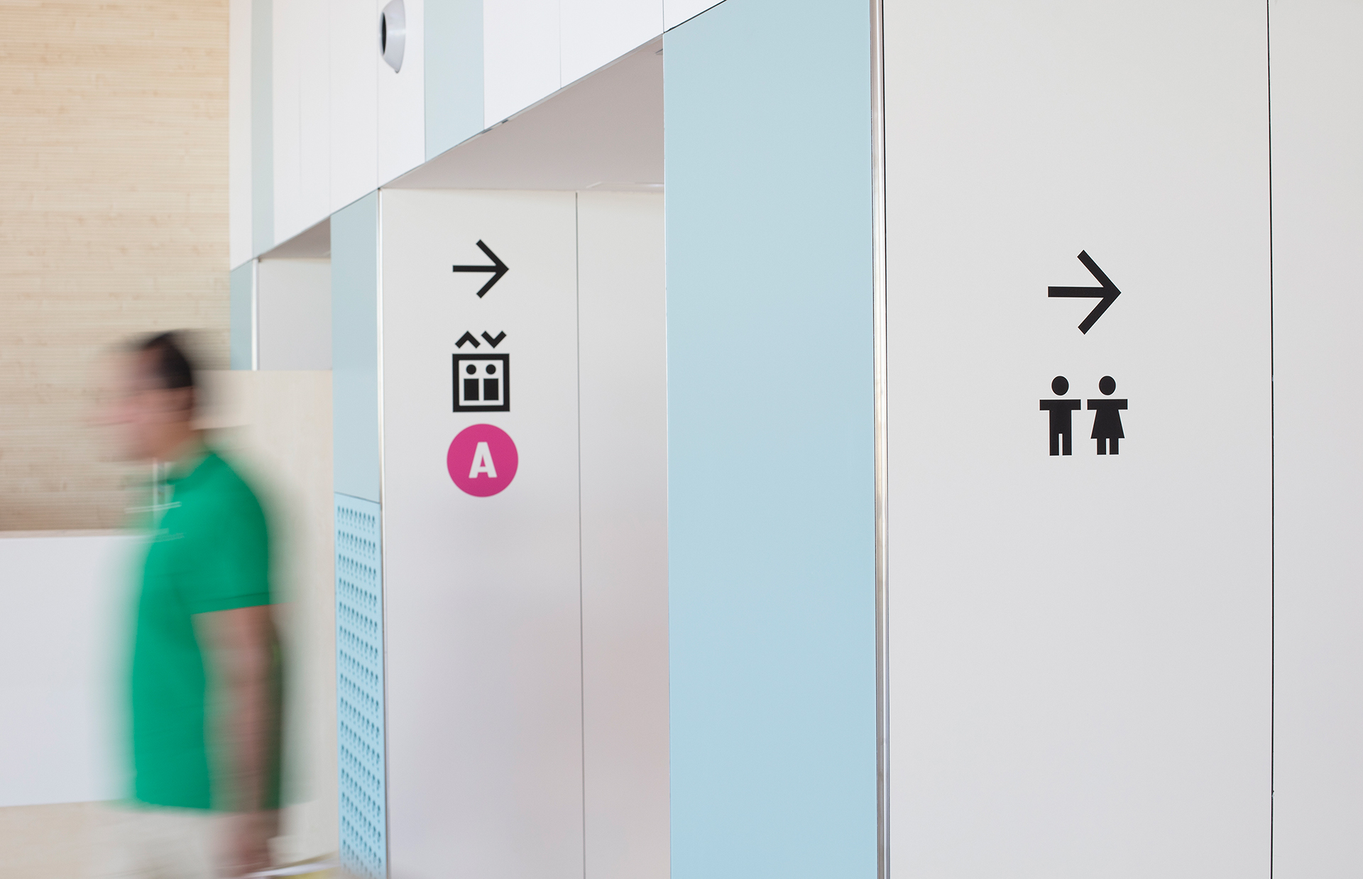
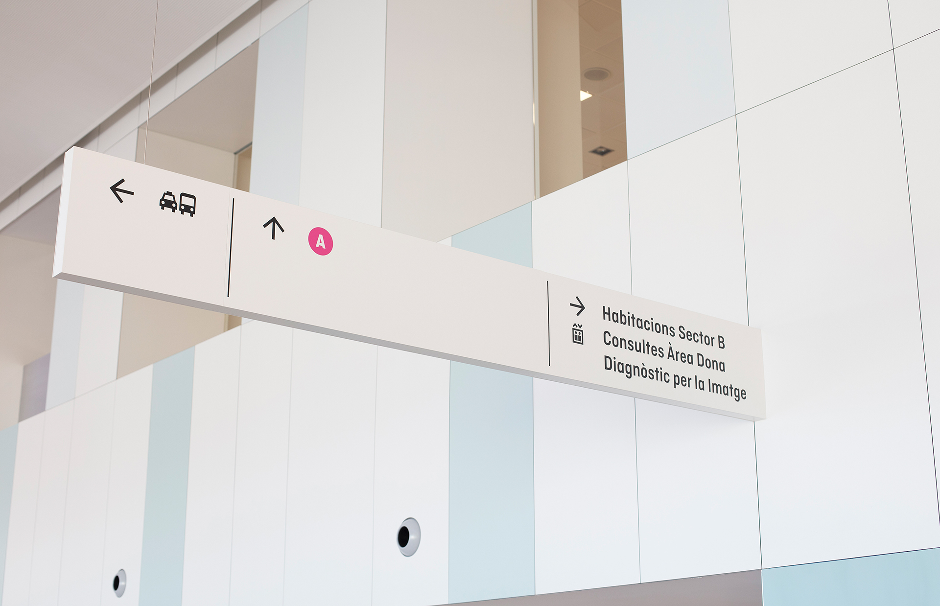
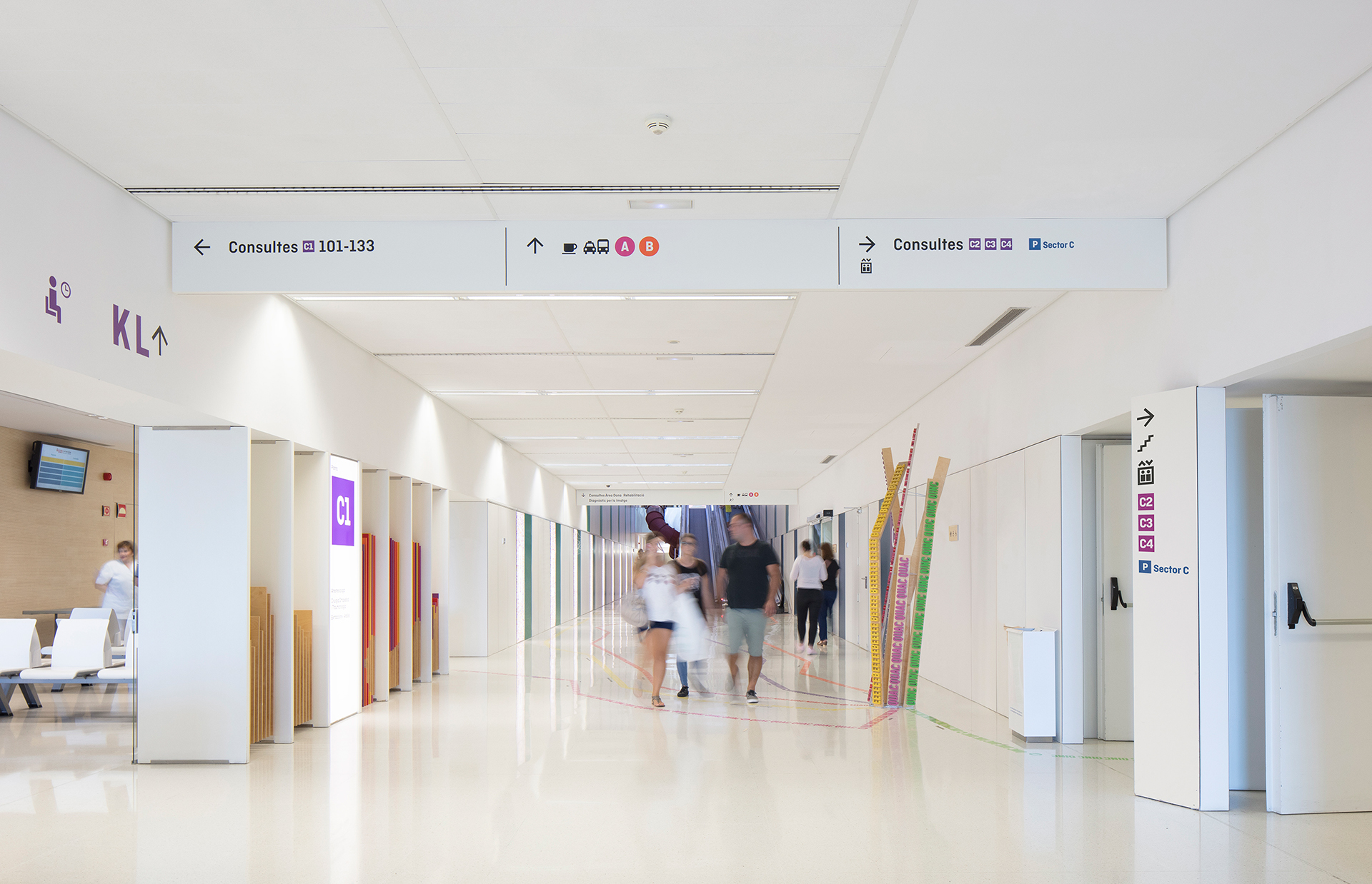
Hospital Sant Joan de Déu Barcelona is a teaching hospital specializing in the fields of pediatrics, gynecology and obstetrics. It is located on Passeig Sant Joan de Déu in Esplugues de Llobregat, a municipality bordering Barcelona, Catalonia. It is a privately owned center concerted by the Catalan Health Service which belongs to the Hospitaller Order of St. John of God, a religious organization that manages nearly 300 health centers over the world...
It is always better to try before you buy, and we understand that live testers of foundries websites are not always enough. This is why we are offering free trial fonts (test fonts) of our entire library for you to download, now you can test hundreds of typefaces from more than 20 font families. Despite having a limited character set, you can see how they perform before licensing the full versions...
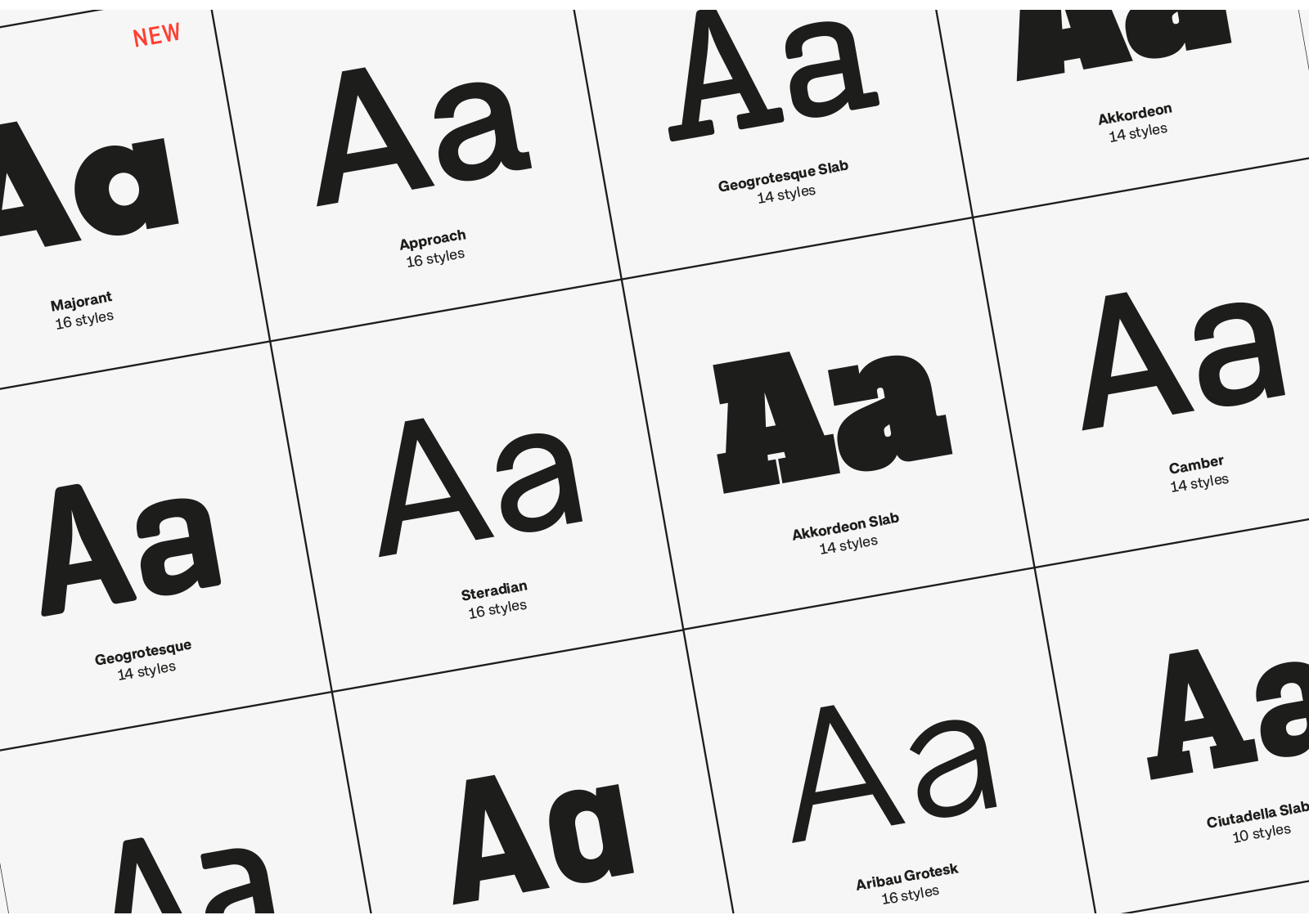
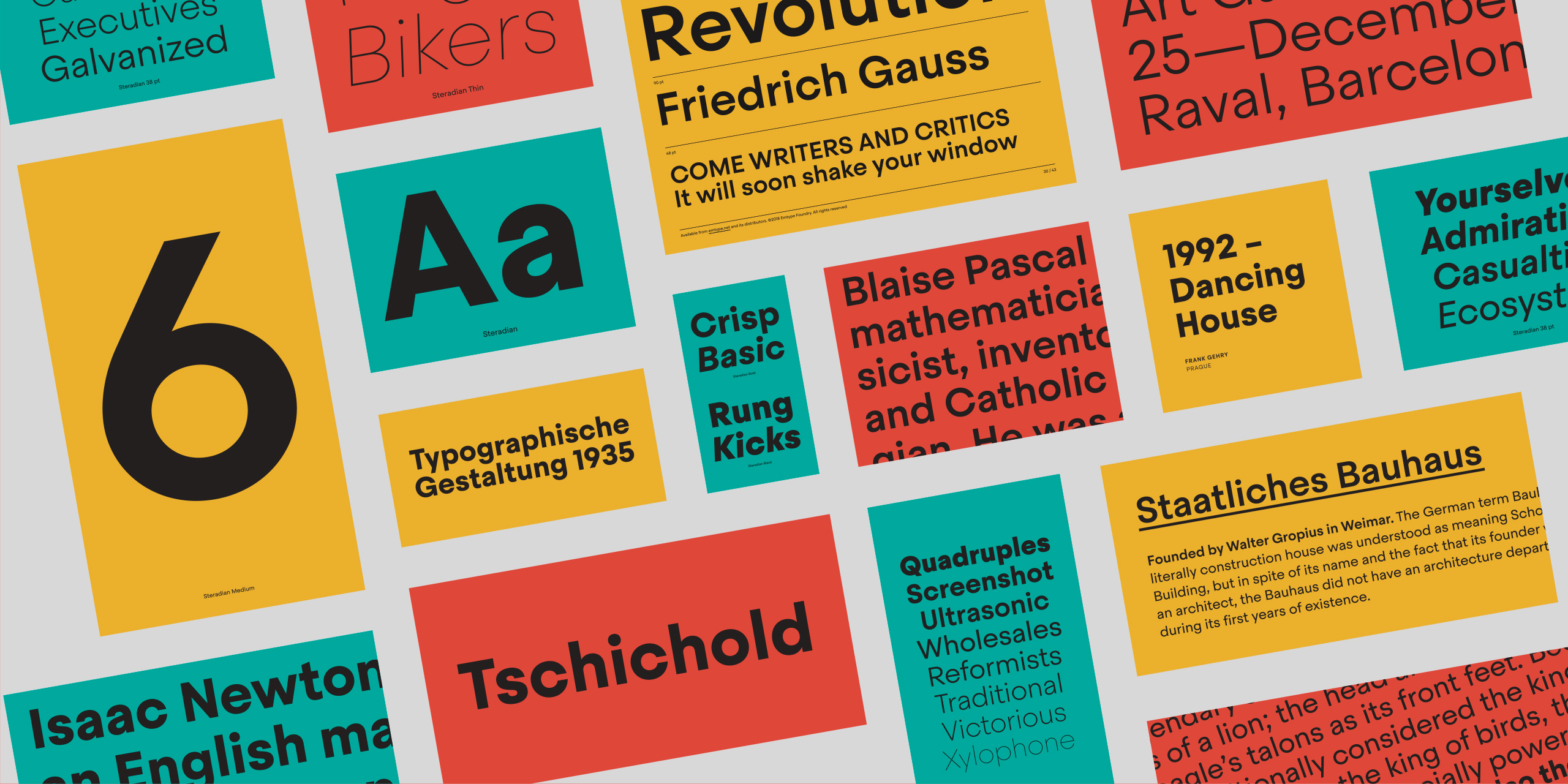
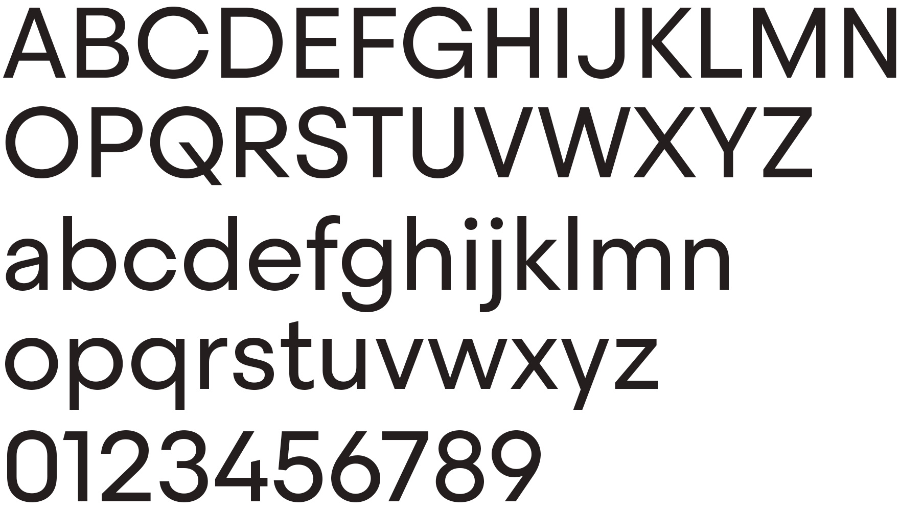
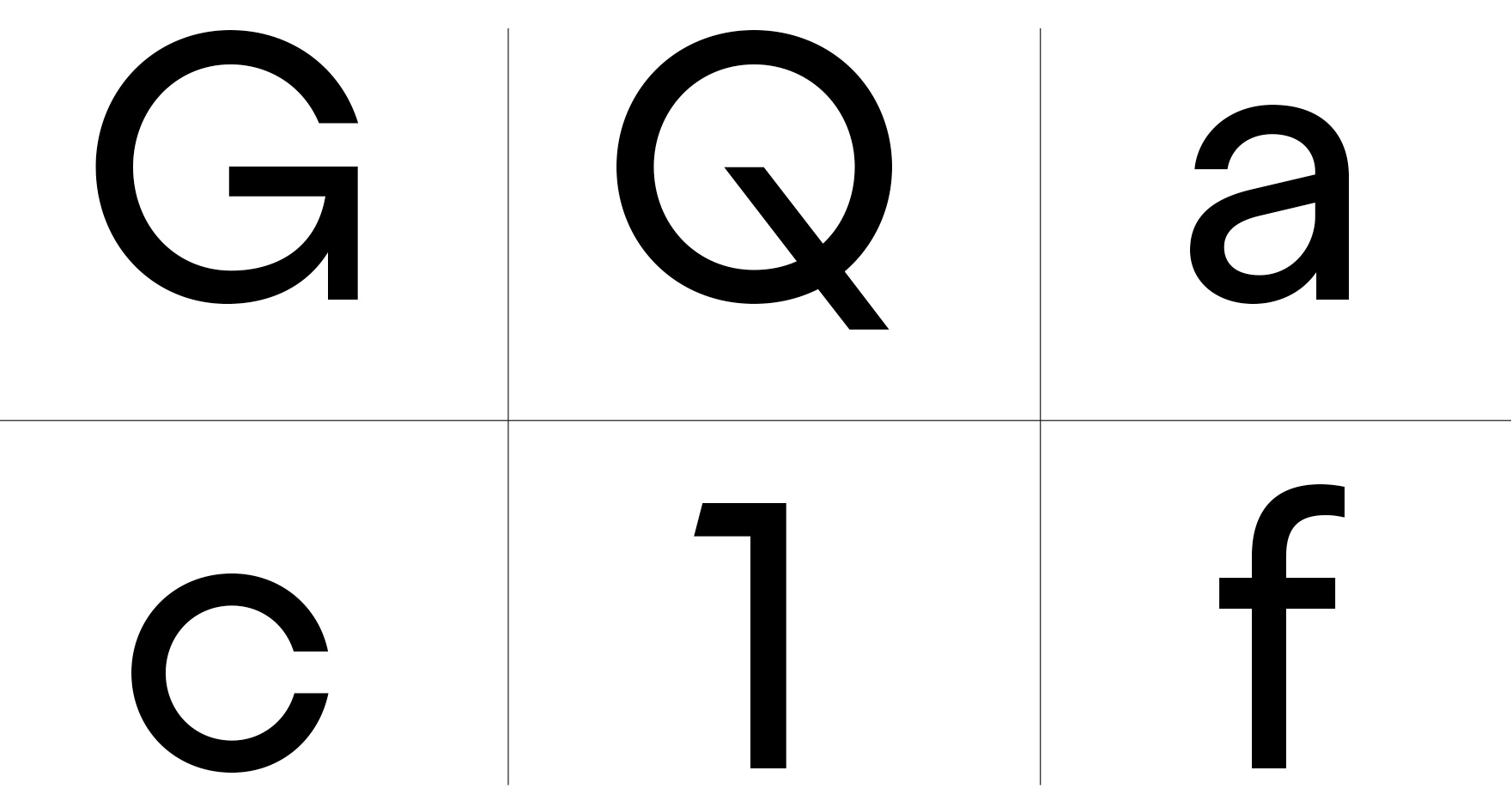
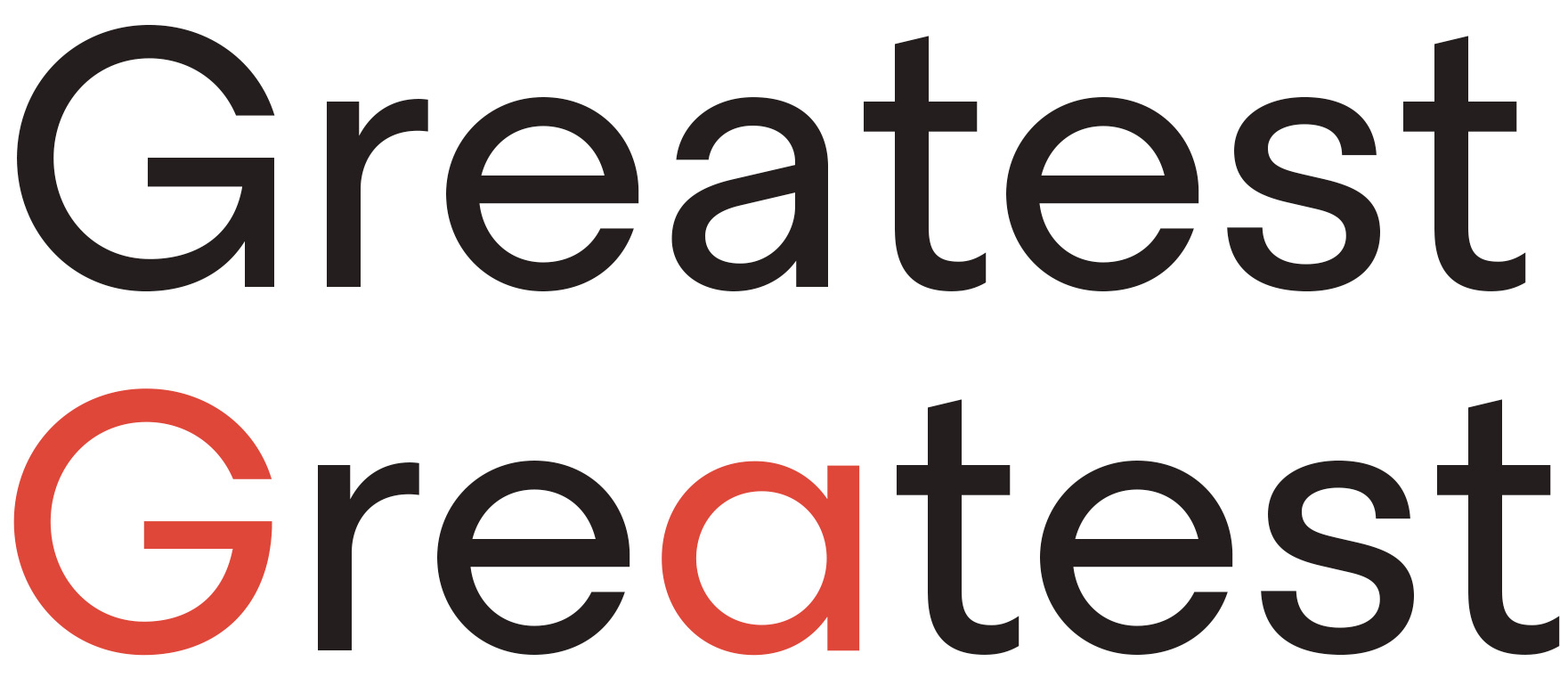
Steradian is an exploration of the geometric genre and although it has a geometric base, the widths between letters are not much different across the weights, something common of the style. That is due to the process, in which the proportions of the heavier weights paved the way for the lighter ones. It also has a series of details that make Steradian stand out and gives it a special touch. Some of its main features are the double-story ‘a’, its closed apertures and some of the capitals have a distinct personality (such as the G and Q)...
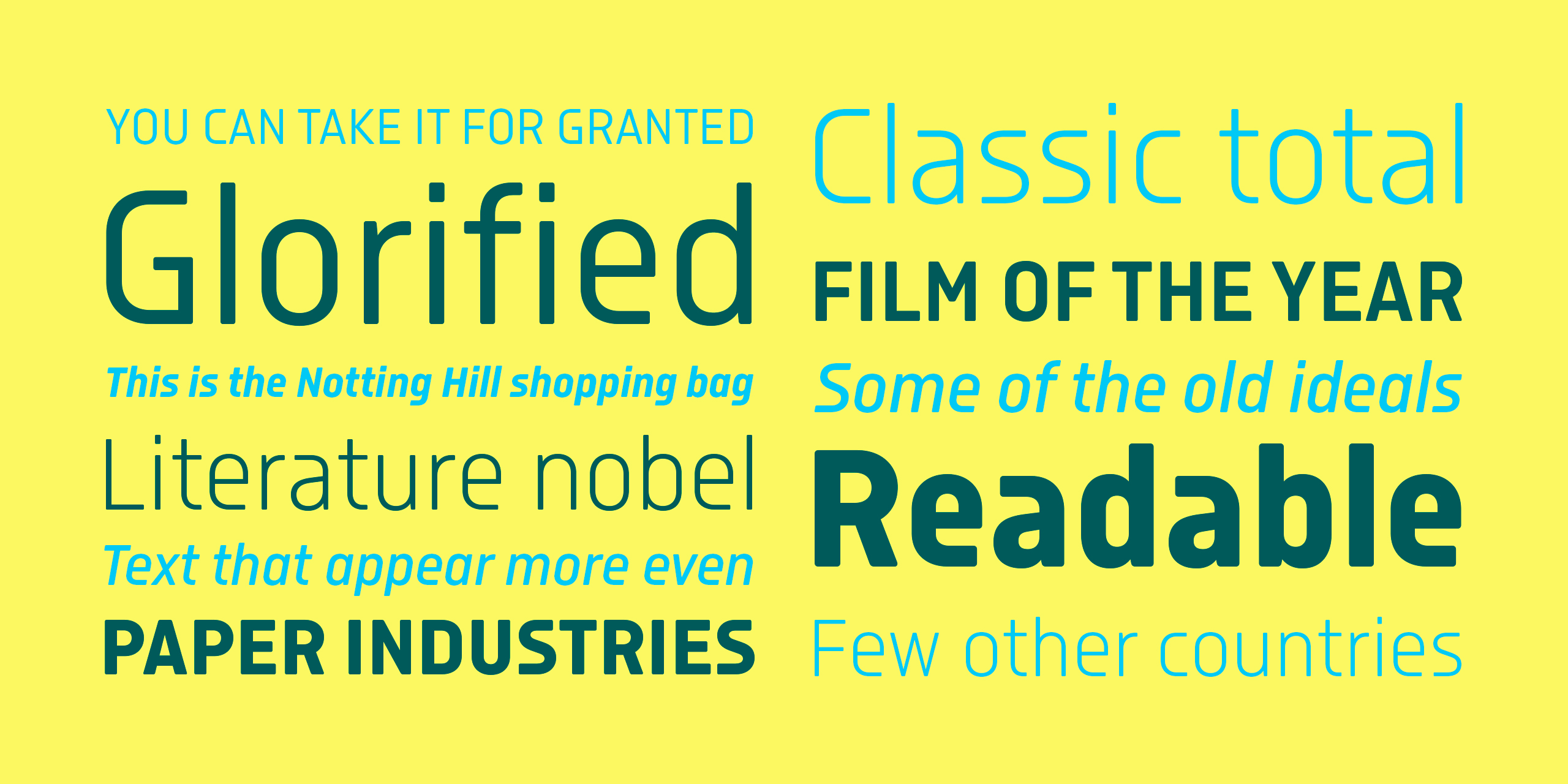
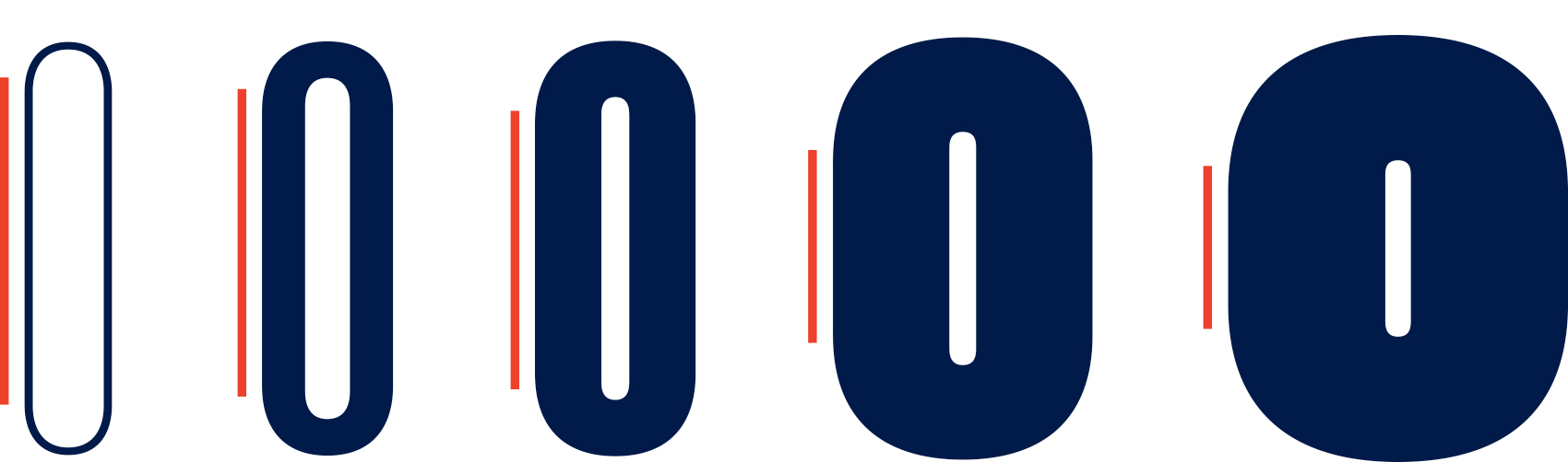
Isotonic started out as a spin-off with the idea of creating a text oriented version of Ciutadella, It has since taken on a life of its own. Building on a foundation that has proven to work very well, we decided to open the counters and increase the x height. Even though it is not strictly a text font, it works surprisingly well in body sizes and screens. The soft corners gives charm, closeness and an appropriate voice for sports, science, tech, economy etc...


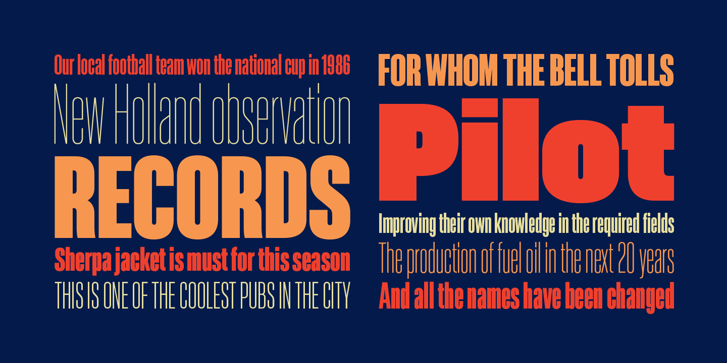
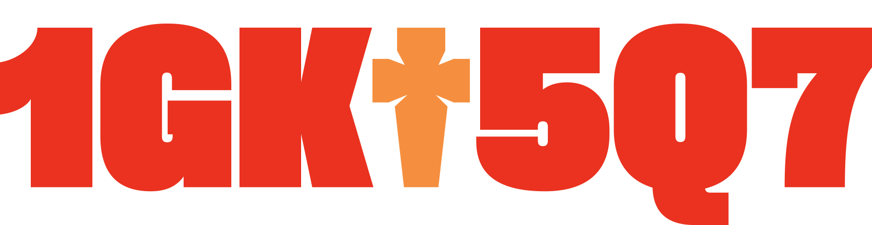
Akkordeon is a display font family roughly inspired by grotesques from the XIX and XX centuries. It is not conceived as a family of constant width but has a variable breadth from narrow to expanded, offering a wide gradation of weights. Akkordeon is designed to be used in short texts such as magazine titles, banners, cover books, charts, advertising, branding and any situation where a compact, solid and powerful font is required...