
Akkordeon is a display font family roughly inspired by grotesques from the XIX and XX centuries. It is not conceived as a family of constant width but has a variable breadth from narrow to expanded, offering a wide gradation of weights. Akkordeon is designed to be used in short texts such as magazine titles, banners, cover books, charts, advertising, branding and any situation where a compact, solid and powerful font is required.
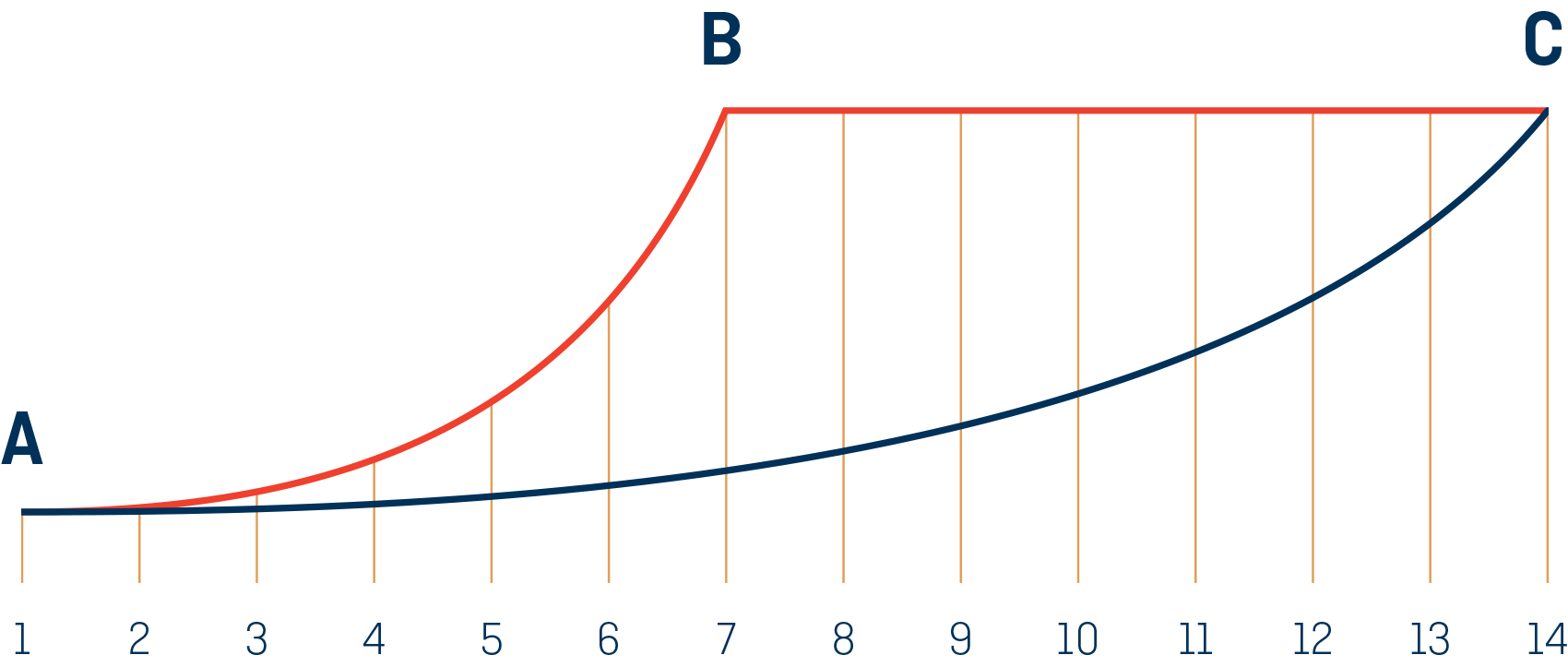
The increase of width and visual weight in Akkordeon is not linear. The width, shown in blue, it is progressive across the gradient: while the visual weight, shown in red, becomes almost constant in the bolder styles.
Akkordeon is not structured as a typical typographic family where weight and width go separately, Akkordeon does not differentiate between one and the other. The name of the family, Akkordeon (accordion in German) tries to reflect that same idea of flexibility. As a result, the names of the styles also escape the standard nomenclature, they are structured in numbers from one to fourteen to show both the change of weight and width. As the letters increase in weight it stops being condensed in order to accommodate the extra weight. Heavy weights contain an unusual amount of black making them the right choice when impact and force is needed. However the lightest and more condensed weights are subtle and elegant.
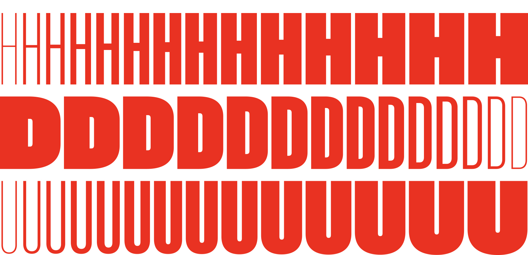
A sample of the letters evolution across the weights. From the compressed thin to the expanded bold in fourteen subtle but significant steps.
In the early XX century the idea of type family was more flexible and less defined than now. Nowadays it is a common thing to create a range of weights between light and bold and in some cases width variations from condensed to expanded. In the past, however, the number of styles of a family and their characteristics were defined by changing needs during different years or even decades mixing width and weight freely.
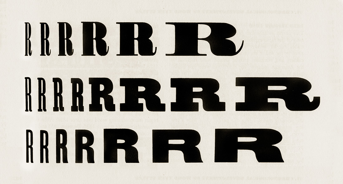
Examples of width and weight increase in a series from American Wood Type: 1828-1900: Notes on the Evolution of Decorated and Large Types and Comments on Related Trades of the Period. New York: Da Capo, 1969 by Rob Roy Kelly.
It is not conceived as a family of constant width but has a variable breadth from narrow to expanded, offering a wide gradation of weights.
According to Rob Roy Kelly, in some traditional wood types, a width increase was usually accompanied by a weight increase. Varying the width of the styles as they gained weight, a great versatility was achieved because this range of styles easily adapted to changing length texts. These expanding type designs were more popular in the United States than in Europe and there are many turn of the century examples of sprawling series much less systematically designed than later families.
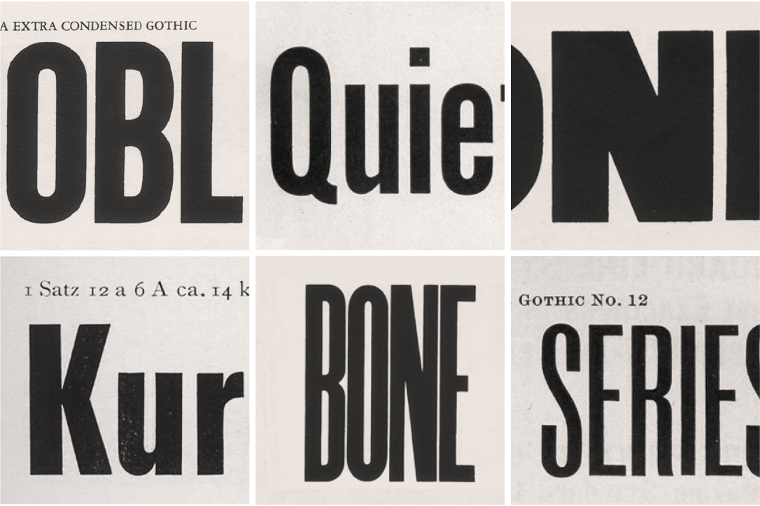
Several grotesques from the XIX and XX centuries that were a source of inspiration for several details in the letters and numbers shapes. The images are from Rob Roy Kelly’s American Wood Type:1828-1900. New York: Da Capo, 1969. American Type Founders Company Specimen Book and Catalogue 1923. New Jersey: ATF, 1923. Genzsch & Heyse Schriftgiesserei Proben Von Schriften Und Initialen. Hamburg-München: Genzsch & Heyse, 1913. Inland Type Foundry Pony Specimen Book. Sant Louis: Inland, 1907.
In Akkordeon, the weight becomes massive in some styles. Although it starts as a very thin and condensed font, there comes a moment that the increment of weight implies expansion. We decided not to be restrained by the original width but to widen the shapes so as to accommodate an extra amount of black. Combined with adaptive flat sides across the weights, this family achieves its heavy weights without losing its identity and without becoming a caricature of itself.

Detail of the adaptive flat sides, reducing the segment as the weight increases. We have used a design space including the five masters above in order to have more control of every detail across the whole system.
Thanks to a path that is not often explored, and having some characters with an untamed touch, Akkordeon becomes somewhat special. With that particular approach and family structure, a very rich palette was created, the light weights work as real space saving fonts and the bolder ones become strong for headlines. Akkordeon is specially designed for use in combination with text fonts to generate contrast, like similar typefaces were used it in the past for traditional shows, fair and circus posters and more.

Some characters with turn of the century grotesques influence
The type family consist of 14 weights and it is available for Desktop, Webfont, ePub, App and Server with support for Central and Eastern European languages. Akkordeon is a versatile display font that offers a wide range of weights as well as creative options.
View Akkordeon / View Akkordeon Slab


