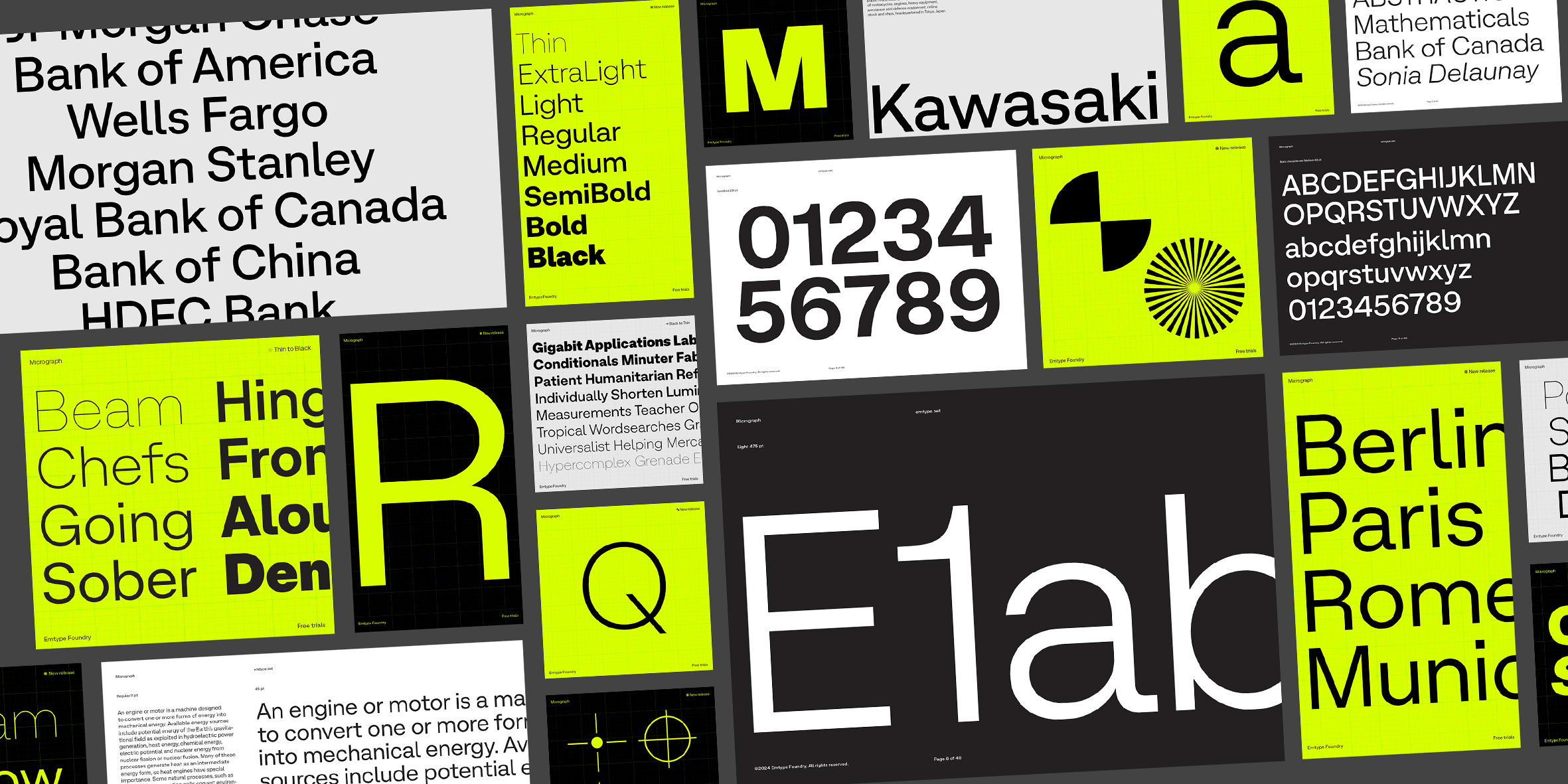
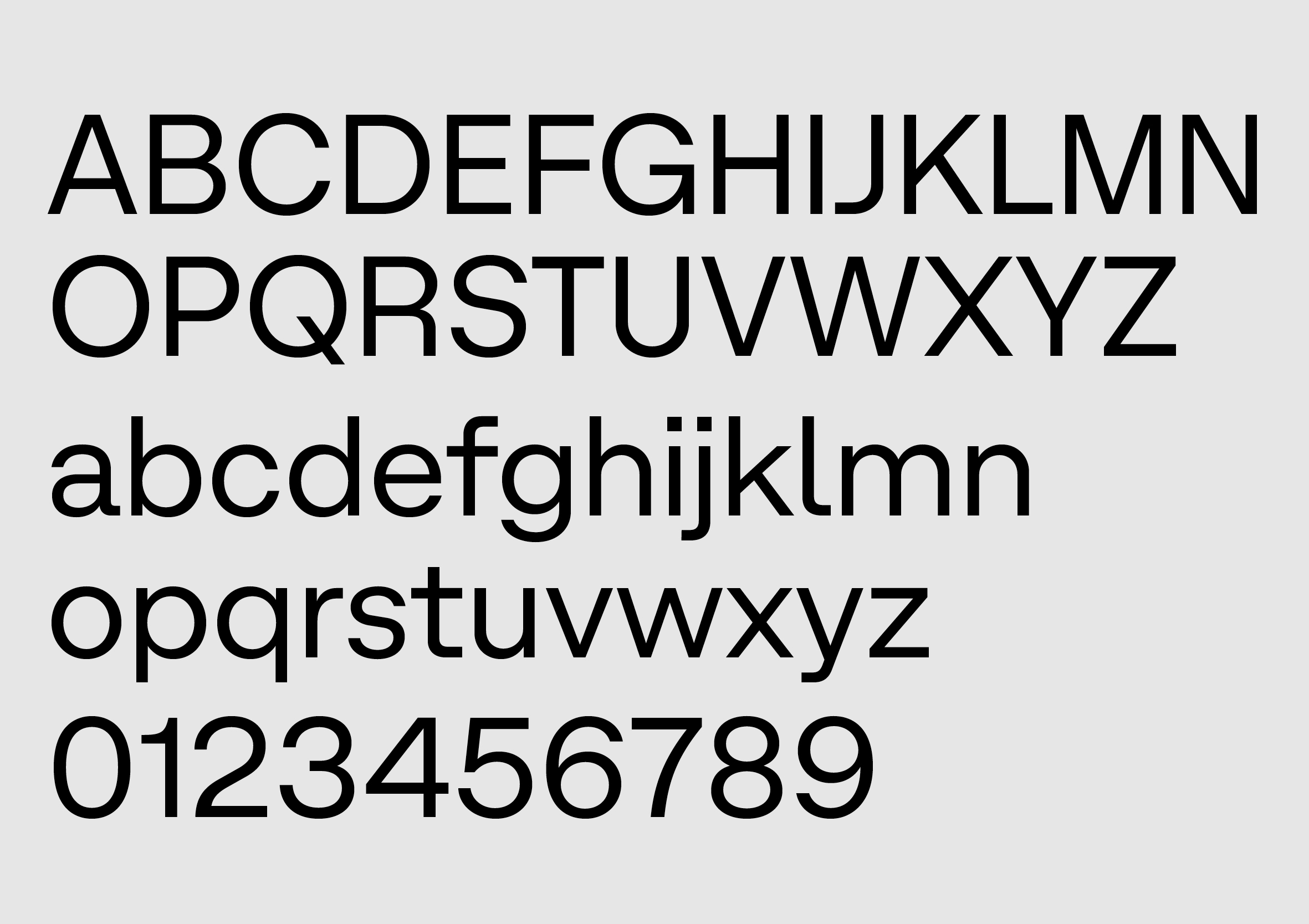
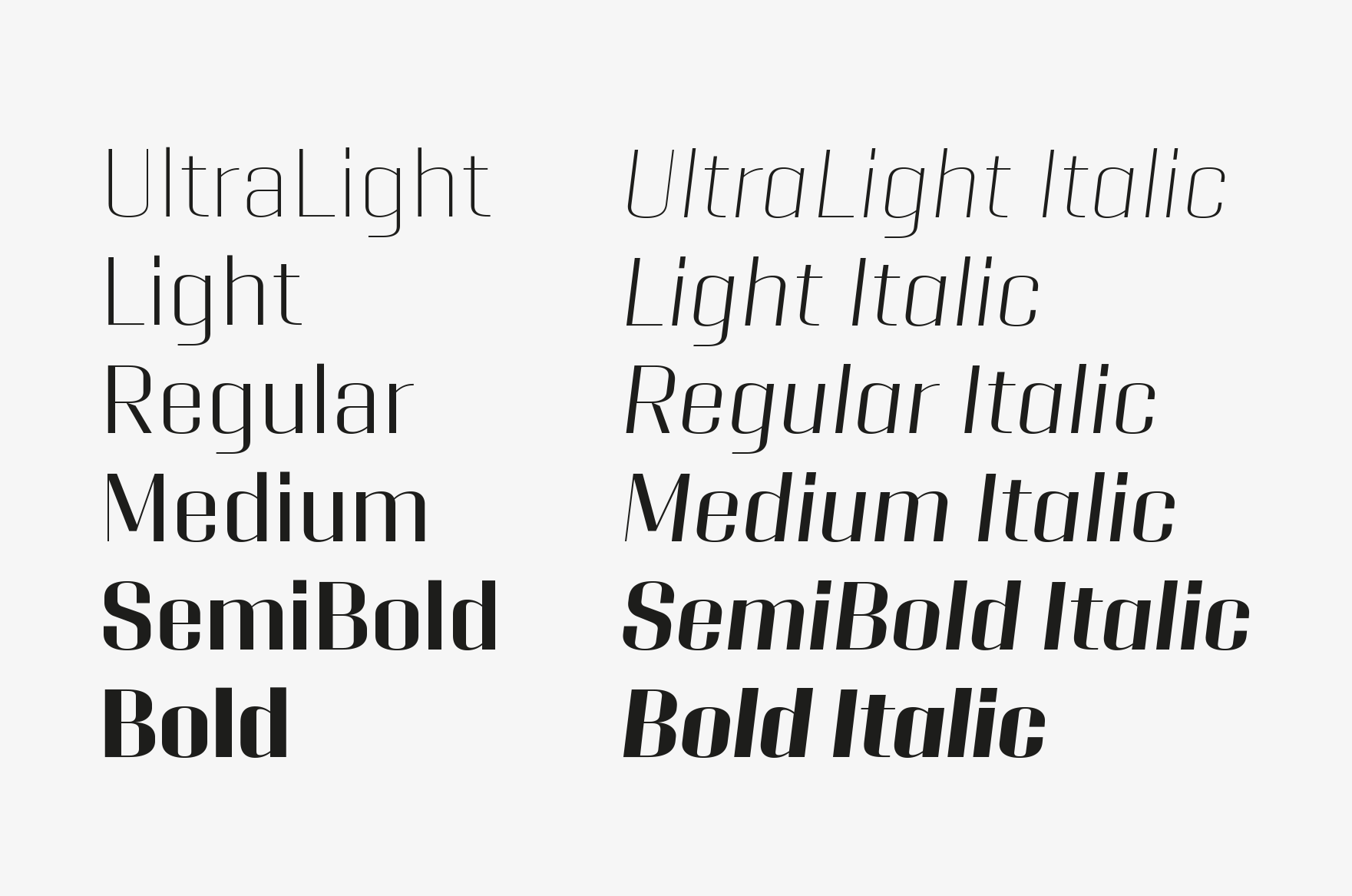
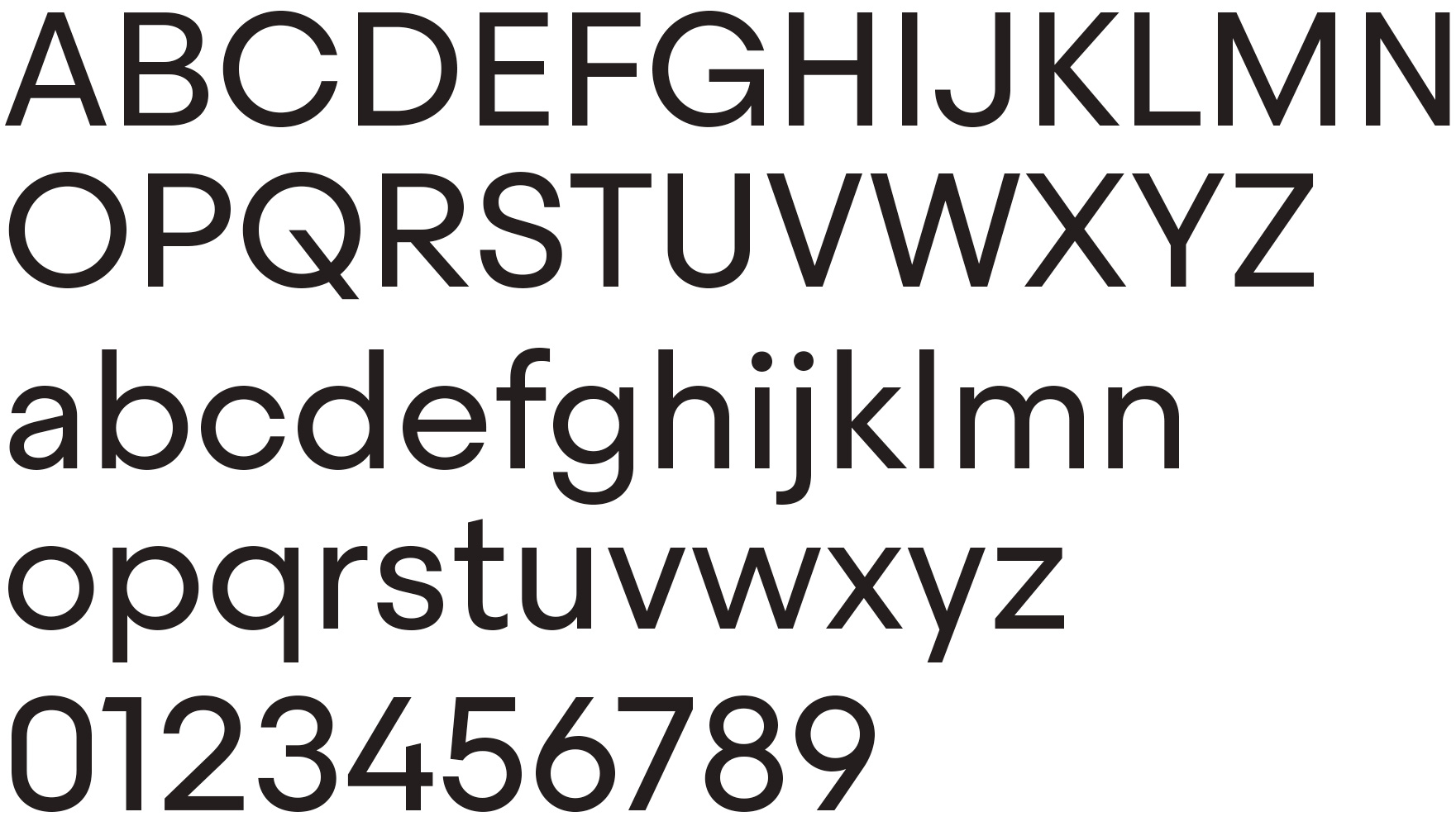
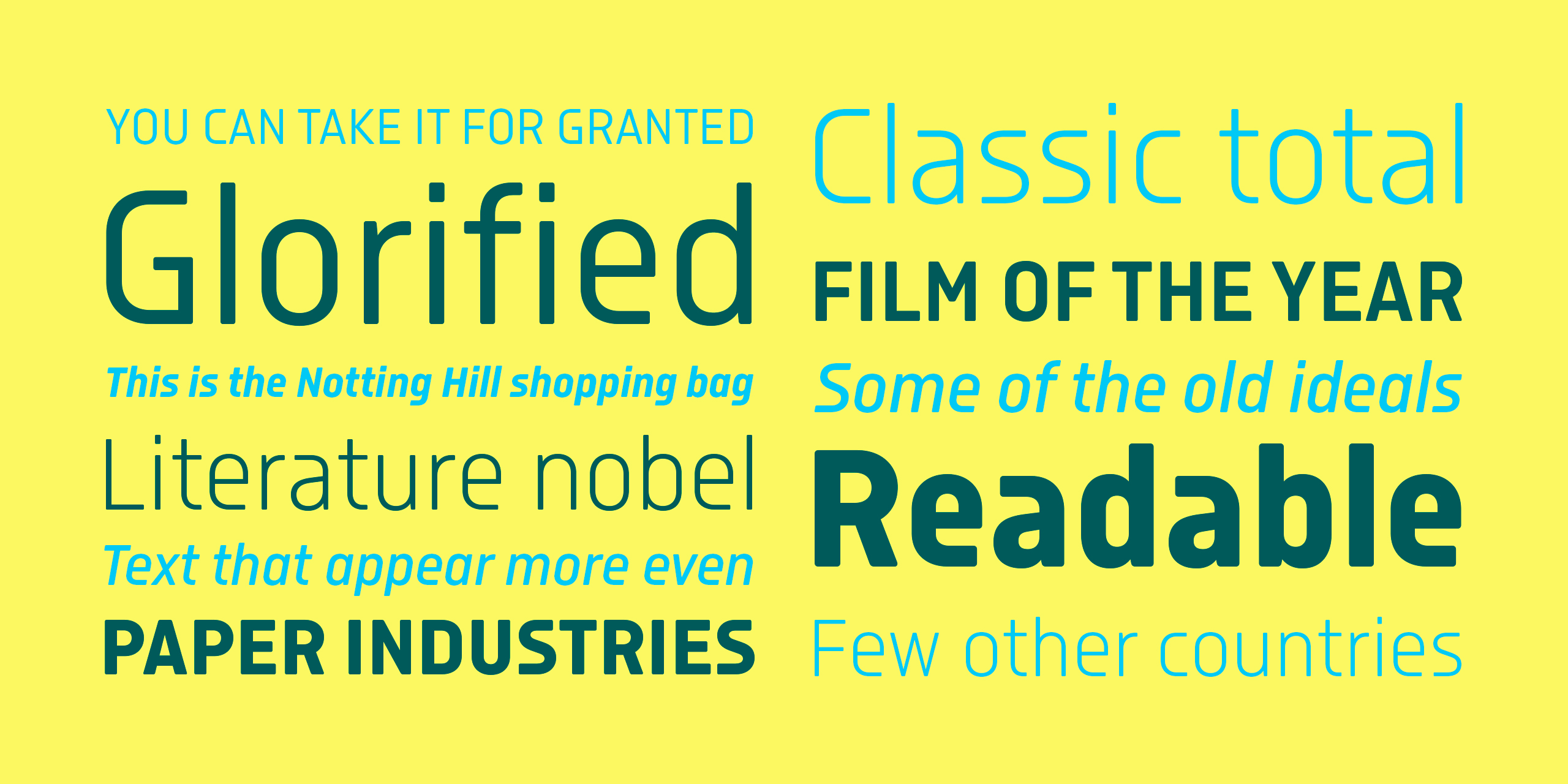
Geogrotesque Mono is the fixed-width counterpart of Geogrotesque. As in the original, the rounded finish provides a warm appearance and make it less hard or technological. It is ideal to use in tables and drafts, but also in packaging or branding where a technical or classic appearance is desired. Geogrotesque Mono is the perfect match for the all time best seller Geogrotesque. It comes in 14 styles: seven weights, plus seven underscored versions...
Geogrotesque Mono is the fixed-width counterpart of Geogrotesque. As in the original, the rounded finish provides a warm appearance and make it less hard or technological. It is ideal to use in tables and drafts, but also in packaging or branding where a technical or classic appearance is desired. Geogrotesque Mono is the perfect match for the all time best seller Geogrotesque. It comes in 14 styles: seven weights, plus seven underscored versions.
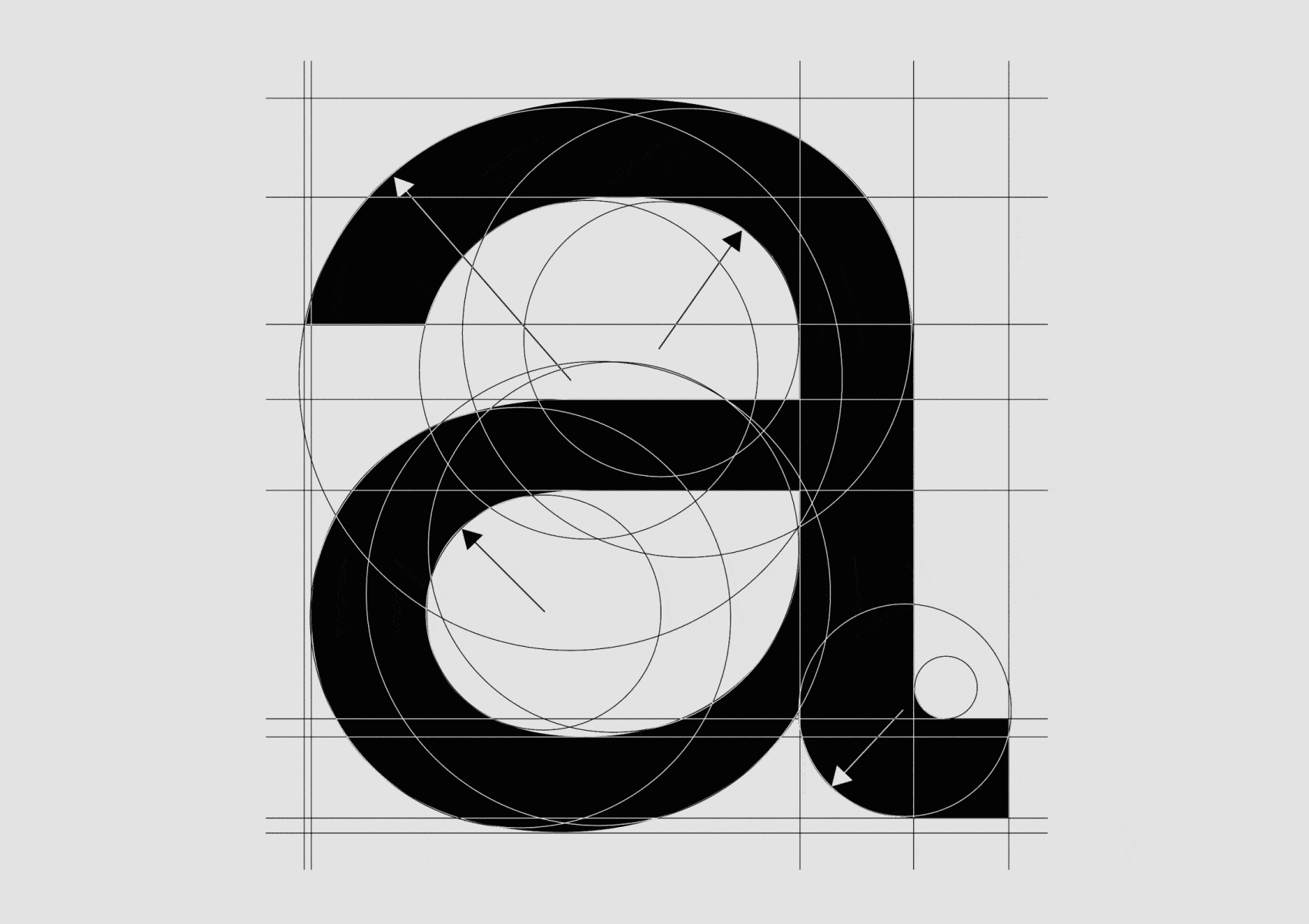
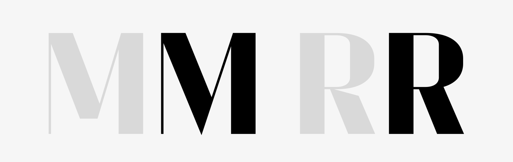
Geogrotesque, formal principle.
Since the launch of Geogrotesque in the late 2008, I have had many failed attempts of doing a monospace version to accompany it. Actually, I have always given up the projects to start something more stimulating. It wasn't until mid 2023 that I took up the idea again. The first monospaced font in my catalogue was Approach Mono, then Inklination Mono; previously, I had done some monospaced fonts for clients. So, when I started this new version of Geogrotesque Mono, in some way, I used all the new knowledge I had accumulated recently and, instead of going back to previous attempts, I started again from scratch.
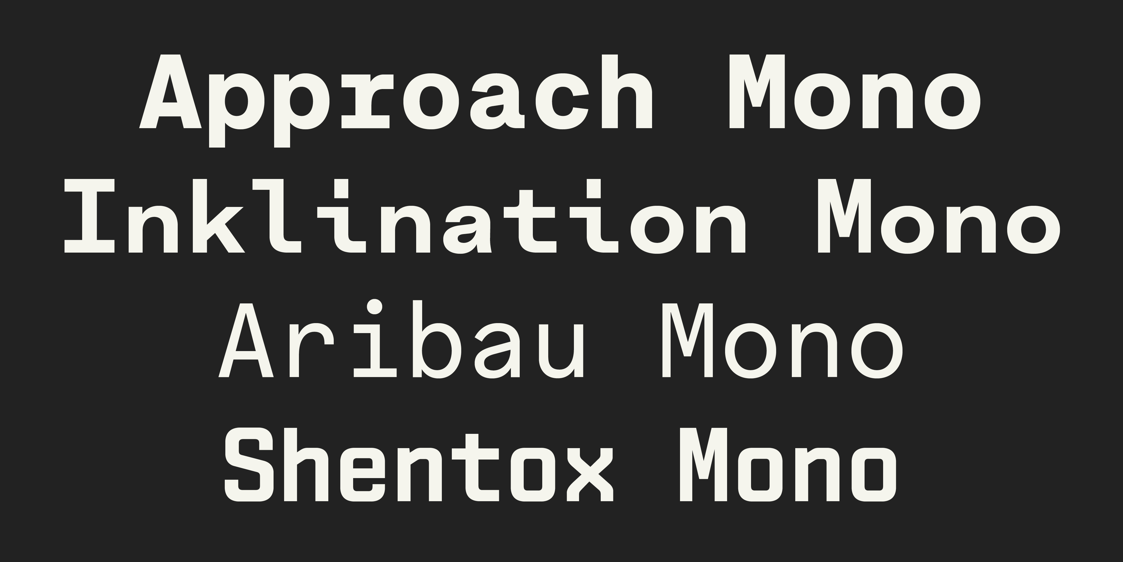
Emtype's monospaced fonts, Aribau and Shentox, have not been published yet.
First of all, I've rethought the width and decided not to force myself to respect the traditional “pitch” width (number of glyphs per inch in a specific point size); nowadays, it doesn't make much sense. The value of 600 ems is common, but it is not a fixed rule. It depends on the design and the specific typography needs. The original Geogrotesque is a bit condensed, and in my previous attempts, I always tried with 600 ems of width, which is the width of Courier and a popular choice, but I got a very light and open texture. In this published version, I switched to 560, and it works much better. The positive side effect of this decision is that Geogrotesque Mono saves horizontal space compared with traditional monospaced fonts like the mentioned Courier or San Francisco Mono, for instance. In monospaced fonts, the spacing is determined by the glyph (advance width) minus the width of the outline (bounding box or width); a change in the width has a huge impact on the texture. Finding the perfect black and white balance in a mono is a long but rewarding process; even better, kerning is not needed.
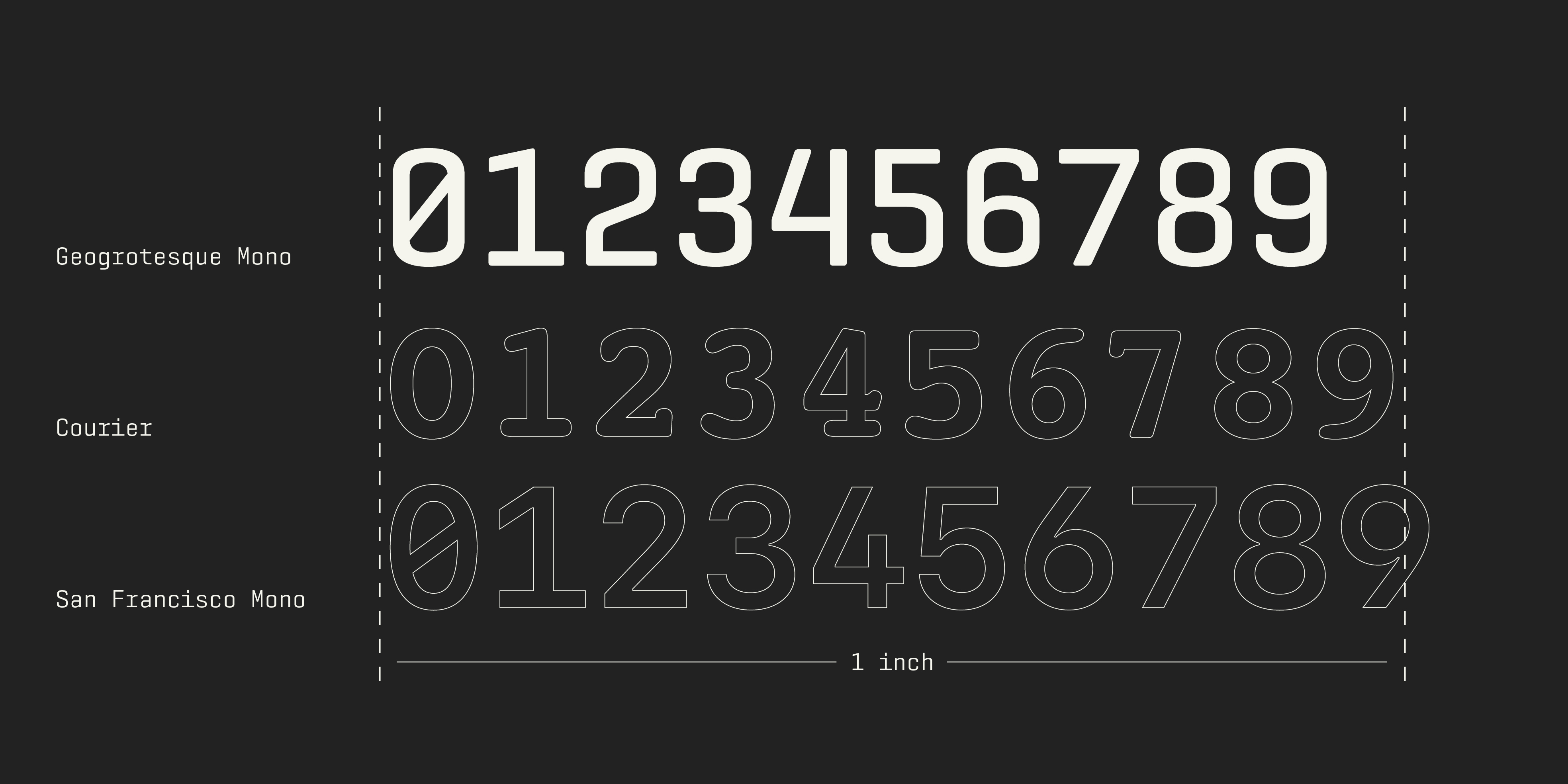
Comparison of Geogrotesque Mono with Other Monospaced Fonts.
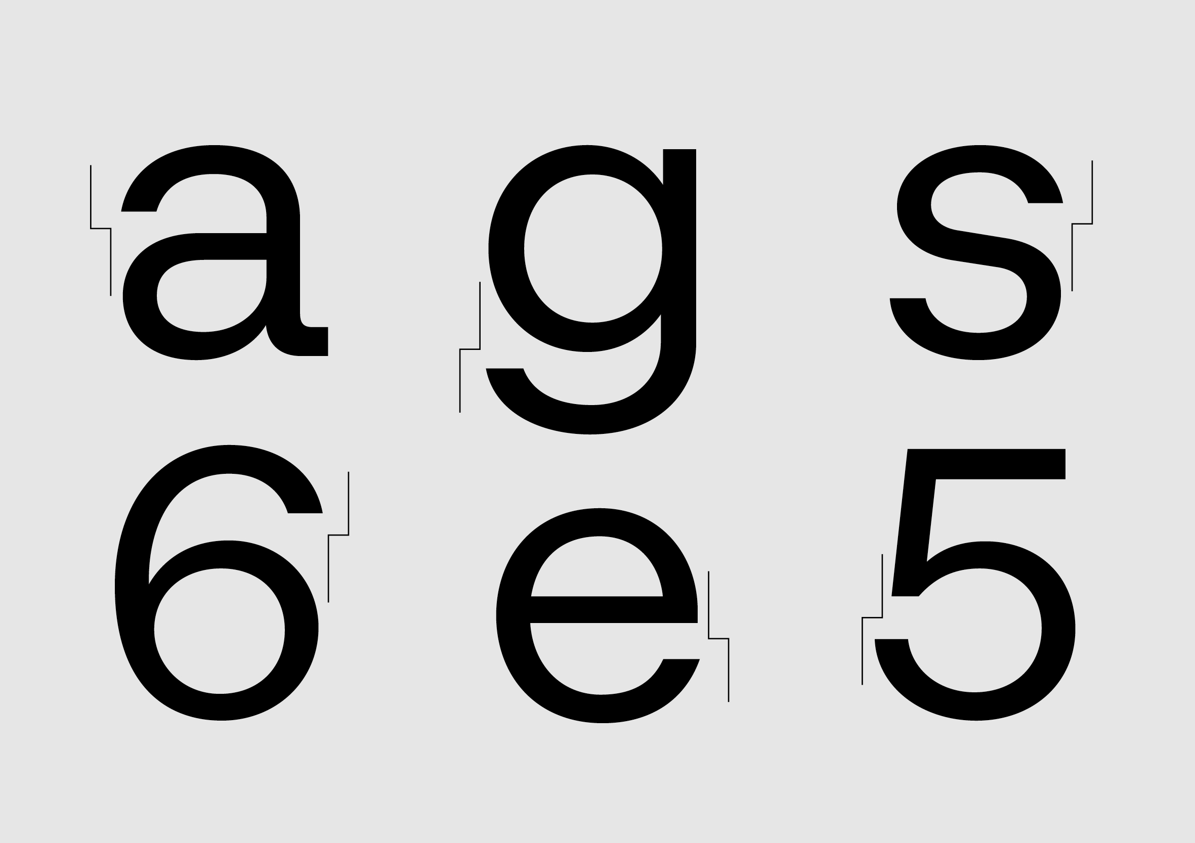
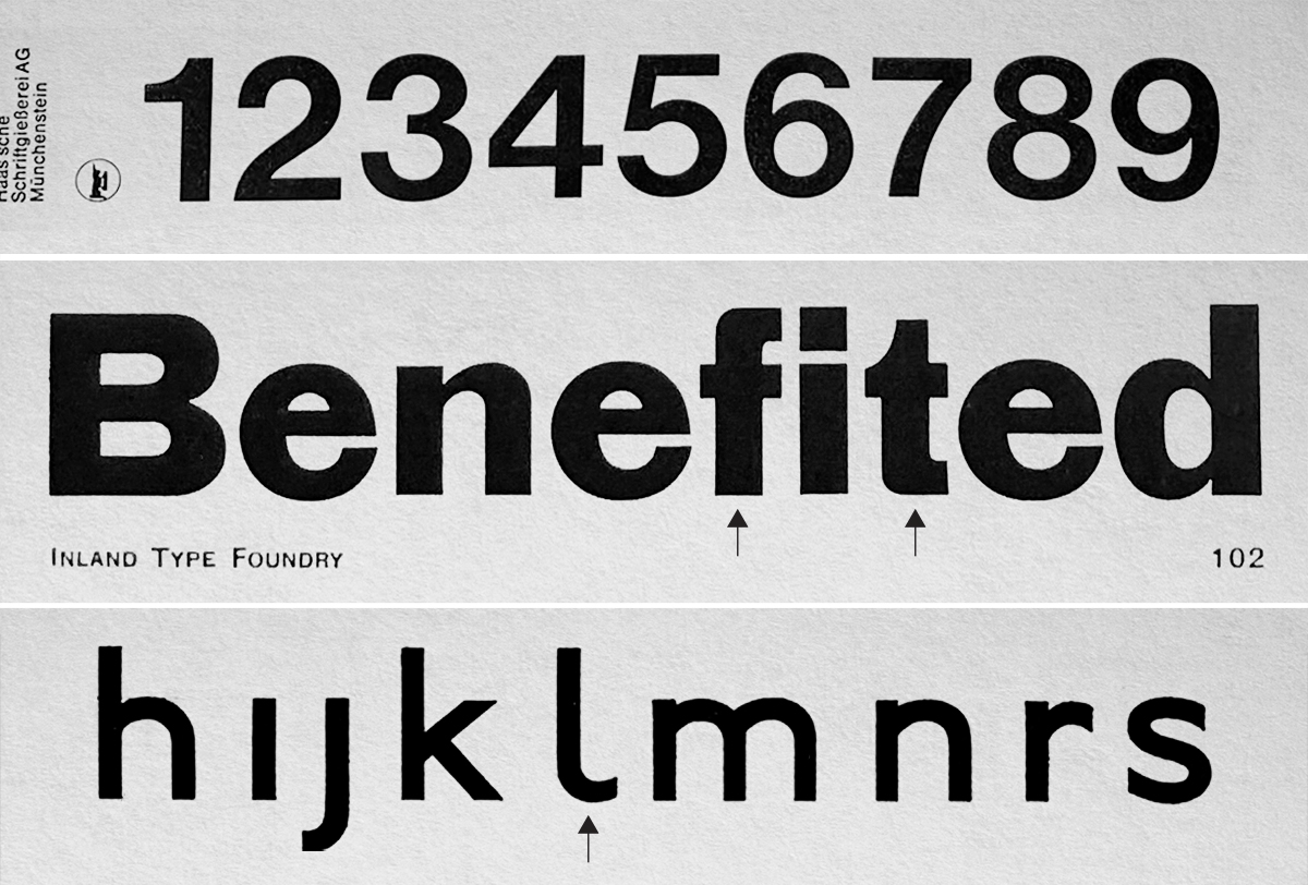
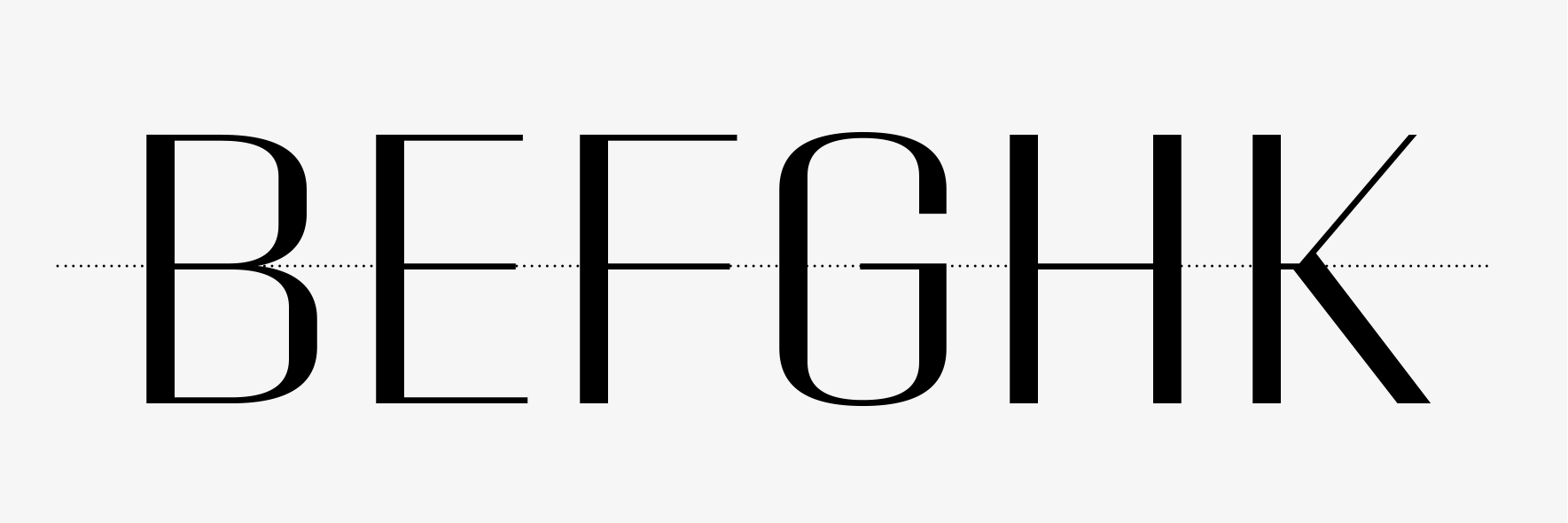
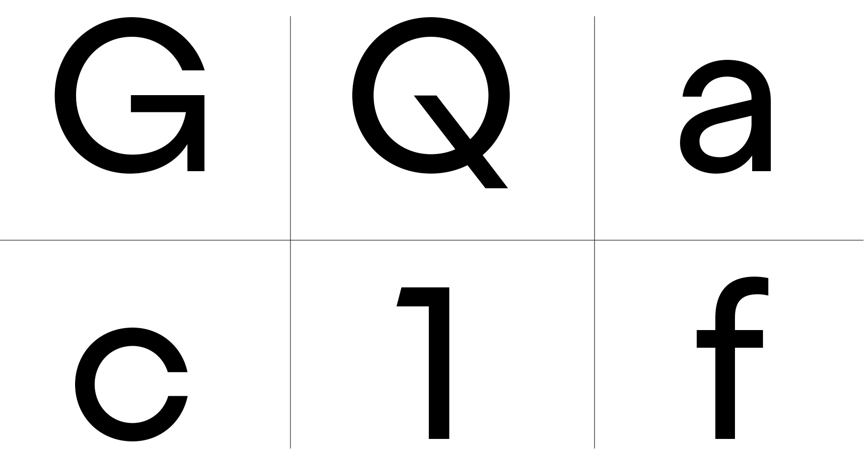
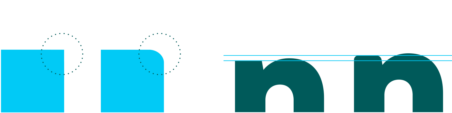
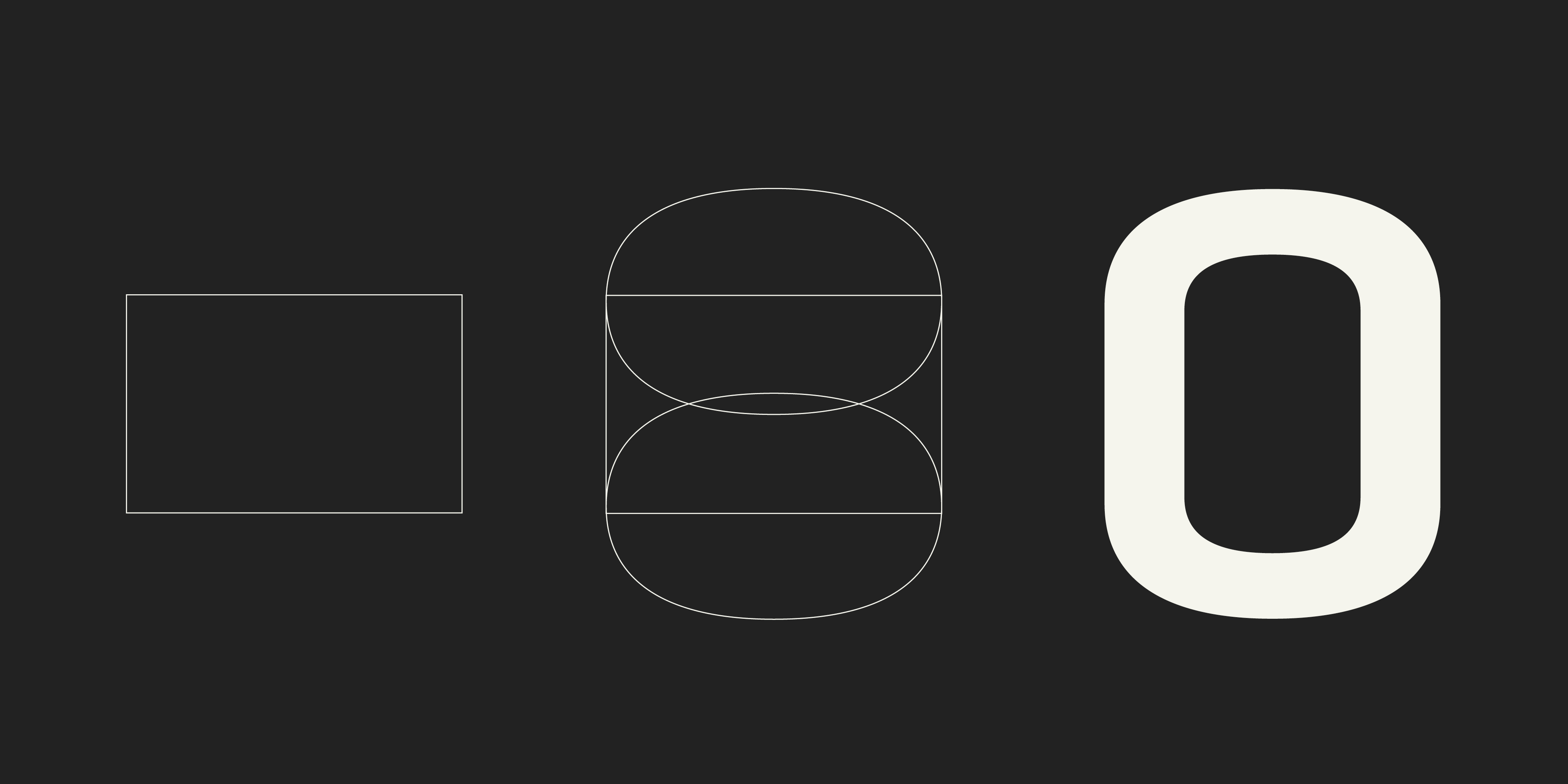
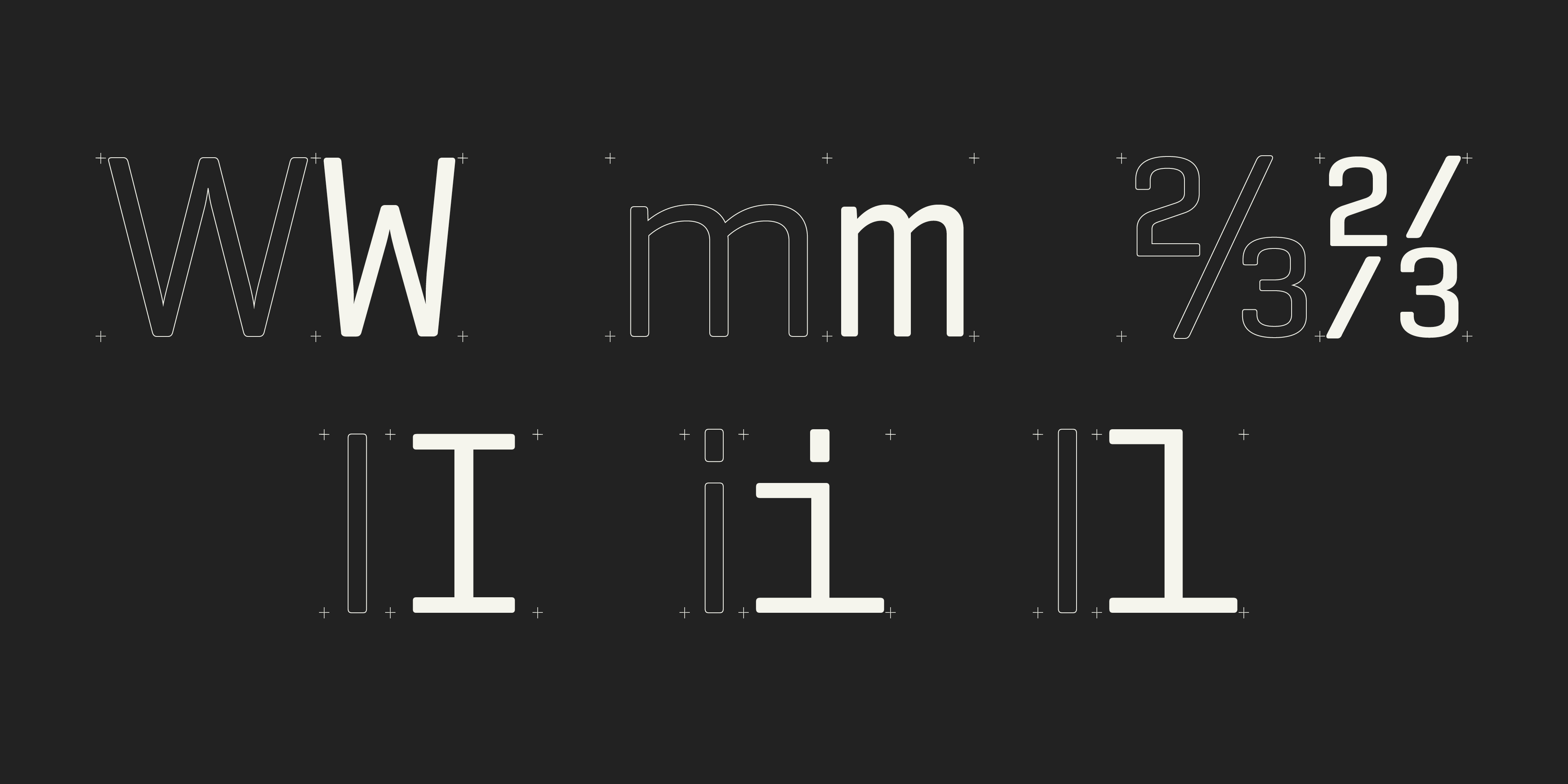
Due to the process of finding the ideal spacing, the uppercase letters are more condensed than the lowercase letters. This caused numbers, which are usually narrower than capitals, to have almost the same width as capitals. That is why the zero has a diagonal bar, to distinguish it from the capital O.
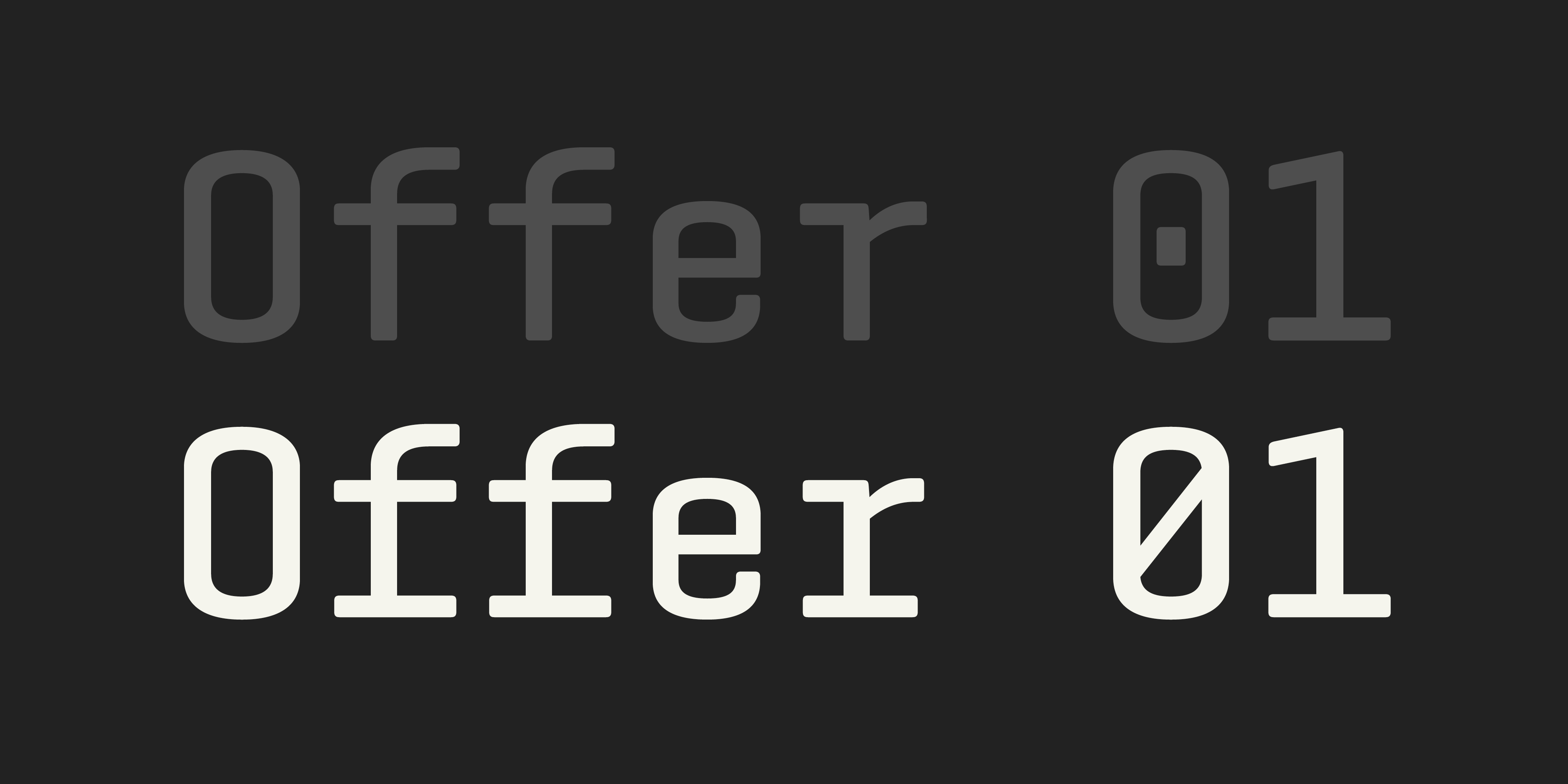
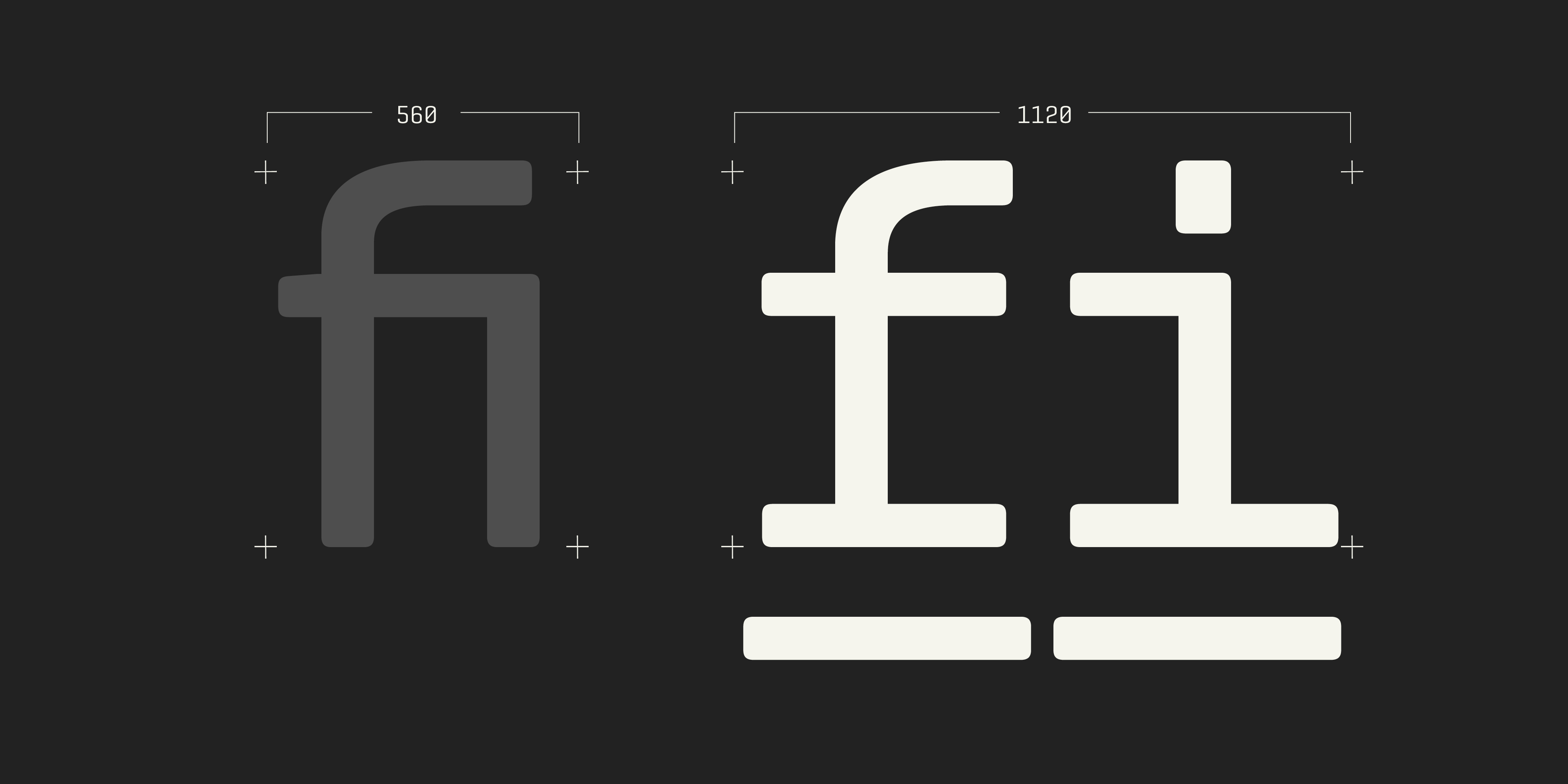
fi and fl ligatures are required in most common font encodings. In a context where all characters must be 560 Ems in width, what should be the width of the ligatures? I tried compact ones, but they were a bit noisy and broke the rhythm. Considering that programs like InDesign activate standard ligatures by default, it was not a good idea. The solution was to double the width of the ligatures to 1120, which looks more natural.
Some discarted options in grey and ligatures.
The punctuation is another detail to pay attention to in a mono; commonly, it is heavier and bigger to fill more of the width and avoid the empty feeling in the glyphs. That is why characters like the period, colon, semicolon, etc. are heavier; the same happens with the tittle of 'i' and 'j'. Other characters that were challenging to make fit in the available space were characters that were originally too wide, such as fractions, 'M', 'W', 'm', 'w'. On the other hand, 'i', 'l', or 'I' were too narrow and needed to fill the space, making them wider.
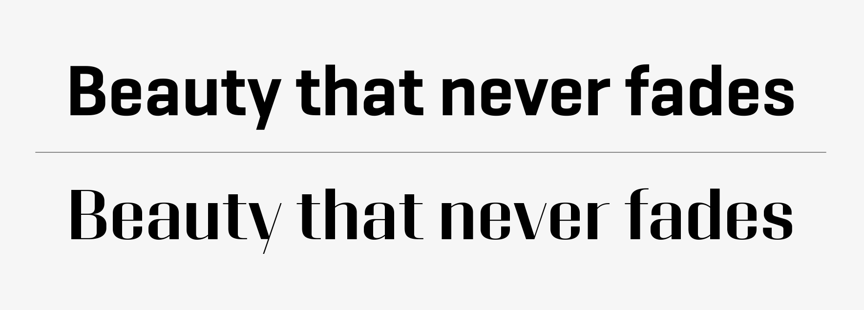
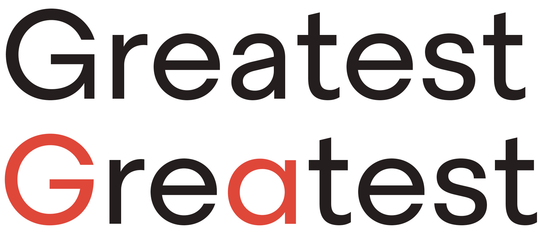
Comparison of Geogrotesque and Geogrotesque Mono.
The are many historical references of monospaced typefaces and one of the recurring variation is the underscored one. This is not surprising, as monospace typefaces emerged due to typewriter machines, and underscoring was a method for highlighting text when there were no options for different weights or italics. Thus, when the first movable types of monospaced typefaces began to appear, they replicated this practice adding an underscored version. Although Geogrotesque Mono already has 7 weights for highlighting and contrasting text, it also includes an underscored version, which broadens the possibilities of use and makes it more versatile.
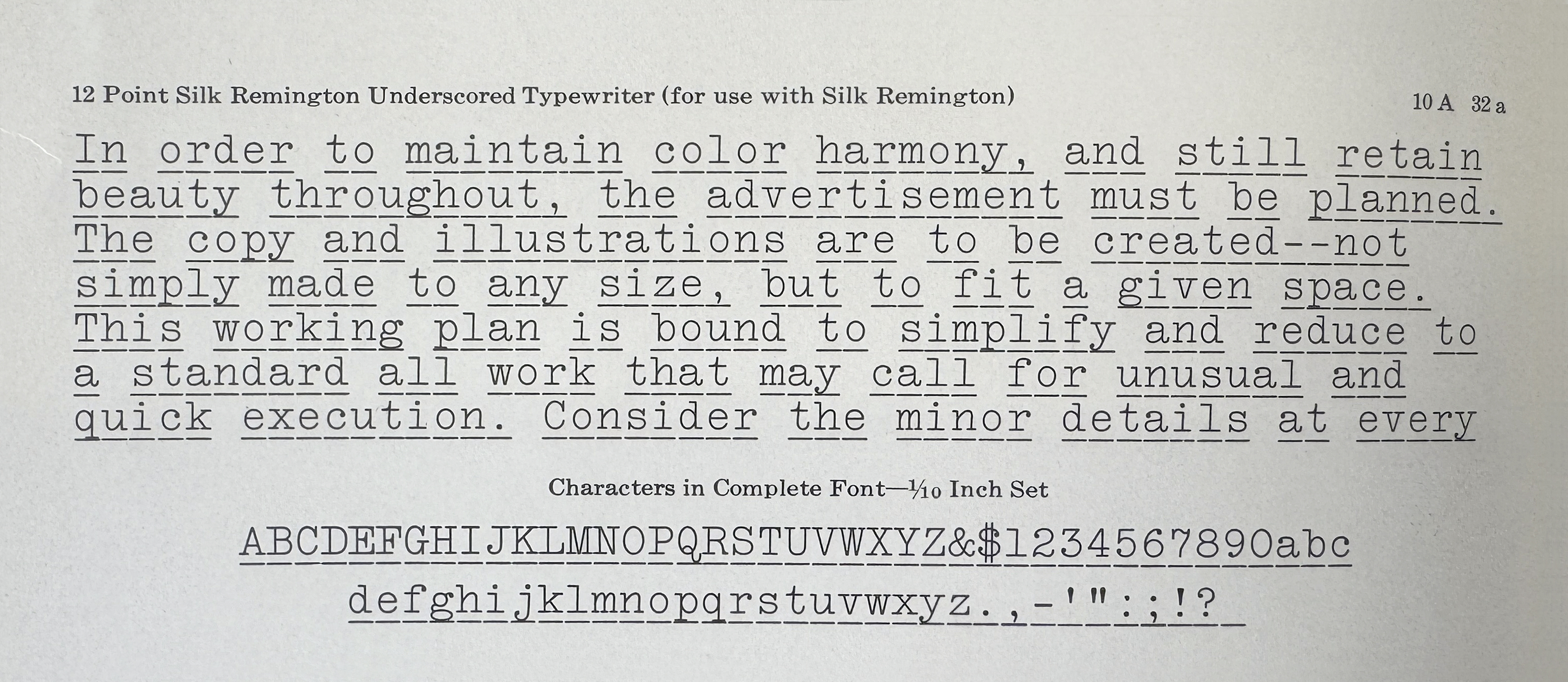
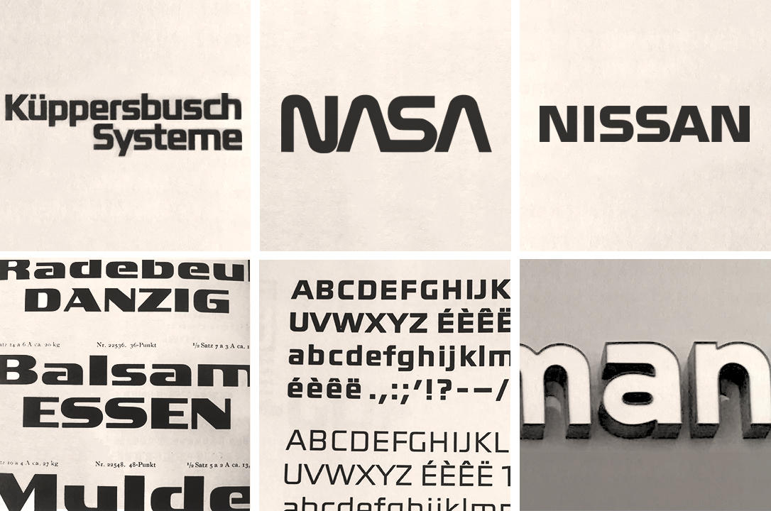
Source of inspiration: Slik Remington Underscored Typewriter. American Type Founders Company Specimen Book and Catalogue 1923. New Jersey: ATF, 1923.
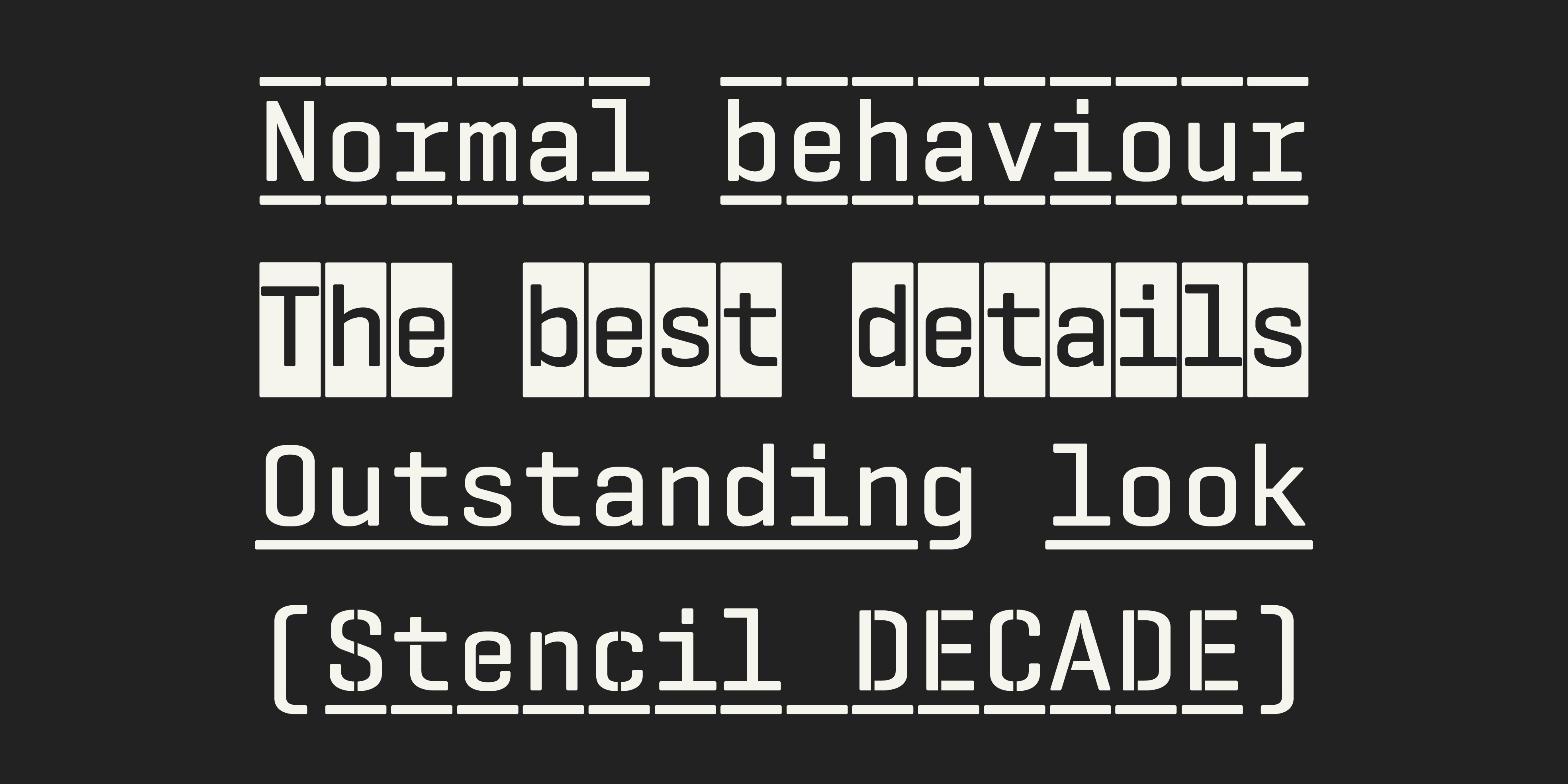
Geogrotesque Mono U (U stands for underscored) can be used to highlight text like in the old days or simply to add another dimension to your design. Many characters have been adapted to perfectly match the underscore, for example, curly braces {([])}, descending letters like ‘g’ or ‘j’, etc.
Exploration to find the ideal counterpart. The goal was to create a compact and functional family, that implies the discard of superfluous, yet interesting, variations. Designers frequently view typefaces as overly complex, thus simplification is always a wise choice.
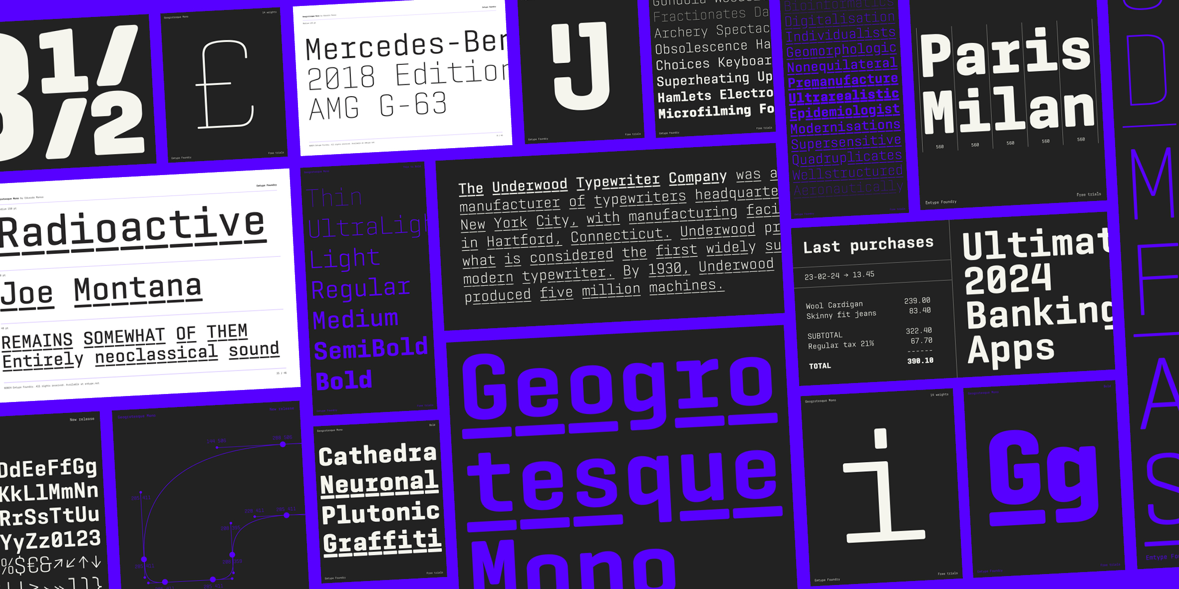
Geogrotesque Mono is perfect for use in coding or technical environments. It is well-suited for tables, film subtitles, scripts, and drafts, or professional communication where a technical or methodical appearance is desired. Its clarity and uniformity make it a solid choice for data representation and instructional material. But not only that, monospace typefaces exhibit a distinctive and attractive aesthetic, especially in editorial, packaging, or branding projects seeking to evoke a nostalgic or classic ambiance. The precise, grid-based structure of monospaced characters can infuse a design with personality and allure. The range of weights allows enough flexibility in design, making it appropriate for use in a general design context rather than limiting it to a merely technical one.
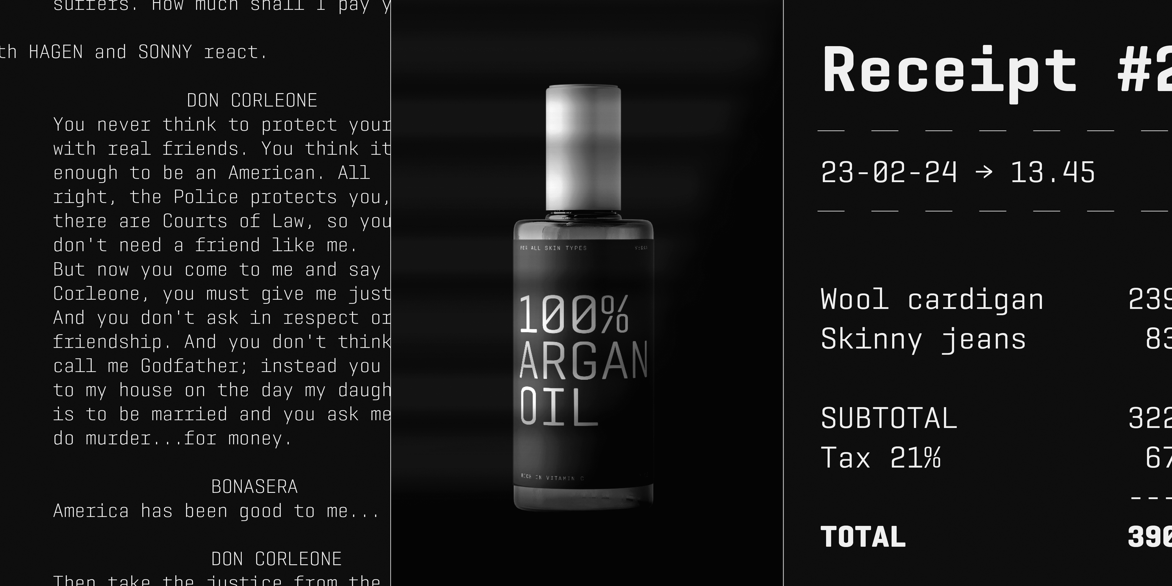
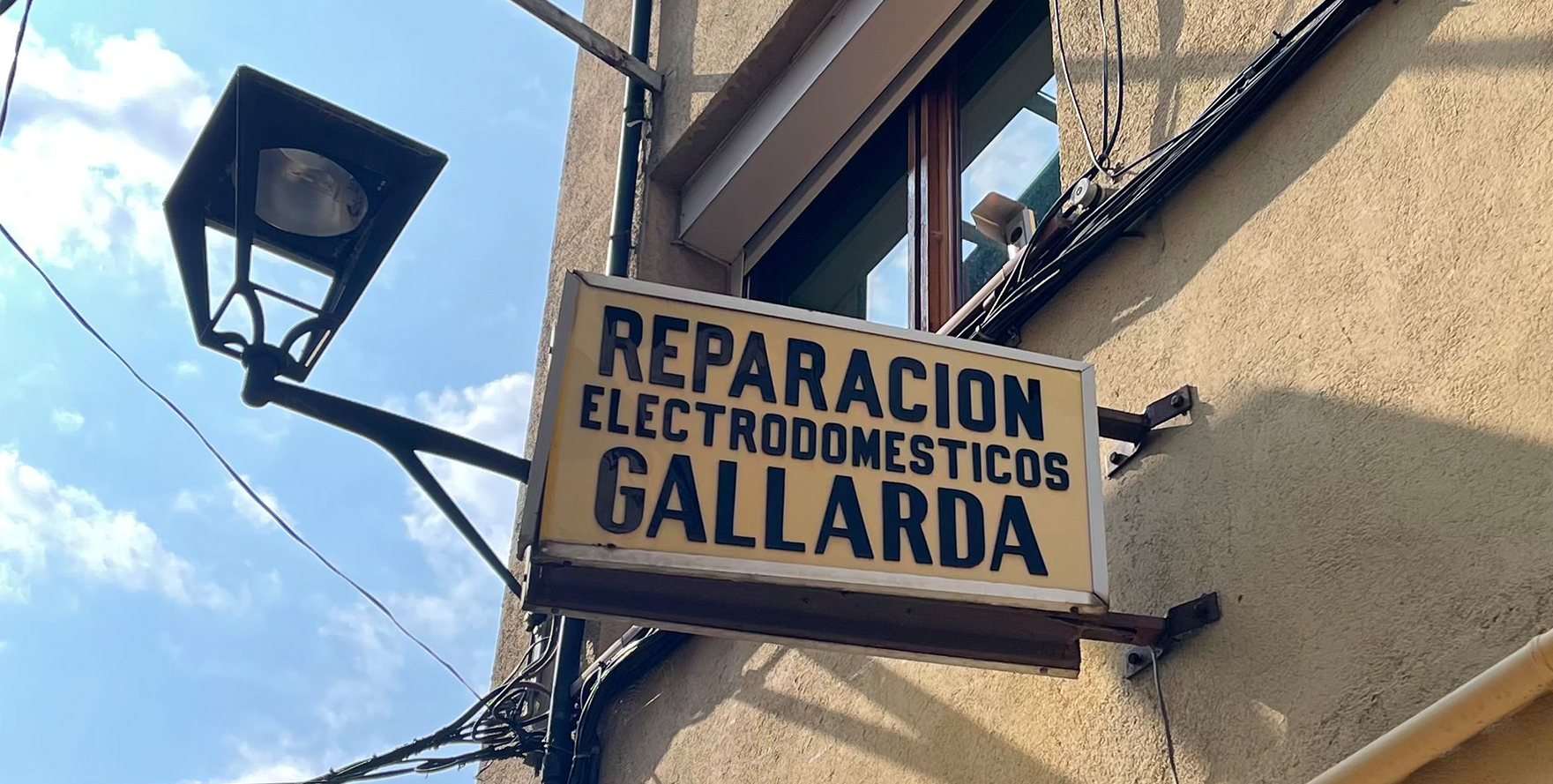
Suitable for a large range of situations, from whisky or cosmetic labels to tables or drafts; it could even be used for spatial computing :)
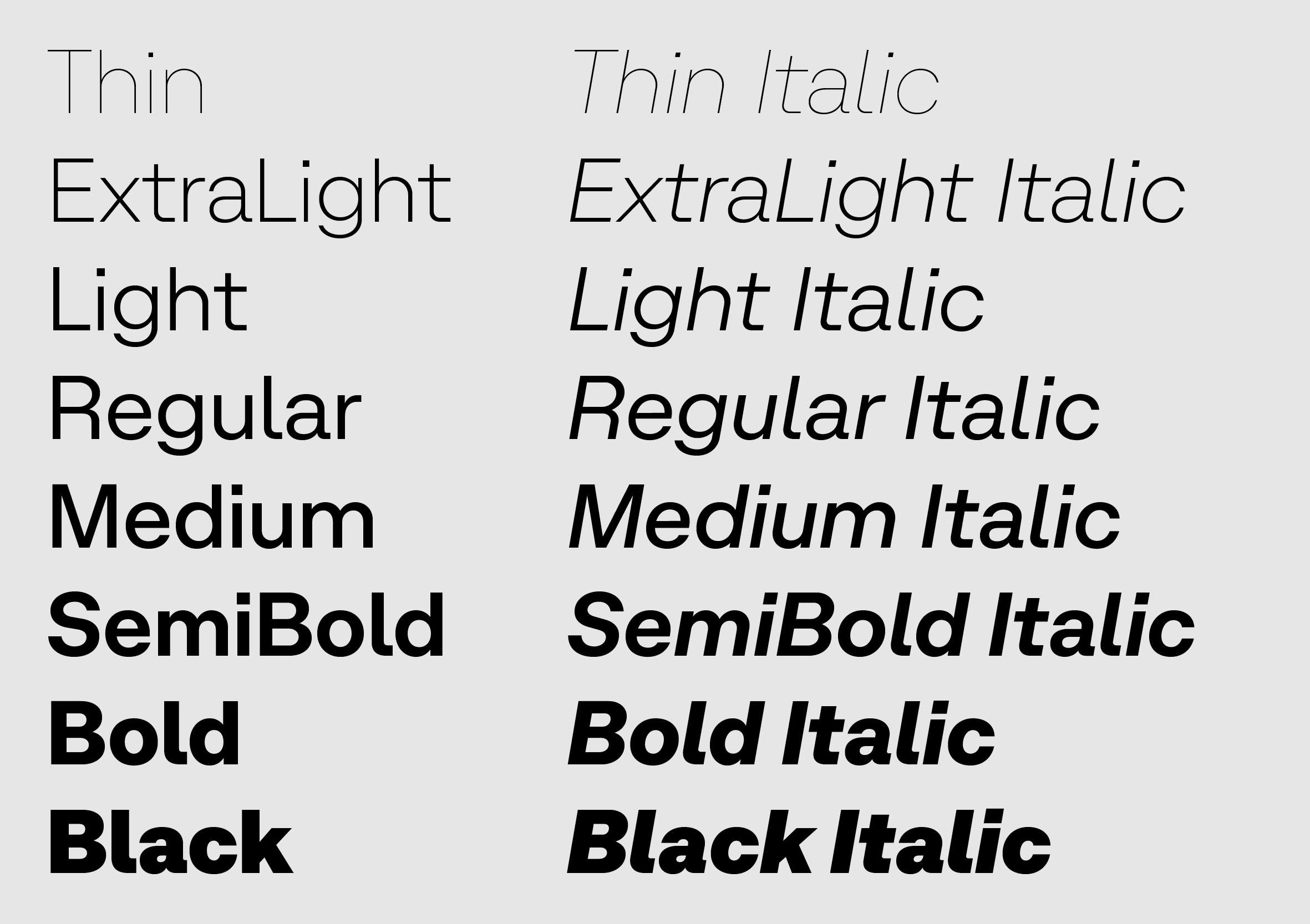
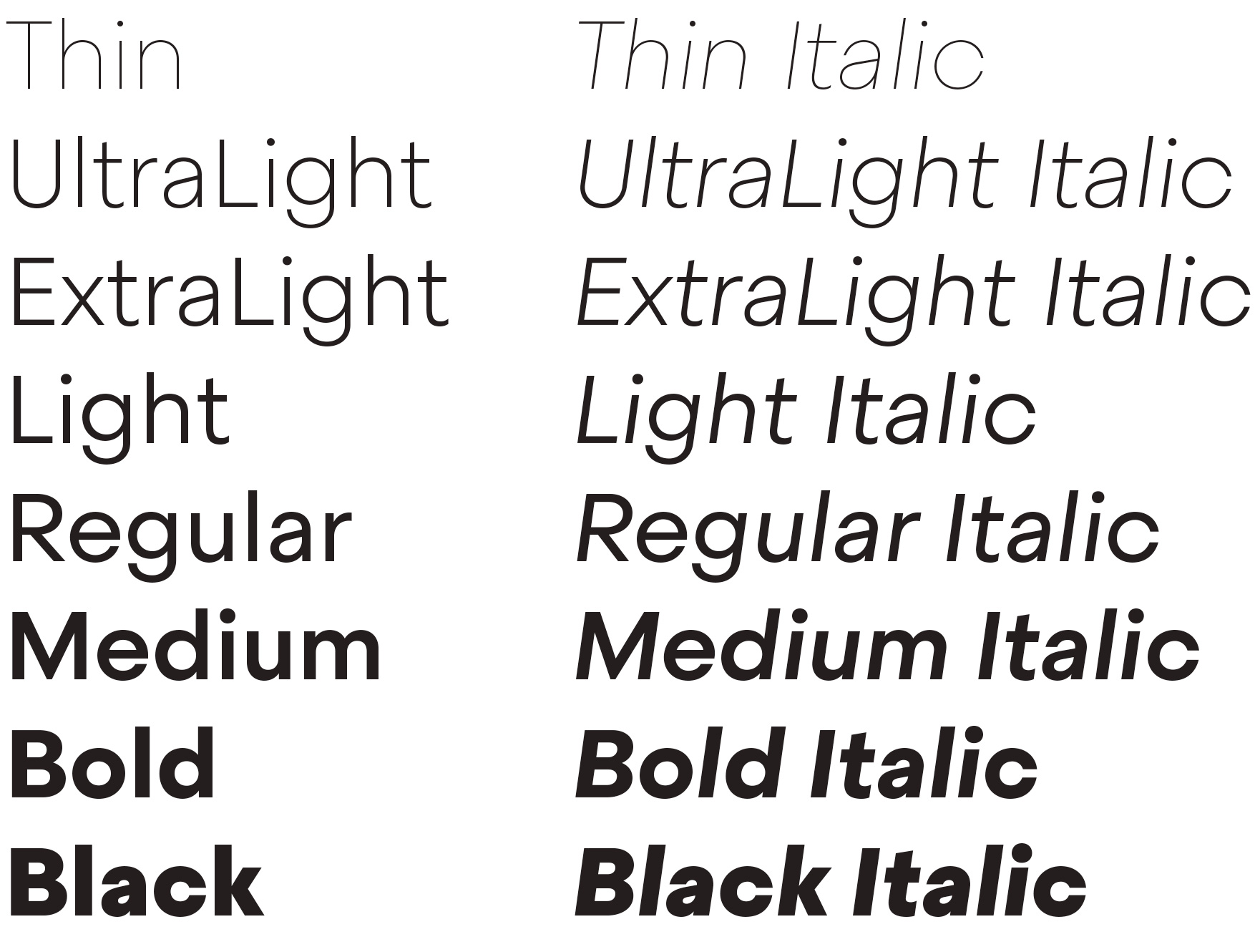
Since the release of the original Geogrotesque, many clients have asked us for a good monospaced font that pairs well with it. Geogrotesque Mono has arrived to answer that need and complement this popular family. It comes in 14 styles: seven weights, plus seven underscored versions. Variable fonts are included with the family or available as separate styles. / em.
View Geogrotesque Mono