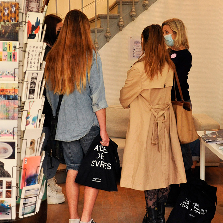
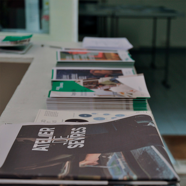
Atelier de Sèvres
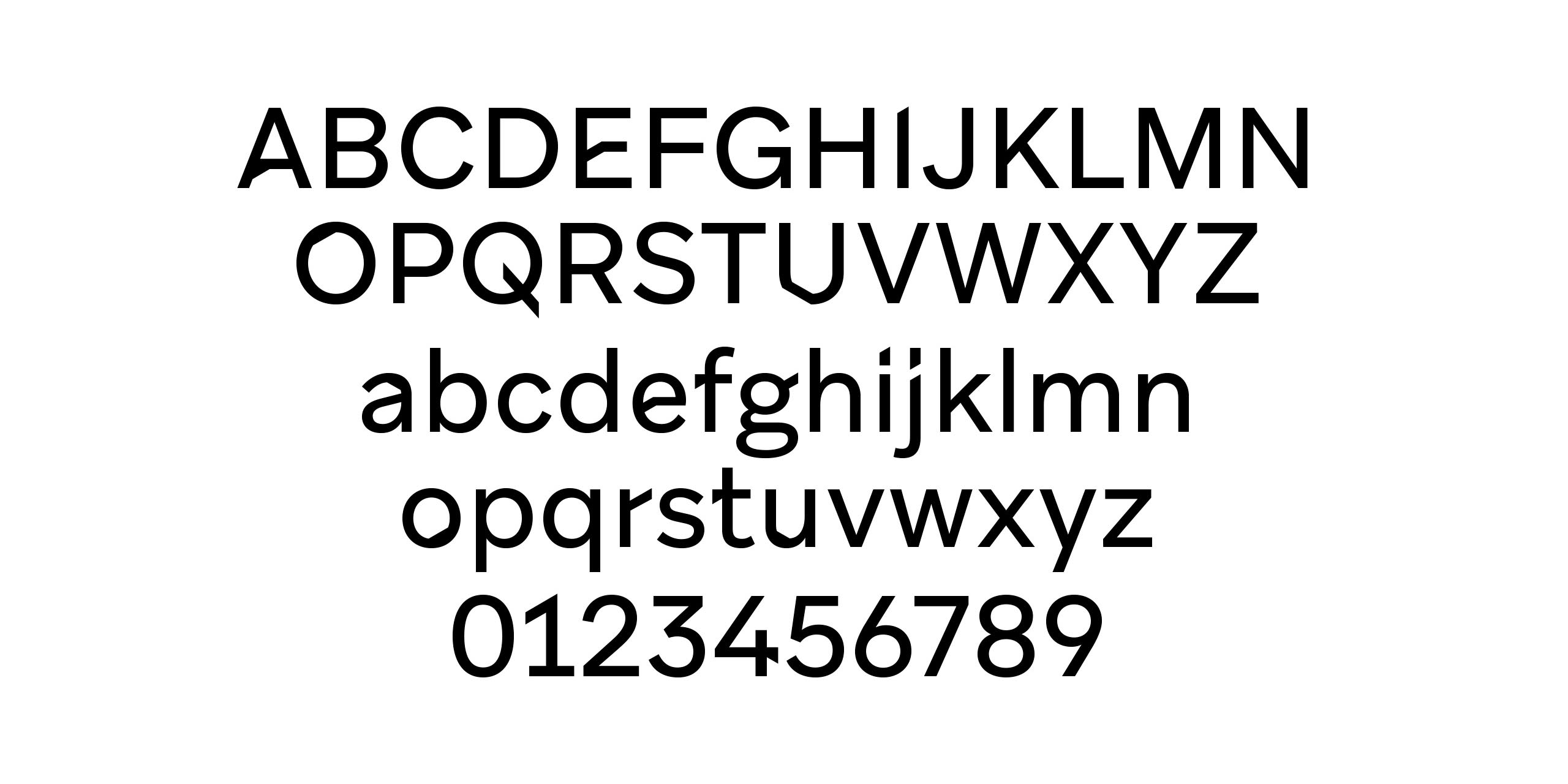
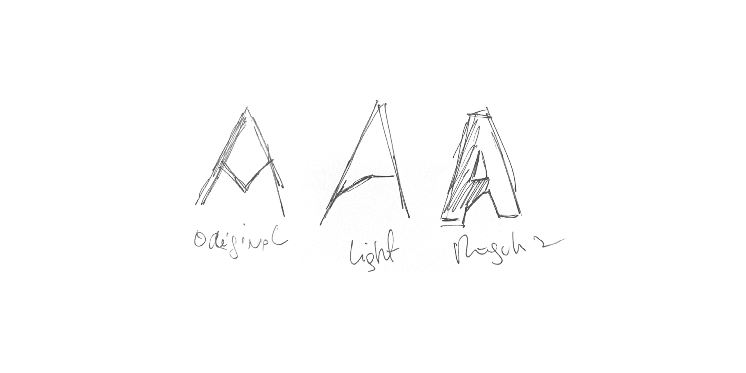
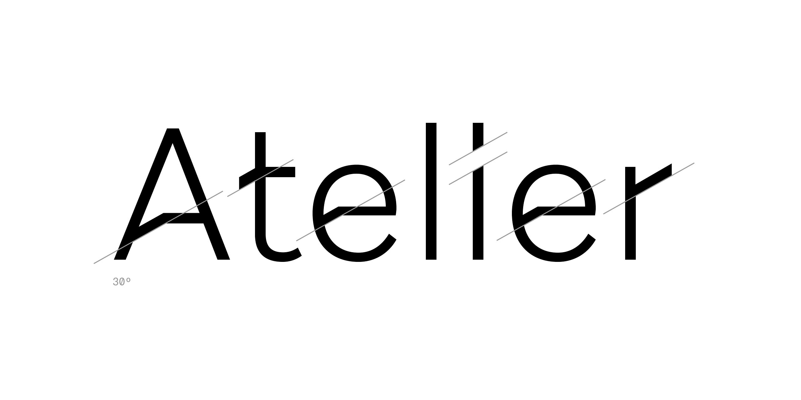
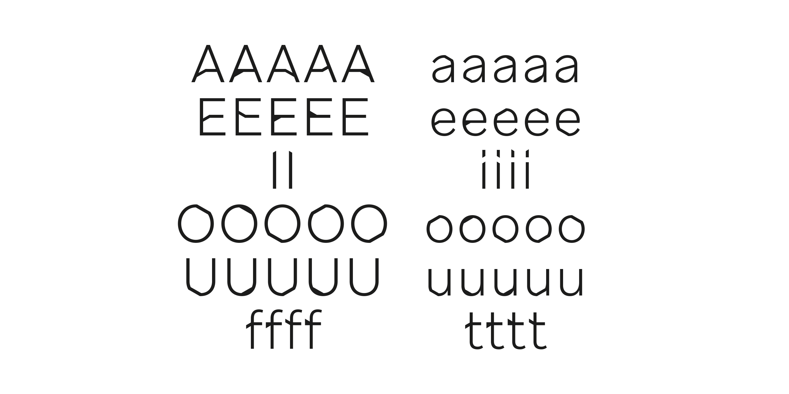
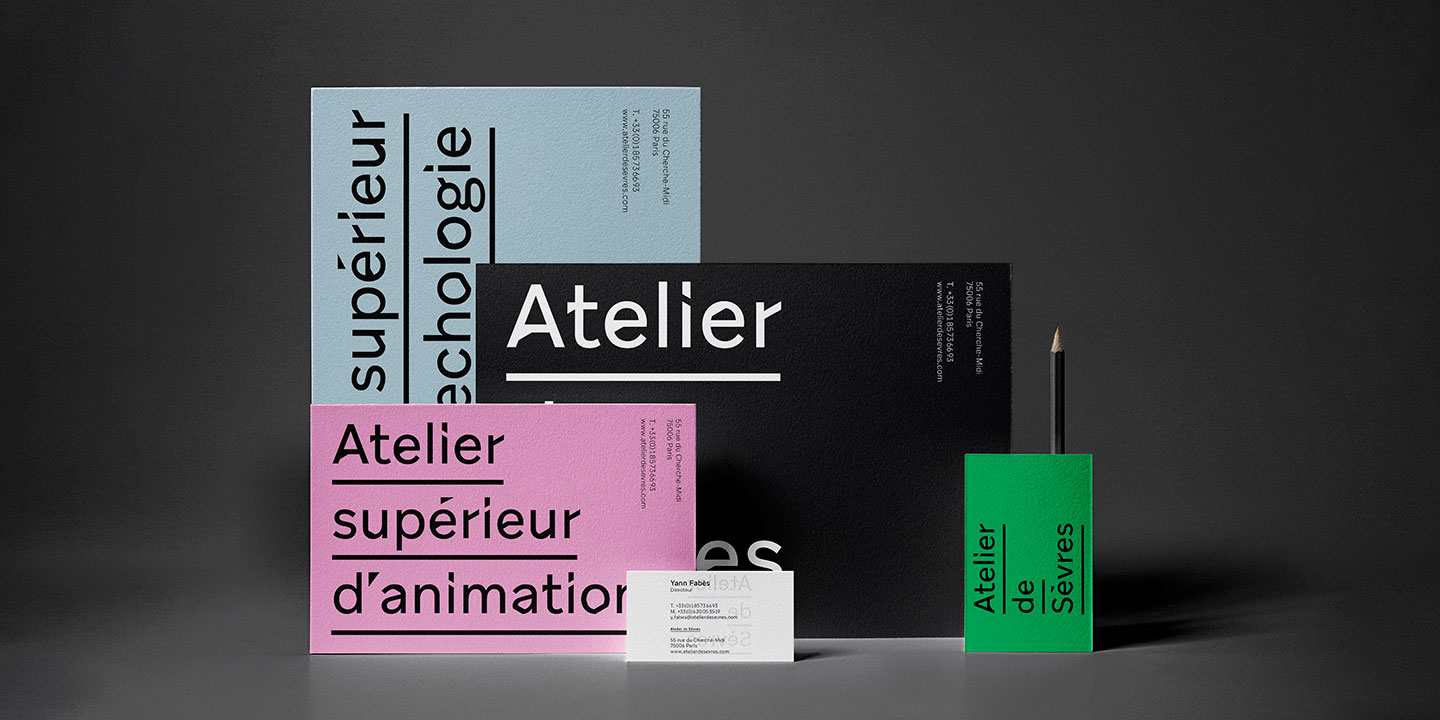
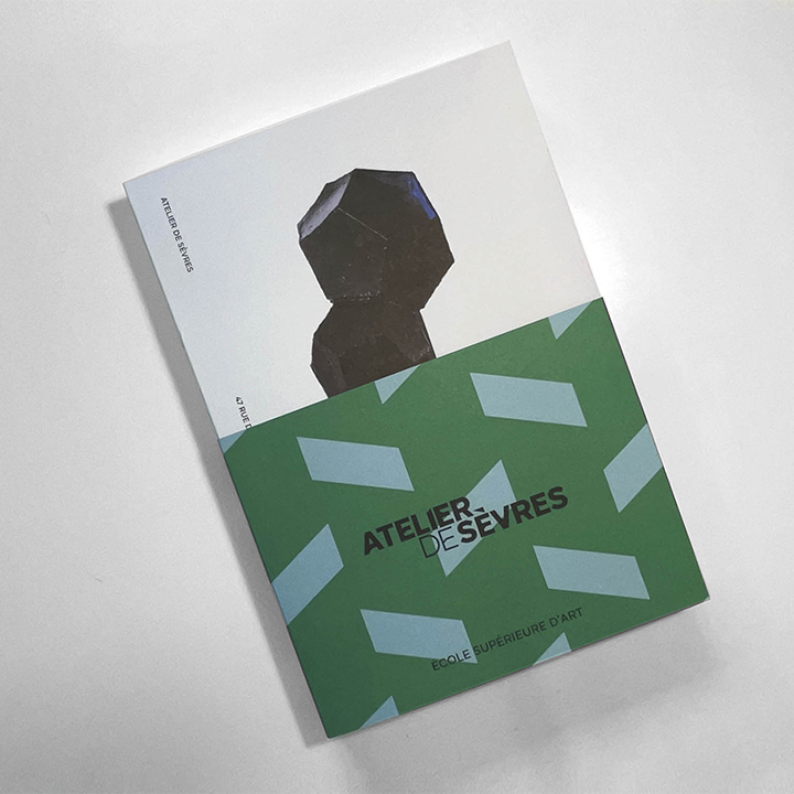
Custom font commissioned by the art director José Palomero from the Atelier de Sèvres, an art school in Paris. The briefing was to apply several changing cuts to the letters to communicate the irregularities and strangeness typical of the fine arts. They wanted to capture and express the surprise and unexpectedness of art through typography. Aribau Grotesk and the “A” from their previous logo were the starting point and gave meaning to the cuts. In addition, using OpenType features, we created a random-like system of alternate characters with several versions of each letter. View Aribau Grotesk.
- More Info
- Atelier de Sèvres