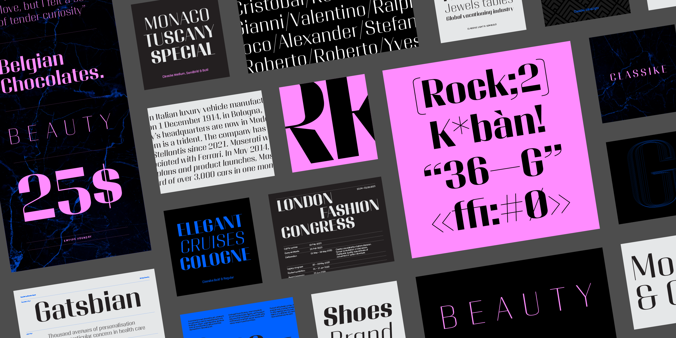
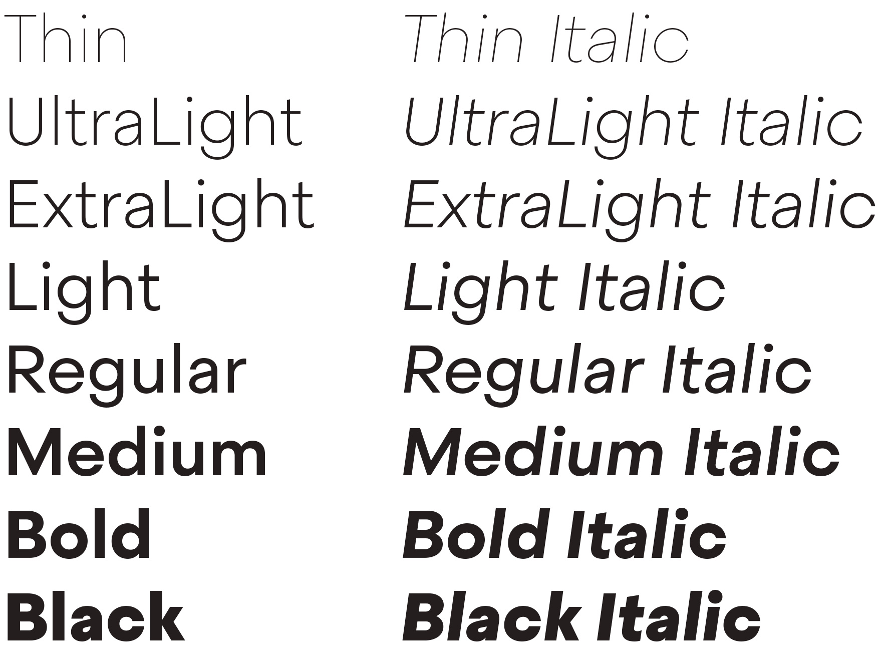
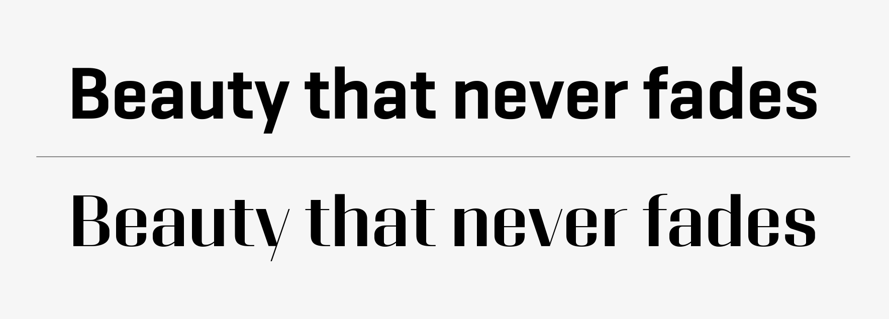
Classike is a high contrast squarish display typeface. Inspired by the Art Déco period from a modern perspective. Refined and elegant yet with a mechanical vibe, it is ideal for pairing with any functional font, it works especially well with Geogrotesque, from which it inherited its proportions and soul. Classike adds an exclusive touch and helps enrich your graphic voice...
Classike is a high contrast squarish display typeface. Inspired by the Art Déco period from a modern perspective. Refined and elegant yet with a mechanical vibe, it is ideal for pairing with any functional font, it works especially well with Geogrotesque, from which it inherited its proportions and soul. Classike adds an exclusive touch and helps enrich your graphic voice.
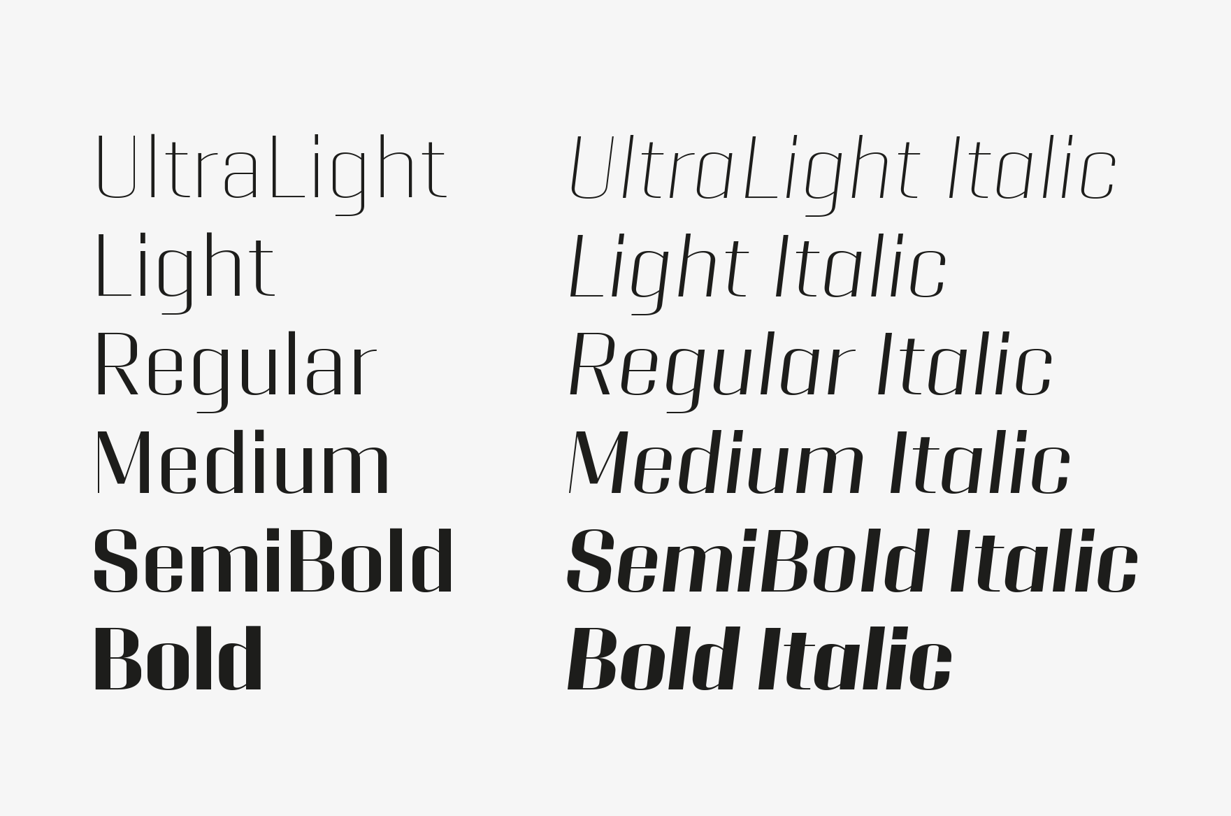
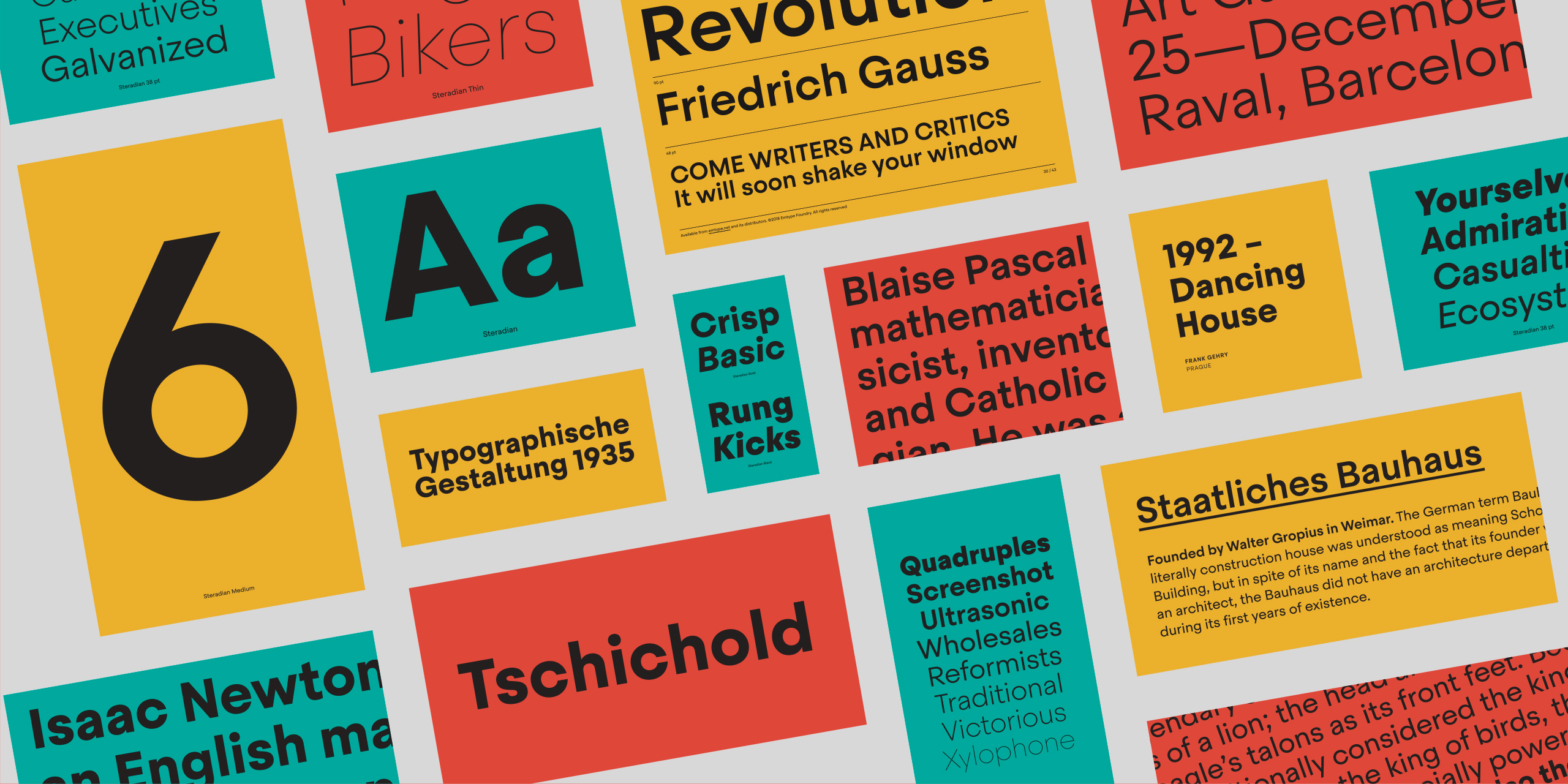
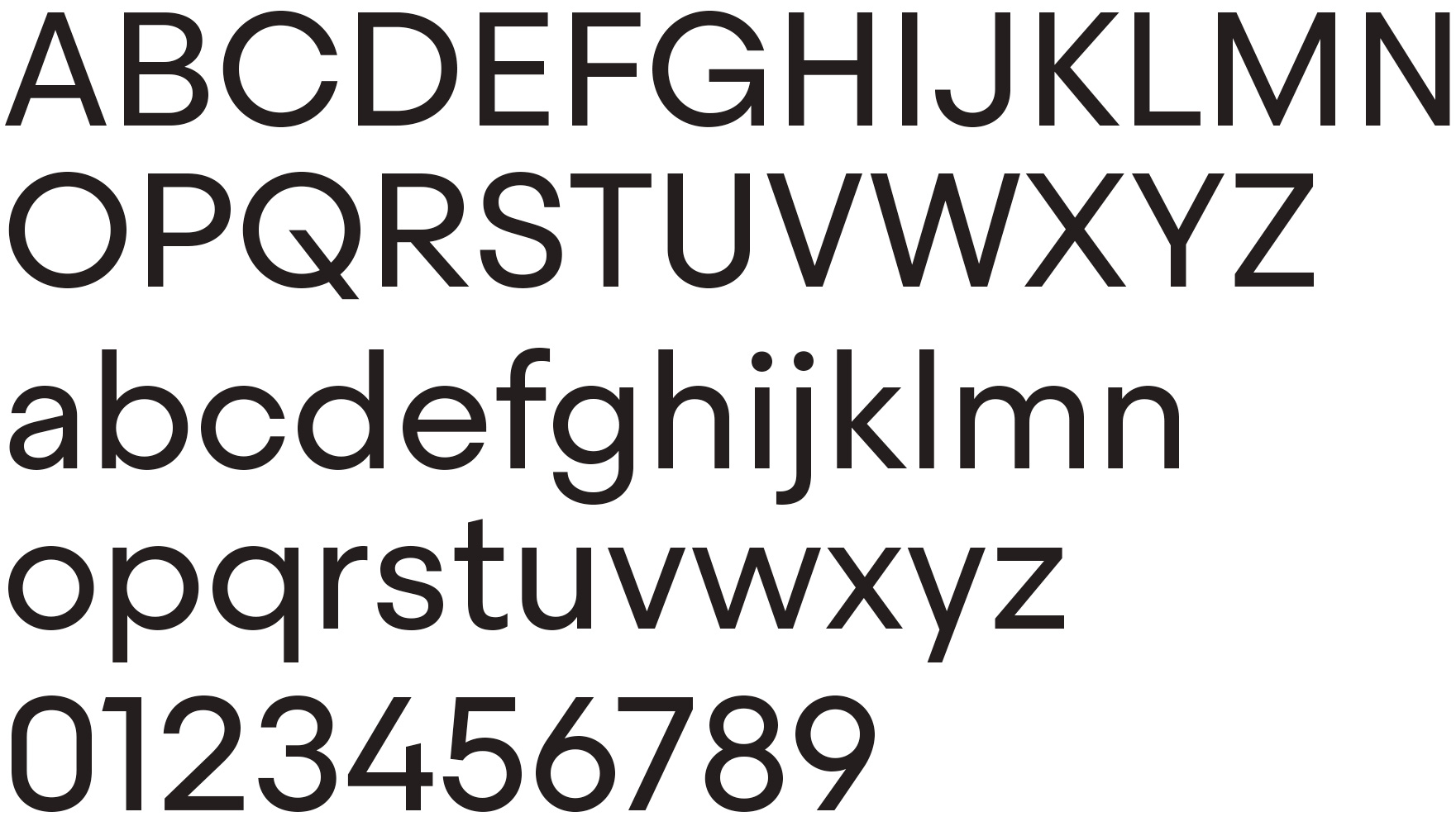
Basic characters of Classike Regular.
Inspiration
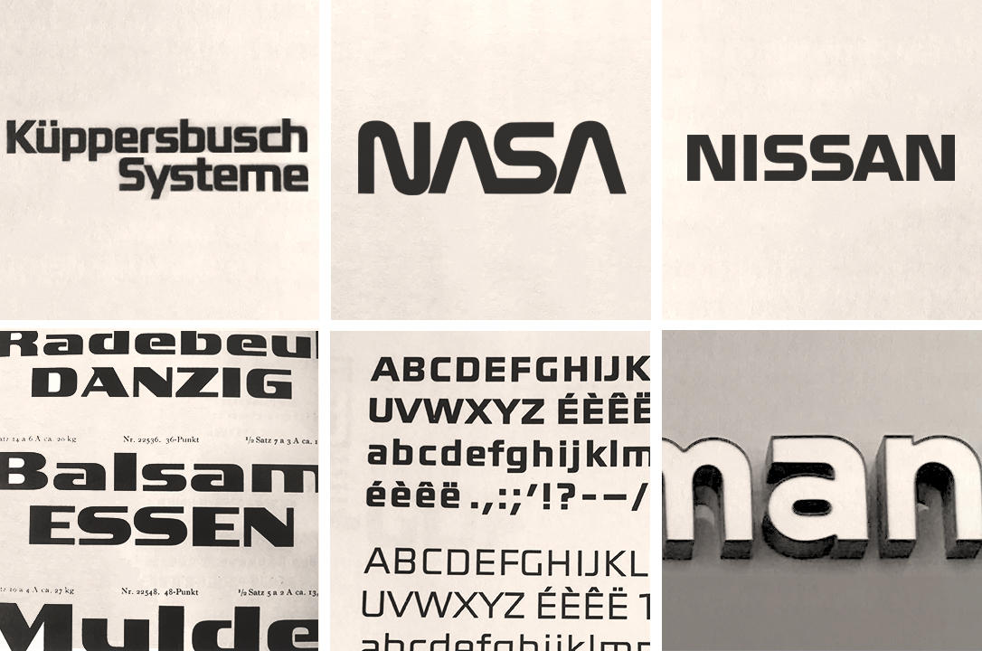
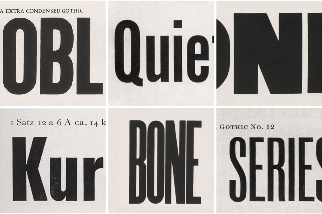
It is inspired by the Art Déco period and street signs typography. While traveling, I noticed that many signs combine squarish sans typefaces with high contrast styles of the same typeface. Those typefaces, sometimes lettering, thanks to the contrast, were more elegant and refined but had the same structure and conceptual essence as the squarish sans.
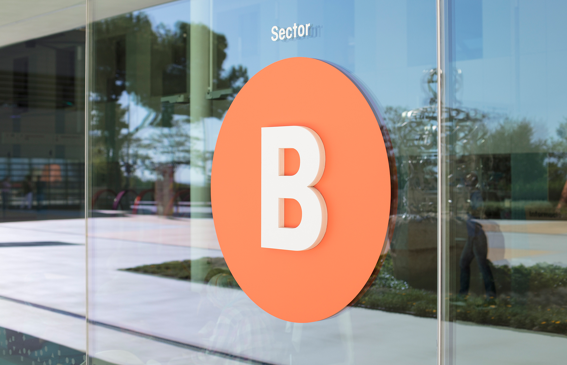
One of the sources of inspiration; a traditional sign in Pugicerdà, Catalunya.
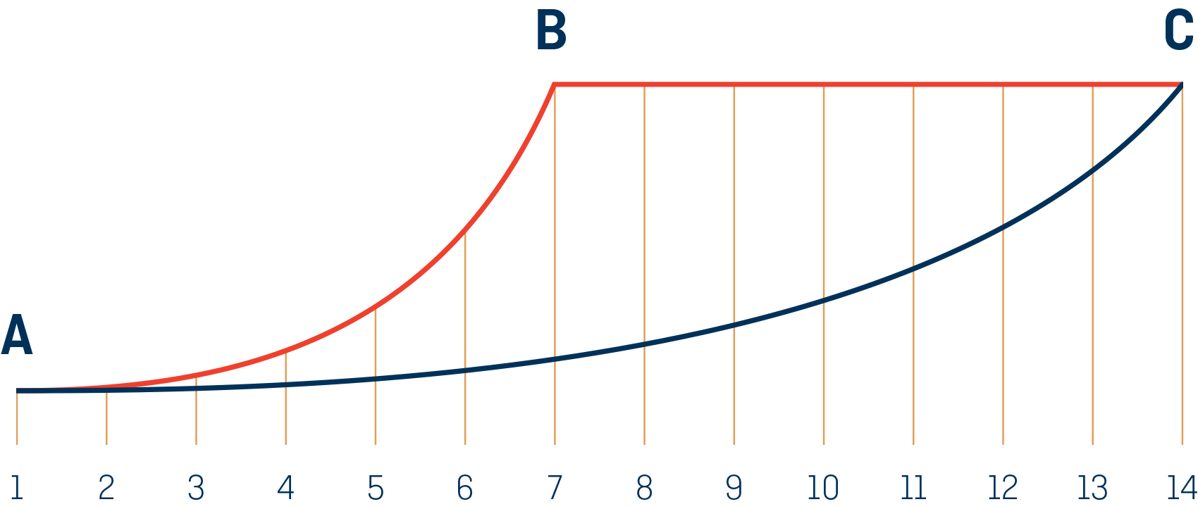
Classike inherits the proportions of Geogrotesque Sharp. I thought it was a solid starting point to create a high contrast sans. In the beginning we did several proofs to see how far we could push the contrast, but we finally opted for a moderate solution to make it usable in a wider range of situations. Despite this, it still looks luxurious and elegant.
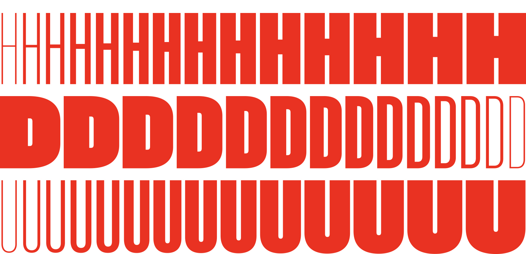
Comparisson between Geogrotesque Sharp and Classike, both in SemiBold.
In the beginning we did several proofs to see how far we could push the contrast, but we finally opted for a moderate solution to make it usable in a wider range of situations.
Details
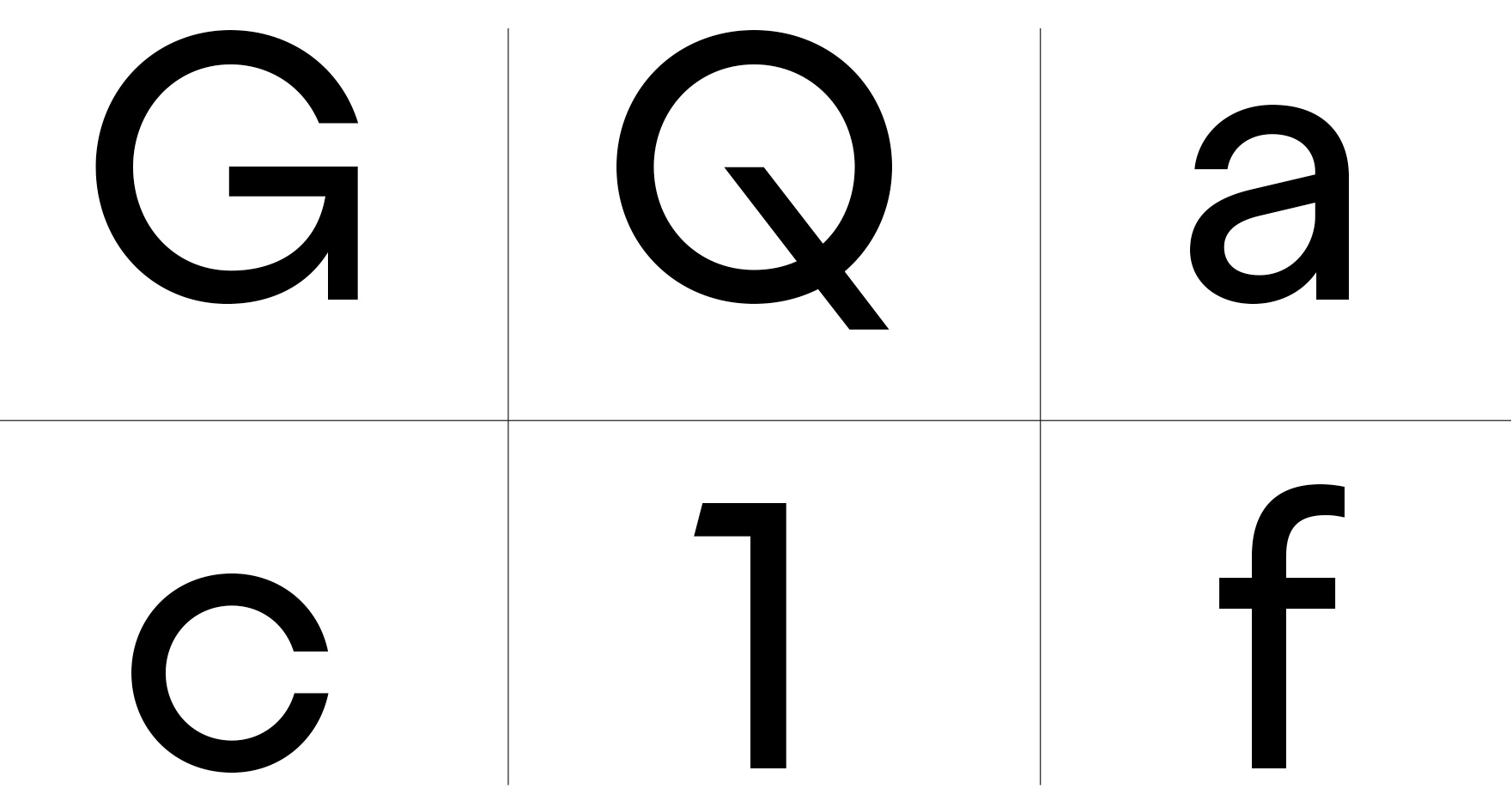
Apart from the high contrast that adds most of the charm, there are less visible details like the middle bar that has been aligned in several letters such as, B, E, F, G, K and H and the numbers 3 and 8. It is reminiscent of the hand painted street signs, where the letter artist would use only a few alignment lines for all letters. These regular proportions emphasised the Art Déco look of the family.
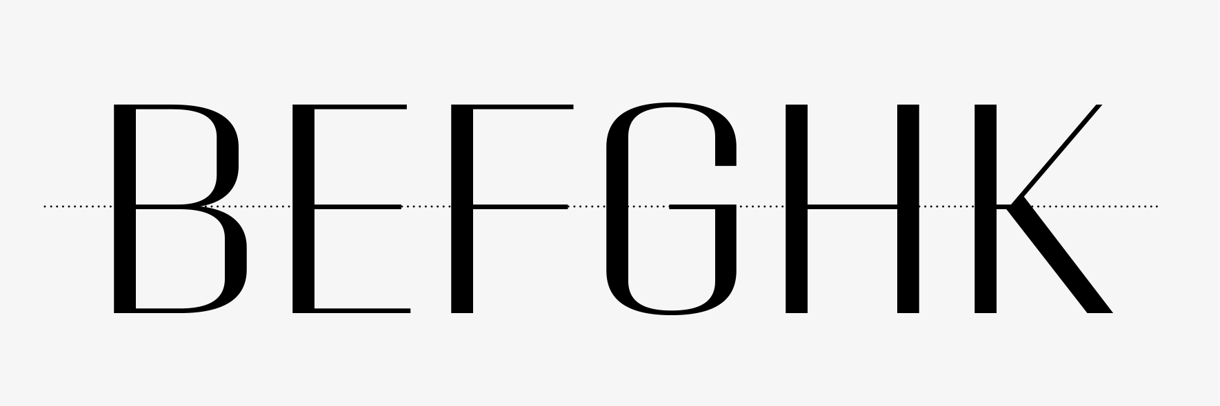
Detail of the middle bar alignment in several letters.
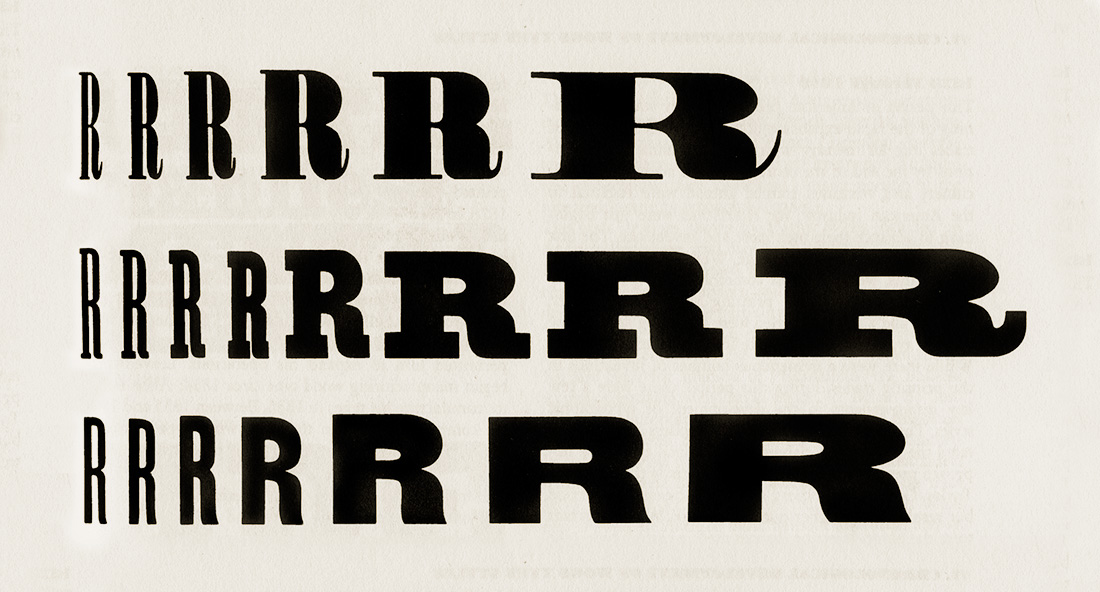
It is common for many alternates to appear during the typeface design process, however, more is not always better. Too many alternates can lead to chaos and confusion for the user. So, the work of the type designer is also about editing, choosing which alternates are really useful and make sense for the project. Classike comes with just two alternates, M and R. Not a lot, evidently, but just enough to expand possibilities without deviating from the concept.

M and R with its alternate versions.
Naming
The naming deserves its own chapter. Nowadays, it’s extremely time-consuming to find a name that meets all the conditioning factors that a good font name needs. Asides from anything else it should be memorable, euphonic and short (for technical reasons). Most importantly, it must express the spirit of the font and show its best face; the name is like a mini specimen and most of the time it is the only touchpoint of your font with potential customers. On top of all this, the key aspect and the most difficult to achieve today is that it must be unused by any other font. With over 200k available fonts and counting (Between commercial and free fonts), it is becoming increasingly harder to do this. A good solution for the overload of names is to use a foundry prefix. I could use EMT for instance, but that would be a shortcut and as I didn’t do this from the beginning, I prefer to continue with the tradition and keep the names clean. This pushes us to find or invent original names that avoid any unfortunate coincidence. That is why Classike is not simply called Classique, in the proper french way.
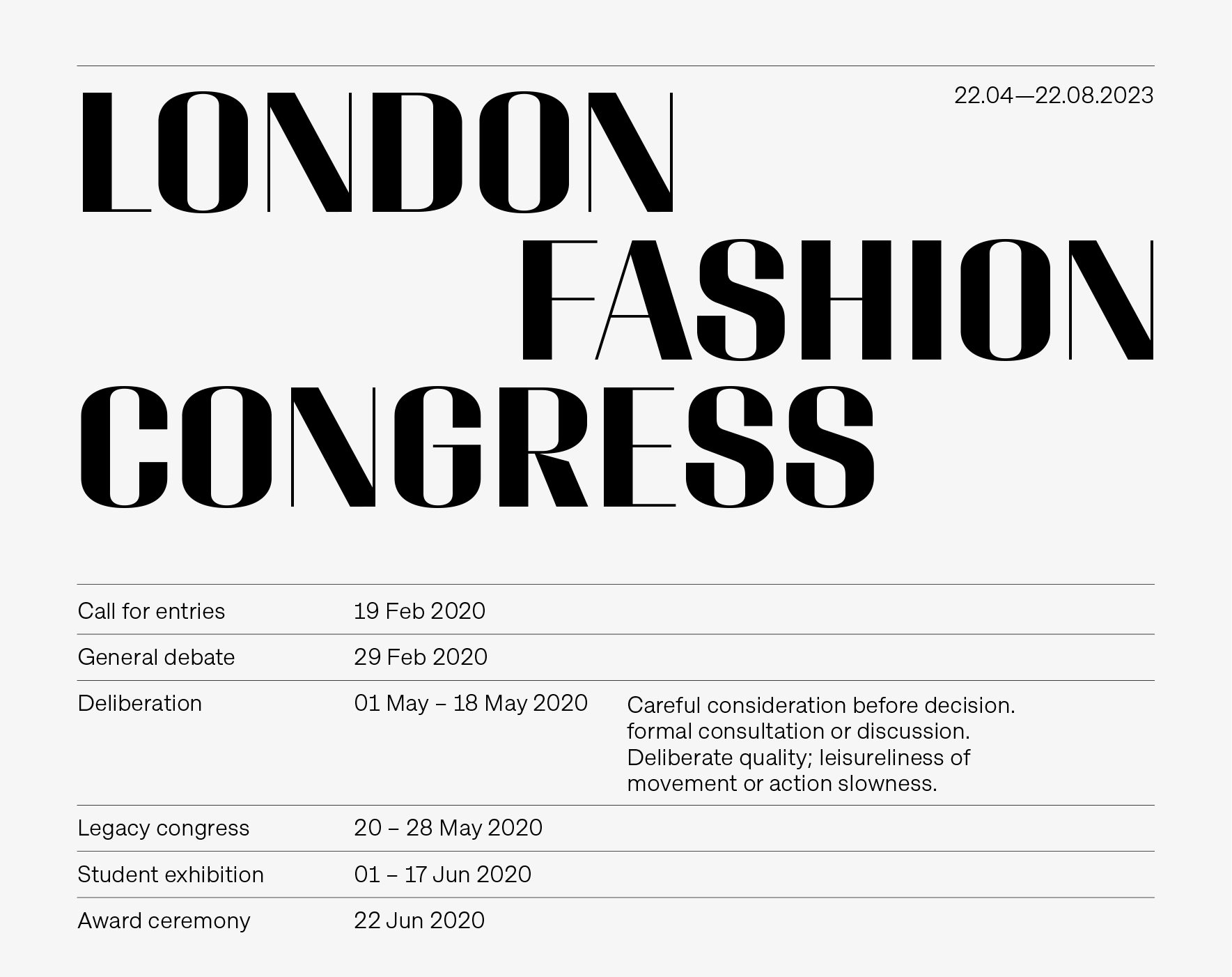
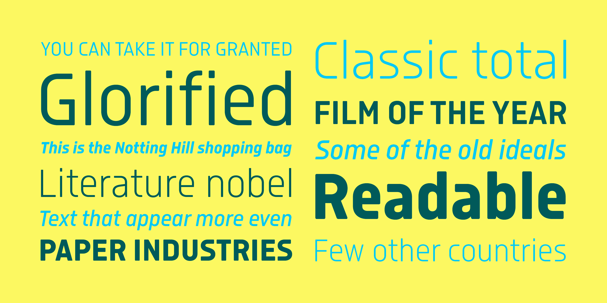
Showcase of Classike working together with Approach.
Usage
Pairing with Geogrotesque is obviously easy due to its origin, but also with any functional sans. Above you can find a combination example with Approach. As a general rule, I design typefaces with a specific use in mind, it could be a very large list or short and specific. In this case, Classike was meant to be used in elegant situations so I wrote down the tentative usage in order to focus on the style. Among others, that list includes: Luxury resorts, lifestyle, heritage, wineries, private spaceships, cruises, Italian cars, classic bikes, cinema magazines, musicals, architecture, credits of mystery movies, perfumes, etc. These lists are useful but not always matched with the real usage of our fonts once published. The family include a Variable Font that adds all the advantages of the format (All in one file, low size, custom styles, etc). Although Variable Fonts are not fully established in the market yet, it is ready and waiting for that moment. In clonclusion, we are really looking forward to see all of your fantastic uses of Classike :)
View Classike