Typography is a key factor in any graphic identity, but when we talk about a journal this takes special relevance. A newspaper is virtually done only with typography, it could be done without pictures, but not without words. A custom typeface gives cohesion to all the elements of an identity and when we use the font, no matter the application, we are strengthening the brand. Periódico (newspaper in spanish), was originally commissioned by Alfredo Triviño for the spanish daily newspaper ABC. Inspired by old spanish typographic engravings, mostly from the second half of the XVIII century, we picked out the most relevant details of spanish typography as the source of inspiration, and instead of making a revival or an interpretation of these models, we started from scratch to create a truly original font family...
Typography is a key factor in any graphic identity, but when we talk about a journal this takes special relevance. A newspaper is virtually done only with typography, it could be done without pictures, but not without words. A custom typeface gives cohesion to all the elements of an identity and when we use the font, no matter the application, we are strengthening the brand. Periódico (newspaper in spanish), was originally commissioned by Alfredo Triviño for the spanish daily newspaper ABC. Inspired by old spanish typographic engravings, mostly from the second half of the XVIII century, we picked out the most relevant details of spanish typography as the source of inspiration, and instead of making a revival or an interpretation of these models, we started from scratch to create a truly original font family.
The goal was to achieve a very distinctive family, functional and versatile while still reminiscent of the old spanish typography. Before starting to draw, we began to thoroughly investigate what is understood by the term ‘Spanish typography’. At the very first stages of the design process, we came up with a classic semi-condensed serif. It was elegant but not very distinctive. It was mandatory to push up the envelope a little bit, to step back from the fonts used in rest of the spanish newspapers.
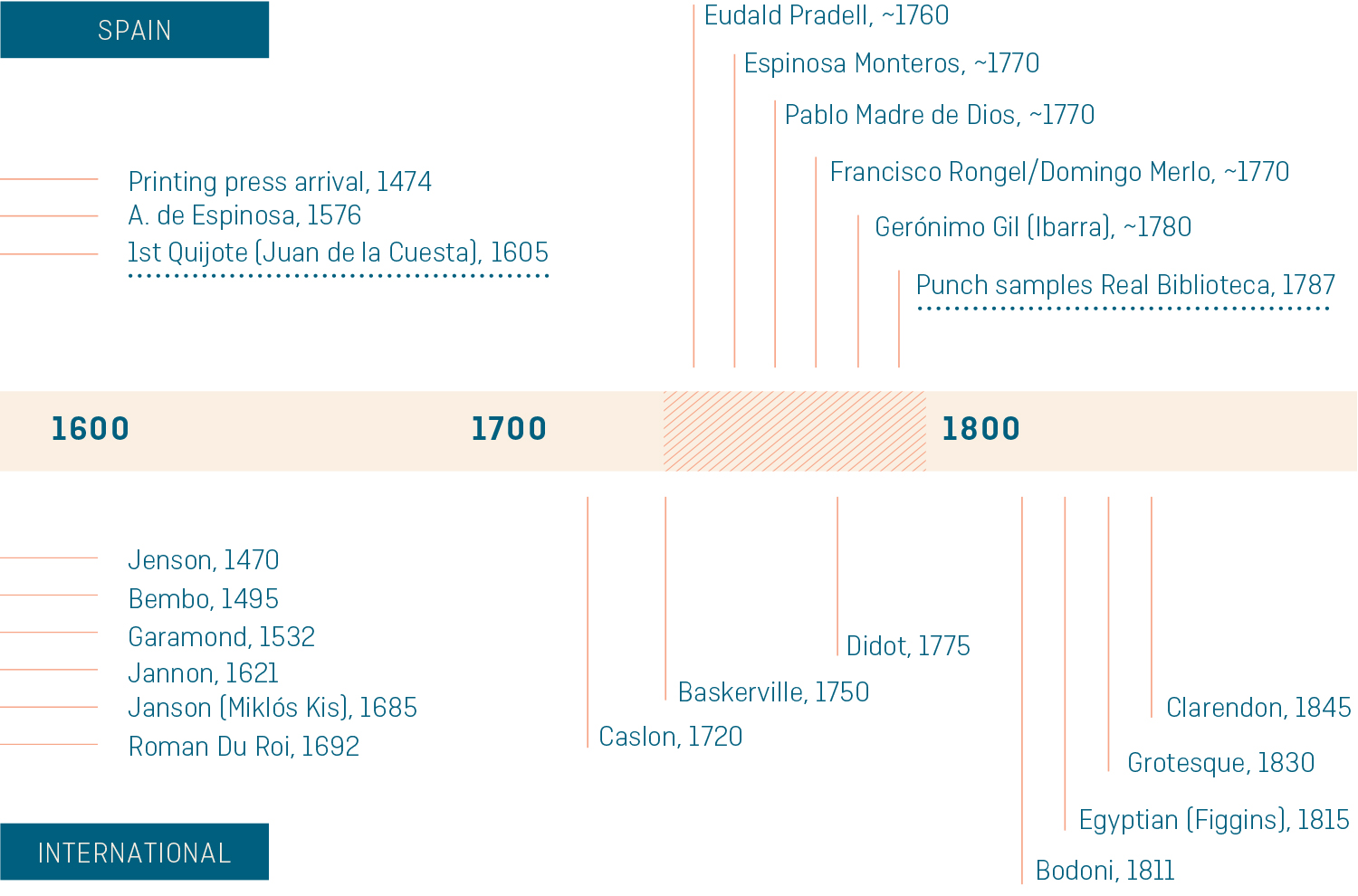
The timeline above shows the most relevant events in typography history, comparing the activity between Spain and the rest of the world. It starts before 1500 and ends in mid 18th century, and the main period for the spanish typography was the second half of the XVIII century. Before and after that moment the type-related events in Spain were sparse.
There were specific needs to meet, so we took a more daring and bespoke approach. Trying to design a refined yet differential typeface, modern and contemporary but keeping a link with the Spanish typographic past. With that idea in mind, the proportions, the contrast, and the serifs were changed to create a genuine newspaper-ready font, evolving and updating the shapes from the past without copying them literally.

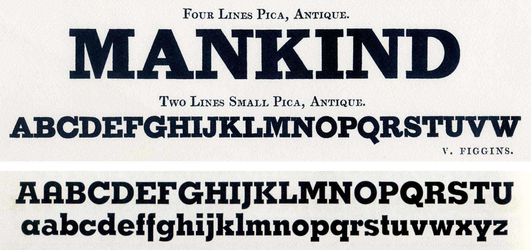
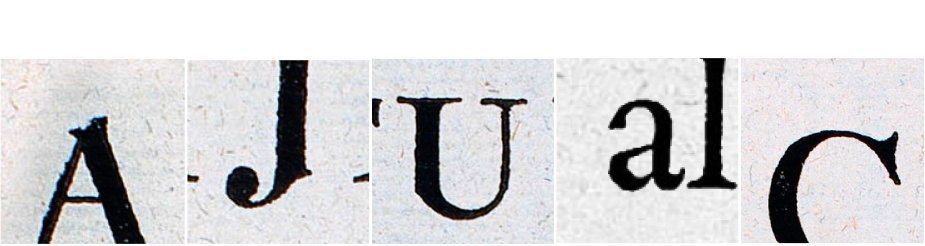
The first and the third image are taken from “Muestras de los punzones y matrices de la letra que se funde en el obrador de la Imprenta Real”. Madrid: Imprenta Real, 1799. The center image is from “Carácteres de la Imprenta Real en 1788”. Madrid: Imprenta Real, 1788.
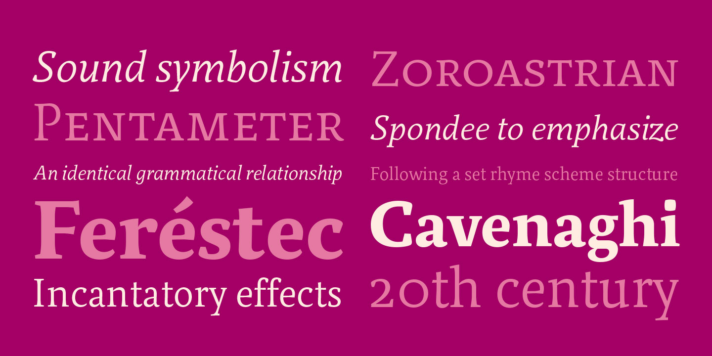
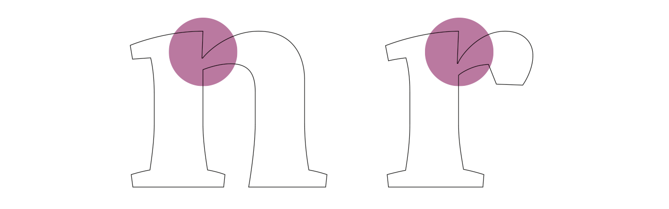
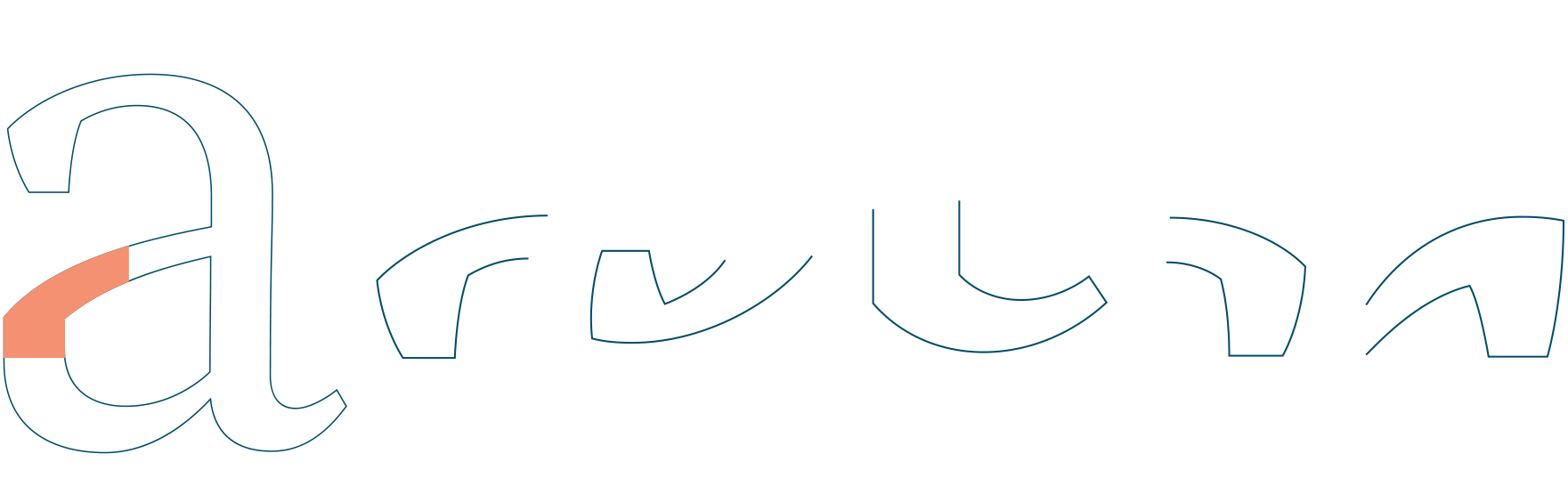
As a result, the letters ‘a’ and ‘g’ are probably the most distinctive of the Periódico family. The shape of the bowl in the letter ‘a’ with the top arch in a diagonal position is very characteristic of old spanish types. In Periódico we emphasize this detail by applying it to many other letters (like ‘u’, ‘j’ and ‘t’) up to a point that it became the ‘leitmotiv’ of this family.
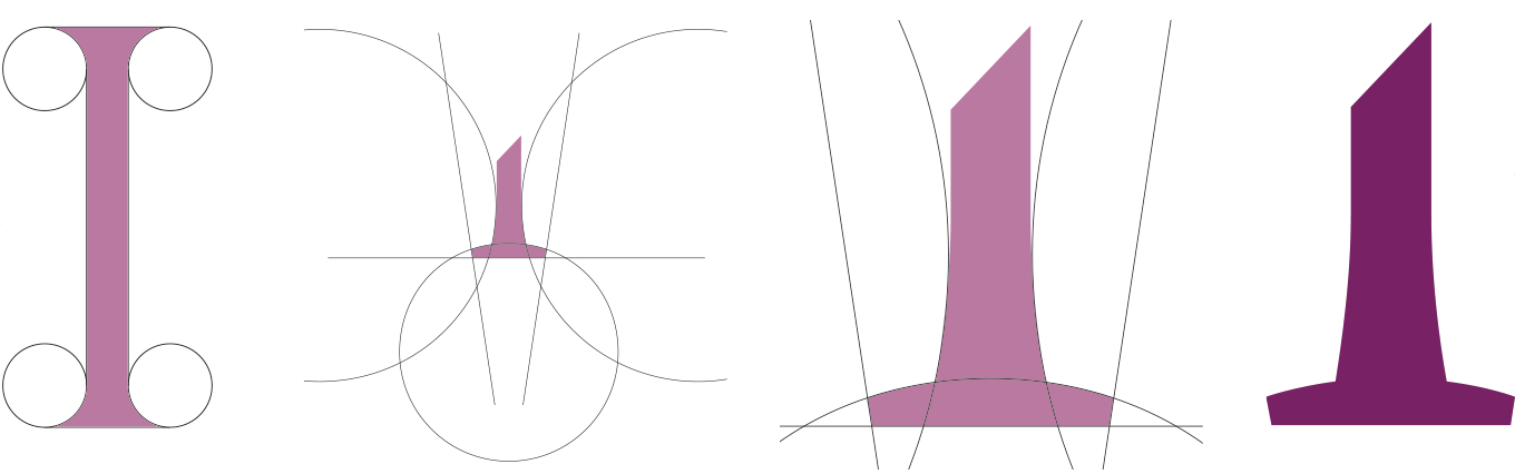
Selection of formal principles from historical references. All these design details define the system and give cohesion.
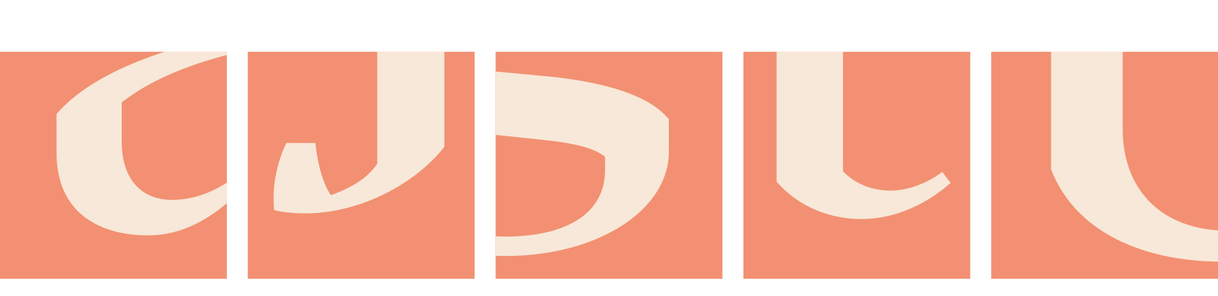
Although we have borrowed many details from the old spanish typography, (like the nail, present in the letters ‘U’ ‘G’ or ‘J’, which we worked on and evolved in order to be applied to other letters) we have also left behind several others. One example is the tilde of the ‘ñ’ engraved by Gerónimo Gil, a very distinctive element of spanish typography that was intentionally omitted for being to atypical for use in a contemporary font.
The goal was to achieve a very distinctive family, functional and versatile while still reminiscent of the old spanish typography.
The formal finish of serifs and terminals is something that gives great personality to any typeface, so we came up with plenty of alternatives in order to find the exact shape we wanted; sober, elegant and contemporary. Even though the serifs are geometric, the upper terminals have a curve with very similar dynamics to the arch in the ‘a’ or the notch in the ‘j’ The terminals in the capitals follow the same style but in this case the inspiration comes from Pradell's Missal, which on the other hand has been influenced by the types engraved by Johann Michael Fleischman in the Netherlands.
A preliminary poster version for really large sizes. Finally this weight was not developed because its use would be very restricted.
Eighteenth-century types were mostly used for printing books and so they have very generous proportions (large ascendents and descendants) and high contrast, but today these characteristics do not work well in newspapers as the news world demands more space-saving fonts. The adaptation of the type's proportions for newspaper use was one of the most interesting parts of the project, specially the time taken to find the perfect balance between the x height and legibility.
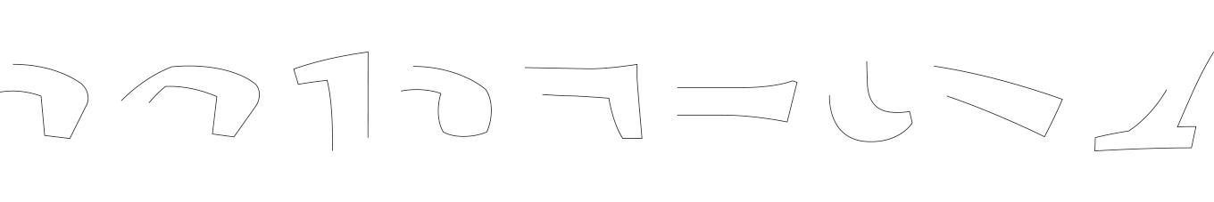
Formal principle that guides the design, to create a palette of repeating shapes that are interrelated. The idea was to create a formal system that could be transferred to each element of the font.
Directly derived from the ‘a’, this corner is present in different parts of several letters, giving Spanish flavor to the whole thing.
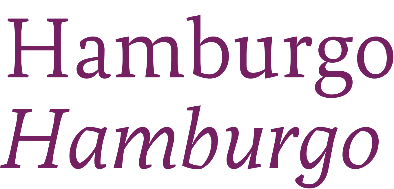
Comparison between Periódico Text and Periódico Display. The display version is slightly different, it has more contrast and a tighter spacing.
Regarding the styles, one might argue that as so many variables are needed this gives many more choices to the designers, giving them more tools to do their job well. It's a matter of probabilities so we create a really complete typographic palette to choose from. For that reason, Periódico is presented in 30 different styles, 10 fonts for text (from Light to Bold) and 20 fonts for display sizes (from Thin to Ultra Black); this family results in an extensive system capable of solving all the needs of a large publication.
View Periódico