


Geogrotesque is a sans serif typeface family created in 2008. It has since grown to become a classic of the square genre. Coming up with a version of Geogrotesque is always a challenge, and making a slab is no exception as the structure of the letters need to be substantially modified. When creating a slab or serif version from a sans, the challenge is to achieve a fully recognizable font that works as part of the existing family. We wanted the font to be credible and not to become a caricature of itself. The font had to communicate the essence of Geogrotesque, to be perceived as an extension that would add new attributes without removing or overlapping the existing ones. In short, the key was to expand the visual vocabulary to convey the same message in a different way.

Comparison between the original Geogrotesque and the new Slab.
The slab process does not simply involve adding serifs. When you incorporate serifs the visual width of each letter changes, some letters become wider, others narrower. All the relationships change and therefore one must try to compensate for this. For example: the H is wider than the O, a problem that has various solutions (to try a narrower H, or a wider O, for instance). As Geogrotesque is already a subtly condensed typeface, we decided to widen the O in order to preserve the general visual proportions.

Details of the serif height variations and the redraw curves on some letters.
The Slab genre, arguably has the loudest voice. Also known as Egyptian, fonts like this have some quirks that make their design particularly intricate. Although these kind of geometric slabs usually have minimal variation in stroke width (with a similar contrast to the sans typefaces), they also have a very heavy serif (thick, block-like serif). The combination of these factors leaves limited space as the letters gain weight, therefore countless ink traps and optical corrections are required.
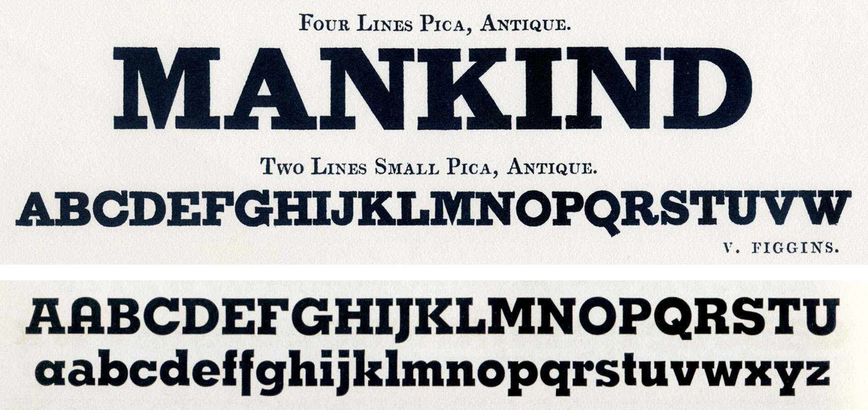
The first image is Antique, taken from Vincent Figgins Type Specimens 1801 and 1815 (Facsimile). London: Printing Historical Society, 1967. The image below shows Memphis from Specimen Book of Linotype Faces. Brooklyn, NY: Mergenthaler Linotype, 1939.
In addition to the serifs, the terminals are another distinctive element. Deciding where to put the terminals has been no easy task. What looks good in one letter can be totally dissonant in another or could considerably change the texture of the text. As a reference we used historical classics like Antique, possibly the first geometric slab typeface with low contrast, and Memphis. We have employed a flexible and pragmatic approach, without ever losing sight of the objective to recognize Geogrotesque in the final outcome.
When creating a slab or serif version from a sans, the challenge is to achieve a fully recognizable font that works as part of the existing family.
Geogrotesque Slab transmits the same attributes as the sans version. The new font remains clean and tech with a human touch yet provides a new security, confidence and firmness. Nevertheless, it maintains its closeness without getting too serious or solemn. The result is a multipurpose family especially suitable for magazines, brochures, branding and any intermediate length text. Above all, Geogrotesque Slab is the ideal companion of the original Geogrotesque.

A sample of the subtly different personalities of both Geogrotesque.
The type family consist of 14 styles 7 weights (Thin, UltraLight, Light, Regular, Medium, SemiBold and Bold) plus italics. It is available for desktop and WebFont and includes ligatures, tabular figures, fractions, numerators, denominators, superiors and inferiors with support for Central and Eastern European languages.