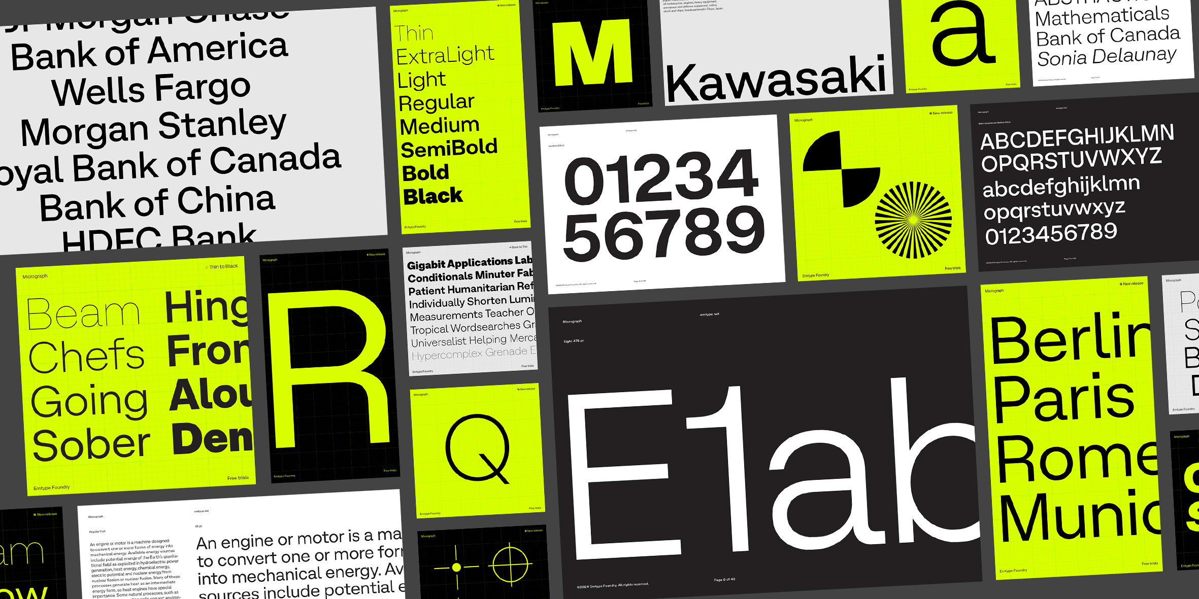
Micrograph is a sans serif that navigates the line between classic and modern, ensuring its relevance and appeal will endure into the future. It has a subtle personality that sets it apart without compromising legibility. The spacing is tight, and its vertical proportions are compact with very short descenders. In the lighter weights, it features prominent punctuation that normalizes as the weight increases. With a clean and mechanical aesthetic, Micrograph offers great versatility across all media...
Micrograph is a sans serif that navigates the line between classic and modern, ensuring its relevance and appeal will endure into the future. It has a subtle personality that sets it apart without compromising legibility. The spacing is tight, and its vertical proportions are compact with very short descenders. In the lighter weights, it features prominent punctuation that normalizes as the weight increases. With a clean and mechanical aesthetic, Micrograph offers great versatility across all media.
Clean and mechanical aesthetic.
With an eye on classic typefaces, it aims to reinterpret that tradition through a contemporary and forward-looking perspective. The initial sketches date back to early 2022. The design went through several stages; initially, it had a stronger and more defined personality, but over time, it evolved into a more moderate and conservative character, which also made Micrograph more elegant, versatile, and timeless.
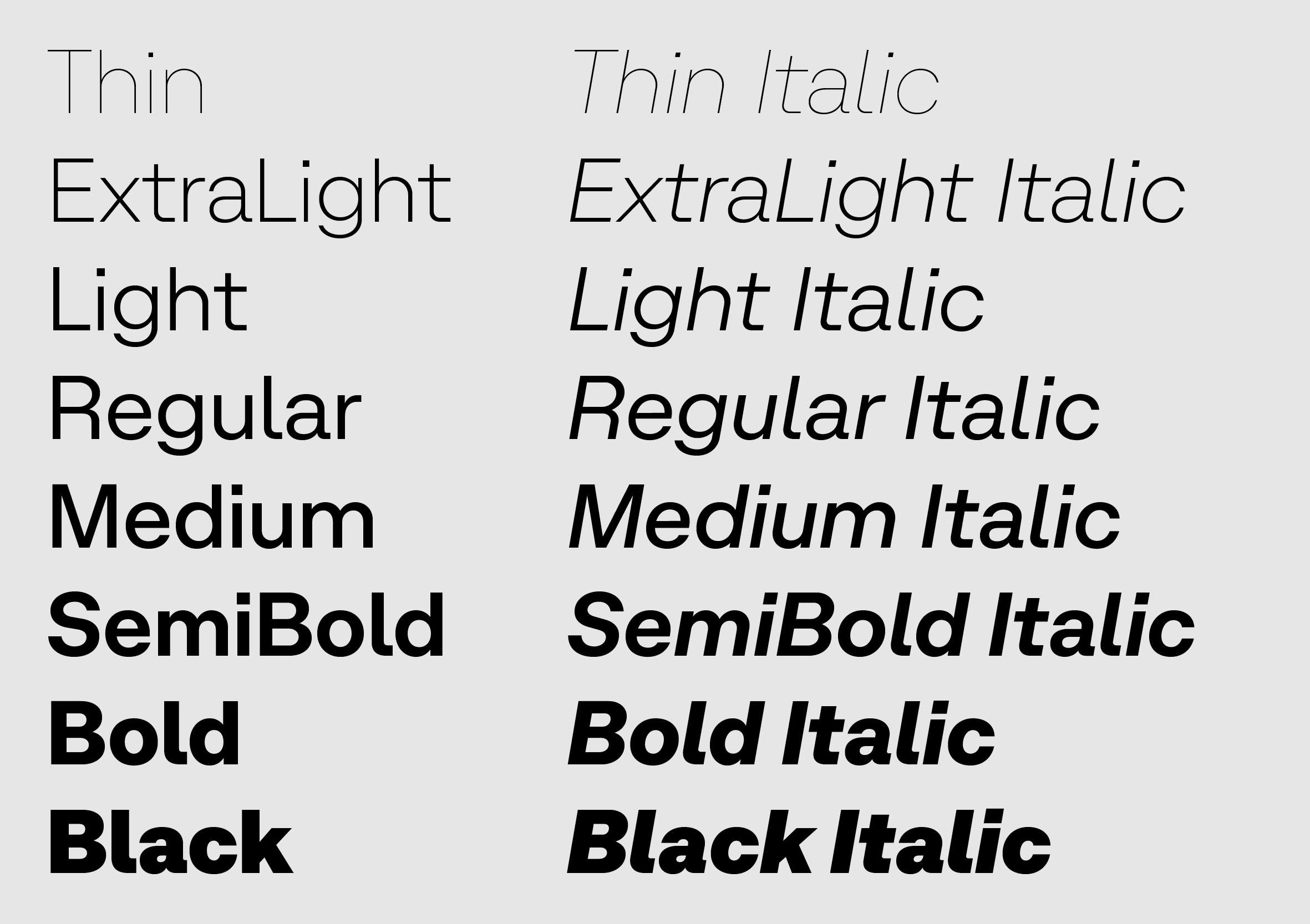
The family consists of 18 styles: 8 weights with matching italics and 2 variable fonts.
In this sense, the question is why choose a moderate personality over one full of character, with distinctive or trendy elements here and there. Trends are very tempting, but they also have an expiration date. Just as they start, they end, and what is trendy today will not be in the future. One of Micrograph’s purposes is to endure and be a useful tool for designers. On the other hand, trends with highly distinctive elements tend to have the opposite effect: they homogenize all typefaces, because those details are the first things that catch the eye. This is why Micrograph has a subtle yet identifiable personality.
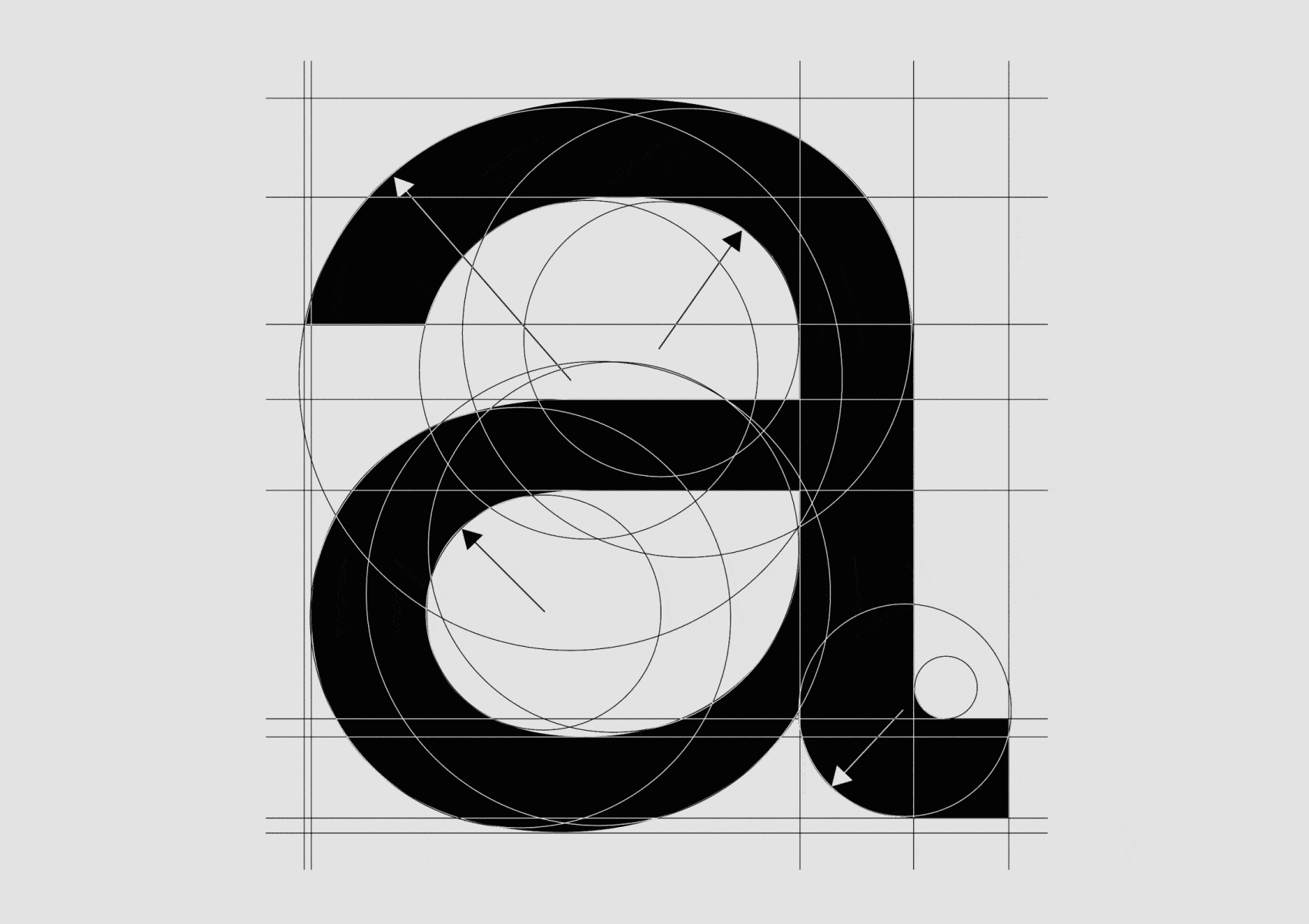
Some characteristic details contribute to its unique identity, such as the subtle "overbite" of the apertures.
Micrograph is a sans serif that navigates the line between classic and modern, ensuring its relevance and appeal will endure into the future.
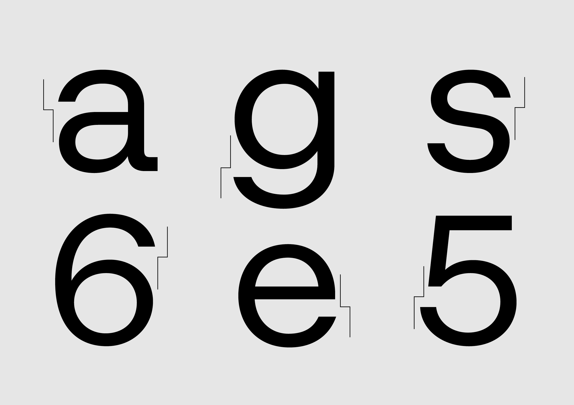
It is a sans serif that draws influences from multiple typographic styles. You could say it's an amalgamation of styles, or we could describe it as a neo-grotesque that incorporates details from many other typographic styles. To mention a few, it is vaguely inspired by Gothic No. 8 in the mechanical curves of the "f," "t," "r," and "y," which are also present in the "l", like in the Edward Johnston’s humanist typeface. In a way, the figures follow a traditional neo-grotesque construction, similar to that of Neue Haas Grotesk, Unica, and other classics. The tail of the "Q" has a spiky ending, more characteristic of the geometric style, as seen in Sol Hess's Twentieth Century typeface. In summary, it doesn't follow any specific model; however, it takes inspiration from many sources to create something original, yet familiar and useful. Upon close examination, as its name suggests, Micrograph reveals characteristic details like the subtle displacement of its apertures, adding a bit of tension and interest to headlines and larger sizes.
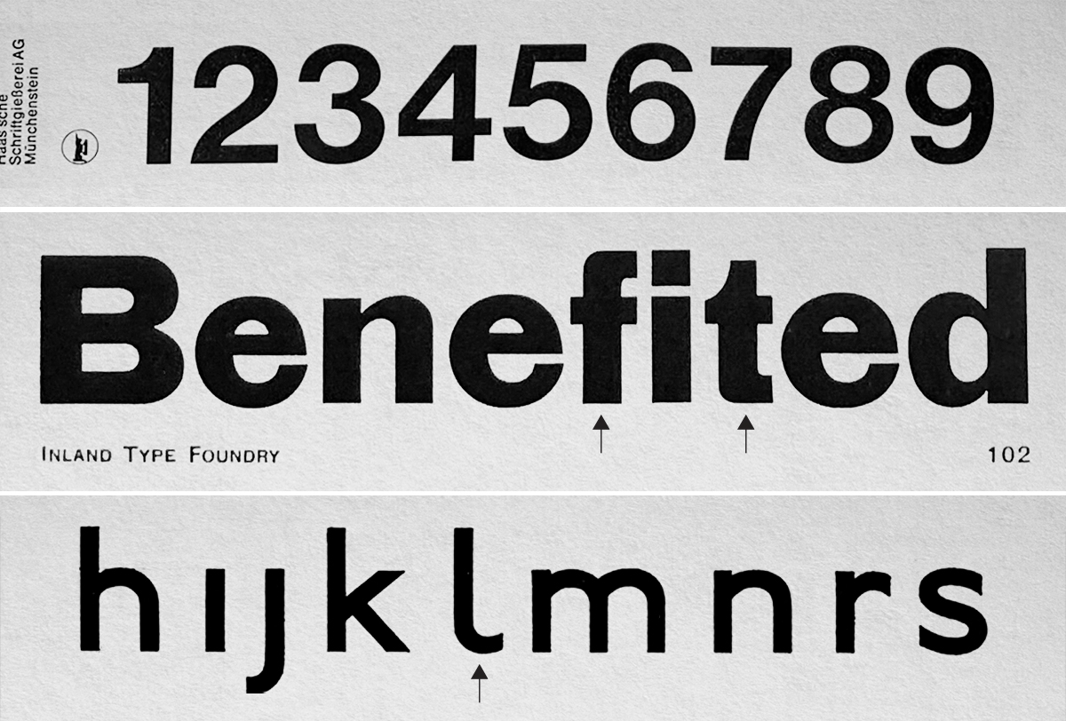
From top to bottom, Die Neue Haas Grotesk specimen (1959), Gothic No. 8 Pony specimen (1907) and Johnston typeface (1916).
The family consists of 18 styles: 8 weights with matching italics and 2 variable fonts (Roman & Italic). A complete range of weights is available, ready to handle projects of any size. As with all typefaces, the extreme weights—very light or very heavy—are intended for display use, while the intermediate weights are more versatile. With a clear, modern voice, this typeface is perfect for conveying contemporary messages. Whether in digital settings like UX/UI or in editorial or branding projects, it adapts effortlessly, adding a distinctive and stylish touch to the content.
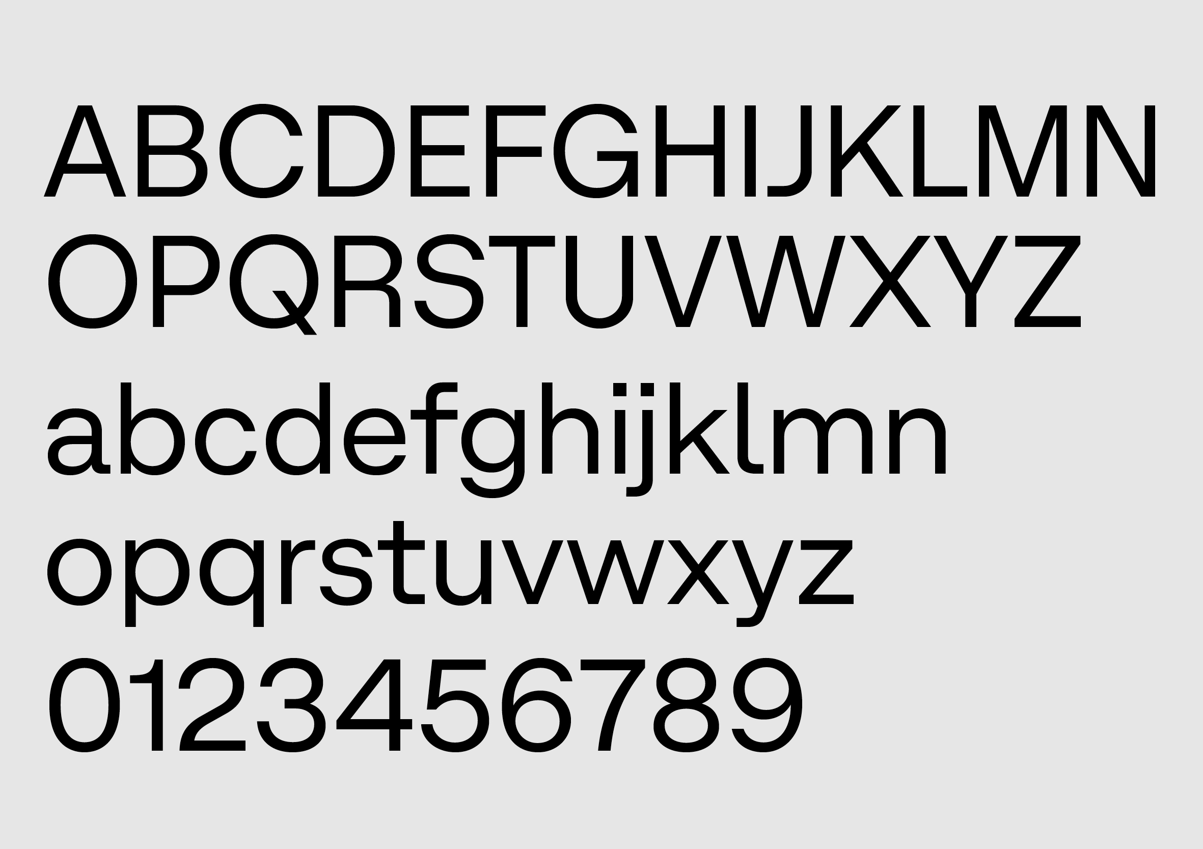
Basic character set.
View Micrograph