


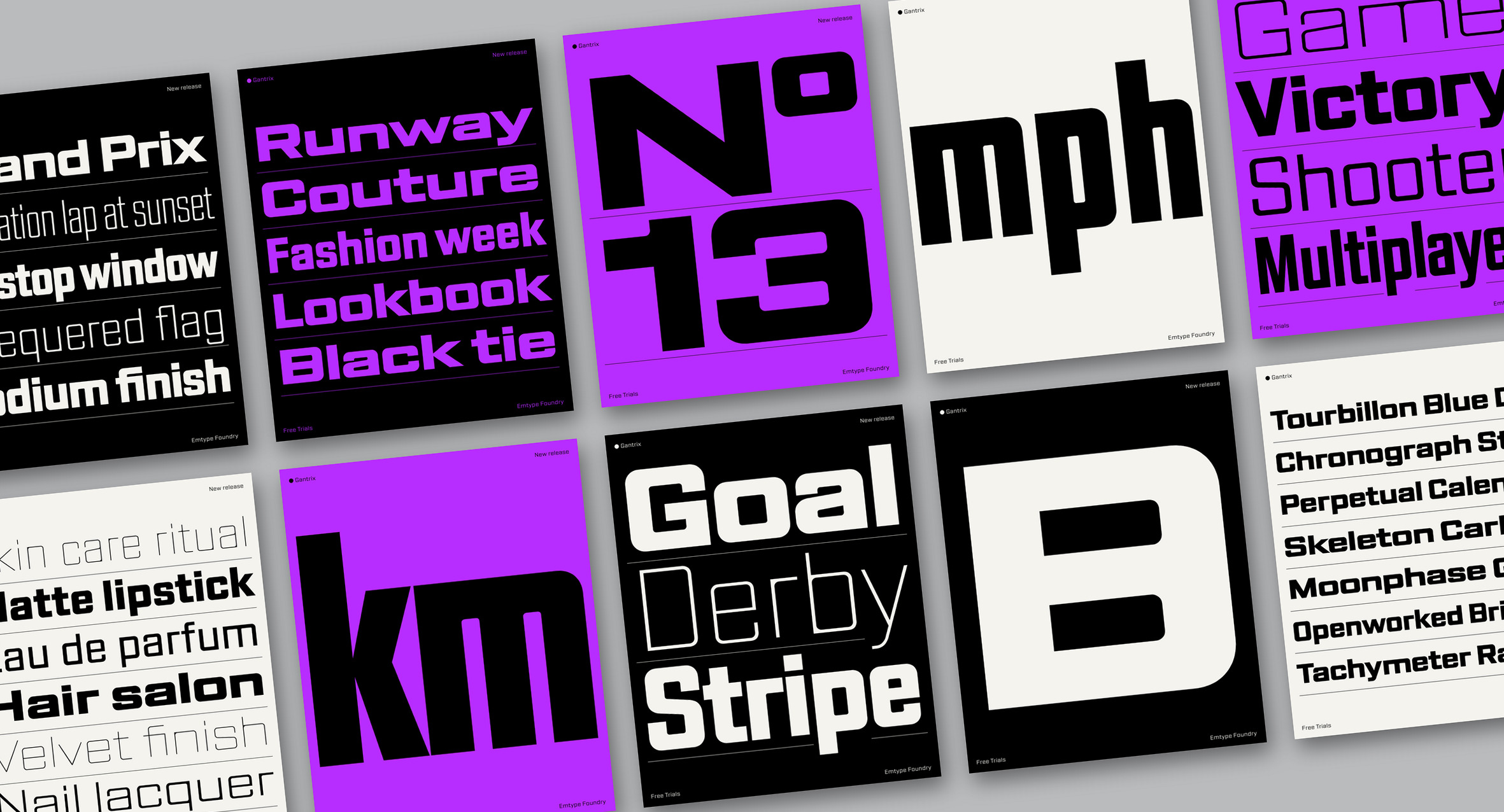
Gantrix is a square sans serif system that sits between futuristic form and functional design. Its joints, usually key to letter recognition, have been removed and replaced with hybrid forms that add personality, especially in the lighter weights. In characters with a middle joint, such as B, 3 and 8, this detail pushes the limits of recognition. Seven widths and seven weights let designers fine-tune tone and expression while keeping a consistent appearance, from light, narrow and elegant styles to heavy, wide and boxy ones. Closer to contemporary sci-fi than to retro futurism, it suits sport, automotive graphics, video games, fashion, beauty or UI design.
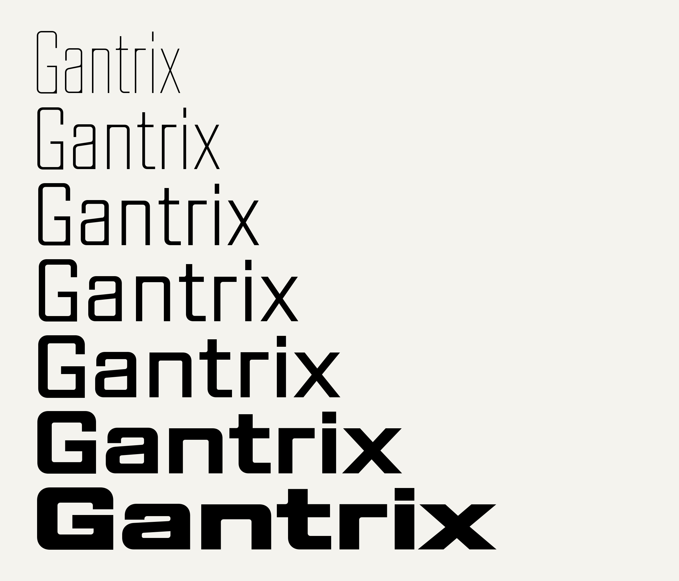
Gantrix from XCompressed Thin to Expanded Bold. Width and weight are independent, so any weight is available in any width.
Where it comes from: the square sans serif tradition
Gantrix’s roots are in the square sans serif tradition of Eurostile, Bank Gothic and Poster Gothic. Bank Gothic was drawn by Morris Fuller Benton for ATF in 1930, a capitals-only family in several weights and two widths. Poster Gothic followed in 1934, a slightly condensed companion designed to pair with it. Eurostile, released by Aldo Novarese at Nebiolo in 1962, grew out of Microgramma, the capitals-only titling face he drew with Alessandro Butti in 1952.
These faces, together with the square lettering of 1960s and 1970s science fiction, are references rather than models. Microgramma ended up on the hulls of Star Trek and in Space: 1999, and Letraset’s Countdown (Colin Brignall, 1965) was a familiar sight in sci-fi television of the period. Gantrix takes the squared curves and the rational structure of that world, but looks at it from today: closer to a sports kit or an interface than to a film poster from the seventies.
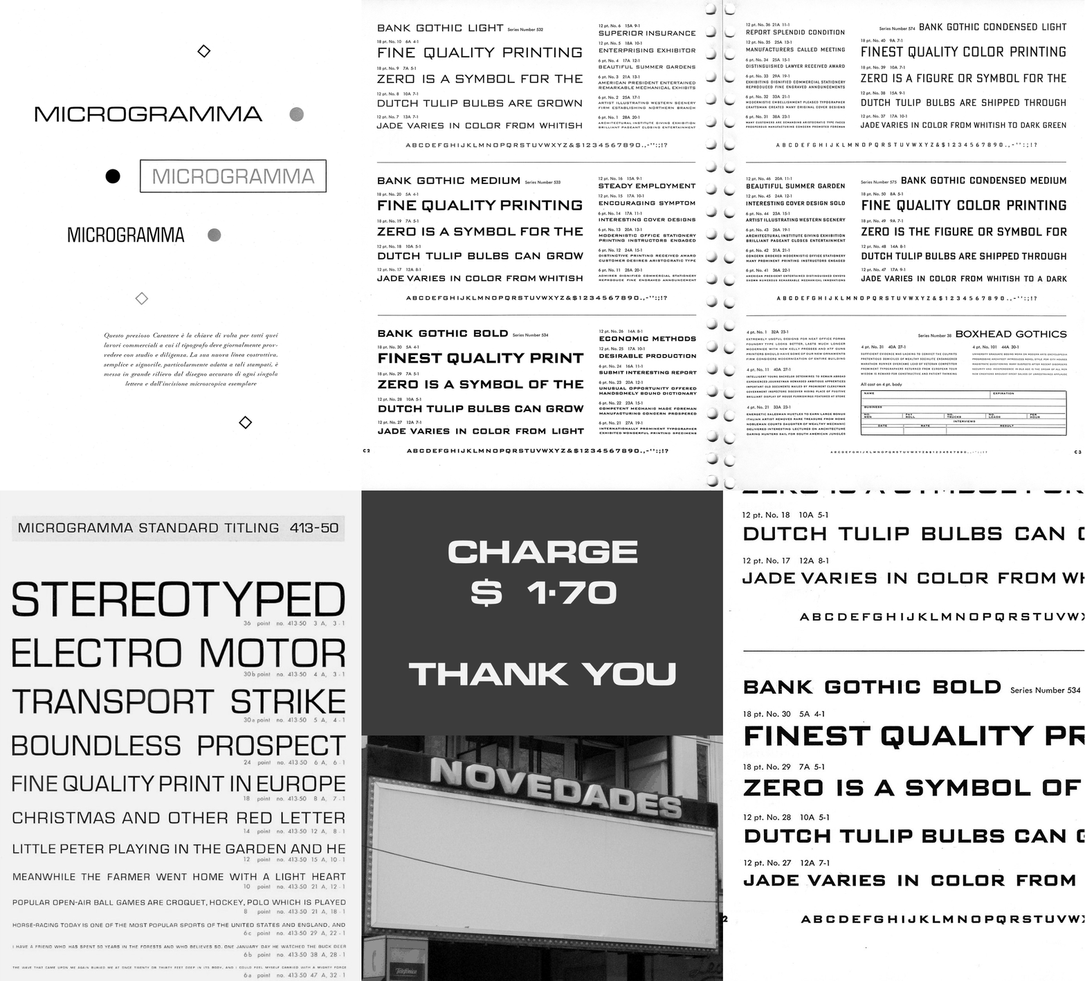
Square sans serif references. First, Nebiolo’s Microgramma specimen and two ring-bound specimen pages of Bank Gothic and Bank Gothic Condensed. Then a Microgramma Standard Titling specimen, the videophone display from 2001: A Space Odyssey recreated in Eurostile Bold Extended, a Novedades sign in Barcelona and a detail of Bank Gothic Bold.
Images via Wikimedia Commons: Bank Gothic and Microgramma Standard Titling specimens by James Puckett, dailytypespecimen.com (CC BY 2.0); Nebiolo Microgramma specimen by Tipi Strani (CC0); videophone display by Morn (CC0); Novedades sign by Color sépia (public domain).
Ink joints, the opposite of an ink trap
The defining decision in Gantrix is what happens at the joints. In most letters, the point where one stroke meets another is part of what makes the shape recognisable. Here the joint is replaced with a hybrid form: where a stroke meets a stem the corner stays sharp and carries a little more ink than usual, while the rest of the outline stays rounded. I call it an ink joint. It is the opposite of an ink trap: instead of taking ink away from the joint, it adds it. The effect is most visible in the lighter weights, where it gives the family much of its personality, and it becomes a quiet detail in the heavier ones.
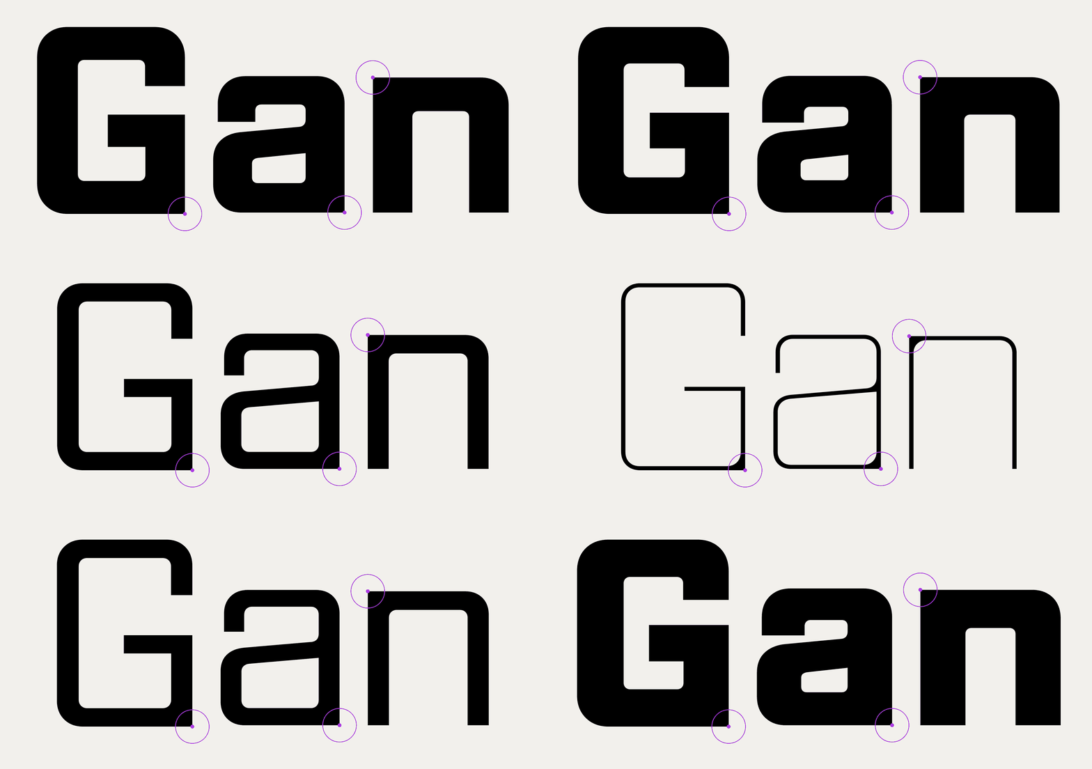
Ink joints in G, a and n, from Thin to Bold: where a stroke meets a stem, the corner stays sharp.
Characters with a joint at the vertical middle, such as B, 3 and 8, are where the idea is pushed furthest. Without a conventional joint, the right side of the B becomes a single straight stroke and the letter stands right at the limit of recognition. The default forms were kept on purpose: they have plenty of character, and they are what makes Gantrix stand out. For the situations where legibility has to come first, such as a product code, a serial number or small text on a screen, stylistic set 1 replaces them with alternates drawn with classic joints.
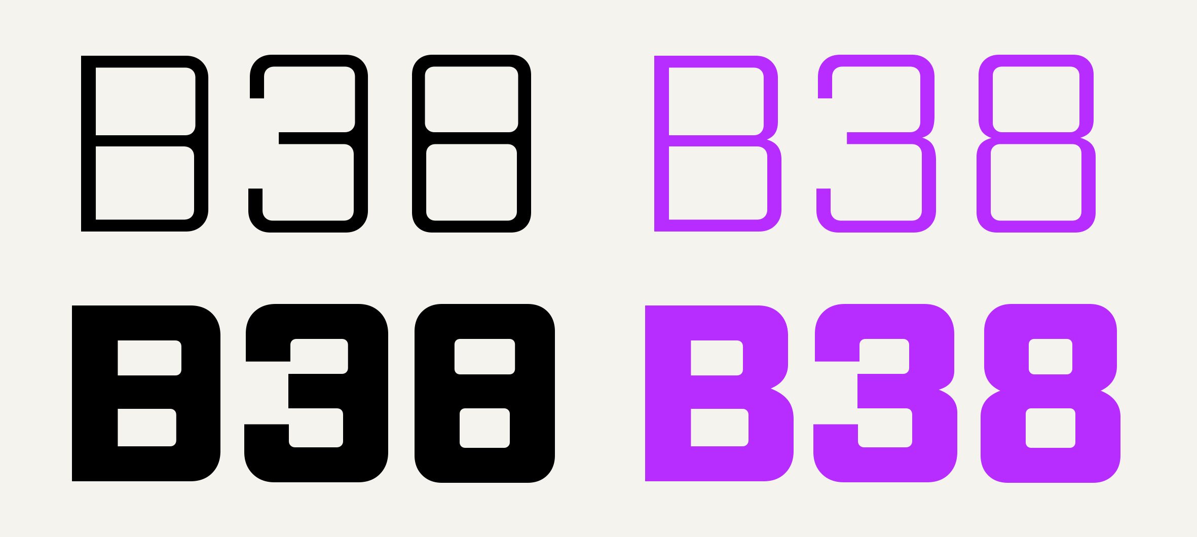
B, 3 and 8 in Light and Bold. Default forms on the left, the classic joints of stylistic set 1 on the right.
A reason to exist
Gantrix is a little futuristic, but always from the side of usability: versatile, complete, a workhorse family. In the right hands it can be as serious as any Eurostile alternative, but it has a twist that makes it its own.
That twist is deliberate. Square sans serifs are a crowded genre, and a new one needs a reason to exist beyond being well drawn. The first sketches and tests were more conventional: the joints were drawn in the usual way, without the straight corner. They worked, but they looked like many other typefaces in the same segment. The ink joints are what made Gantrix idiosyncratic.
A few years ago I would probably have taken the safer path and made a more conventional superfamily. This time I kept the detail and made it work across the whole system. For me, a typeface can have character and still be usable and useful, which is, after all, why typefaces exist.
IMAGE PENDING / Early sketches
Early sketches and tests with conventional joints, next to the final design.
Early sketches and tests with conventional joints, next to the final design.
One construction for every glyph
Curves and proportions follow one construction system across the whole family: the same corner radius logic, the same straight sides and the same sharp joints in every width and weight. The more complex characters, such as S, the German ß and the ampersand, were drawn to follow the same rules as the rest rather than treated as exceptions. Some letters also drop the spur, a detail that takes them toward a more futuristic look without turning retro.
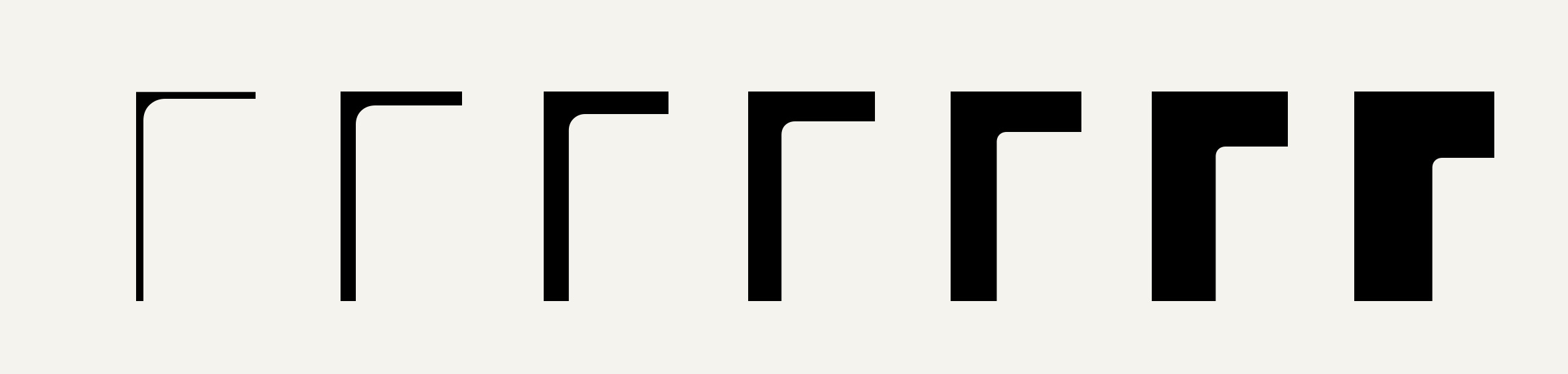
One corner of the n from Thin to Bold: sharp where the stroke meets the stem, rounded everywhere else.
Seven widths, seven weights and a variable font
There are other square sans serifs in this vein, but few with this degree of flexibility. Gantrix has seven widths (XCompressed, Compressed, Condensed, Normal, Wide, Extended and Expanded) and seven weights in each of them (Thin, UltraLight, Light, Regular, Medium, SemiBold and Bold): 49 static styles plus a variable font with Weight and Width axes, for any point in between.
The width range is not there for show. It lets the type adapt to the space available instead of the other way round: compressed styles for dense dashboards, tables and narrow columns, expanded styles for wide headlines and screens that need presence. The appearance stays the same across all of them, so designers can fine-tune tone and expression for any space or medium without changing the voice.
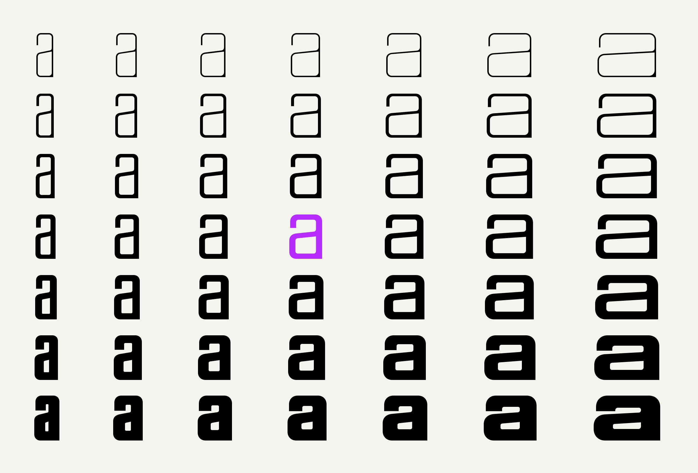
The 49 static styles: seven weights from top to bottom, seven widths from left to right.
Type for data
Much of what Gantrix was drawn for is made of numbers: lap times, scores, speeds, sizes, prices. Figures must be clear at a glance, labels must hold up at small sizes and headlines must stand out on a screen full of readings. Tabular figures keep columns steady while the values change, and the narrow widths let long names fit into tight cells without dropping the size. The same family can set the big number on the dashboard and the small print beneath it, so the whole panel speaks with one voice.
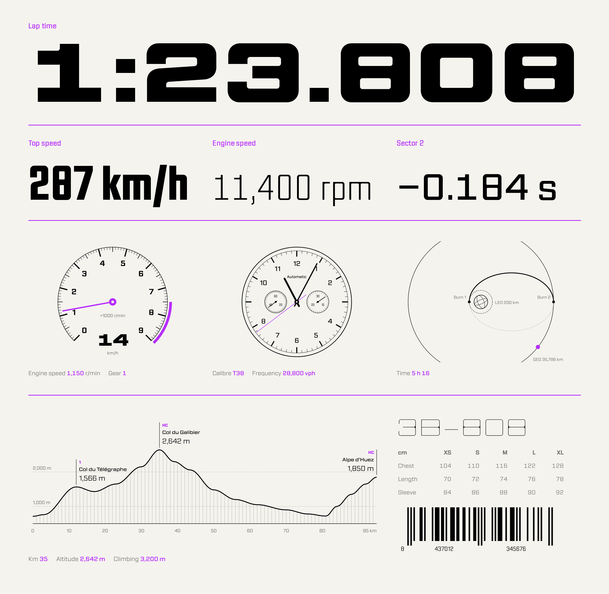
Expanded for the headline figure, narrower styles for the readouts, and Gantrix at work on a rev counter, a chronograph, an orbit diagram, a stage profile and a size chart.
Set a compound word in Gantrix and you have an instant logo.
Gantrix also works as an instant logo. Compound words such as Trackside, Spaceflight or Kickboxing become evocative and full of personality as soon as they are set in it, with very little work from the designer. It runs from light, slender and elegant to boxy, heavy and forceful, with a rich and varied visual vocabulary.
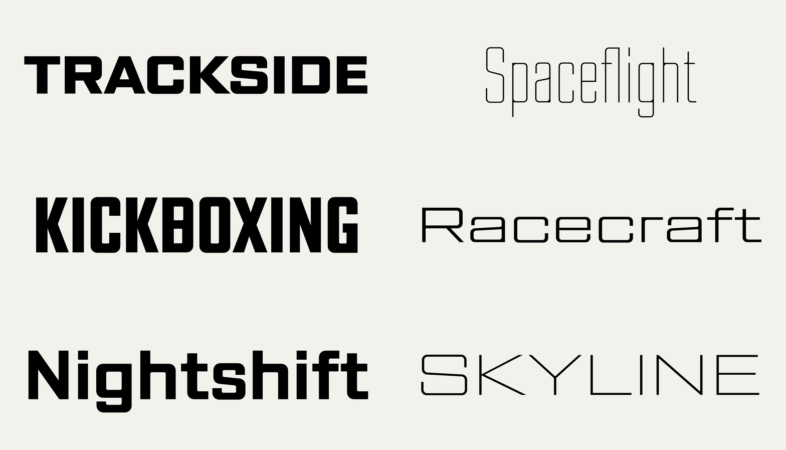
Compound words set in Gantrix become instant logos.
From the paddock to the runway
I did not want Gantrix to be boxed into sport or science fiction. The same letterforms that read as engineering in a wide, heavy style become elegant and almost fragile in a light, narrow one. It can work on a fashion or beauty brand as well as on an NFL jersey, on a motorsport livery, a video game interface, a watch dial or a synthesiser panel: contemporary sci-fi, less fantasy and more utility.
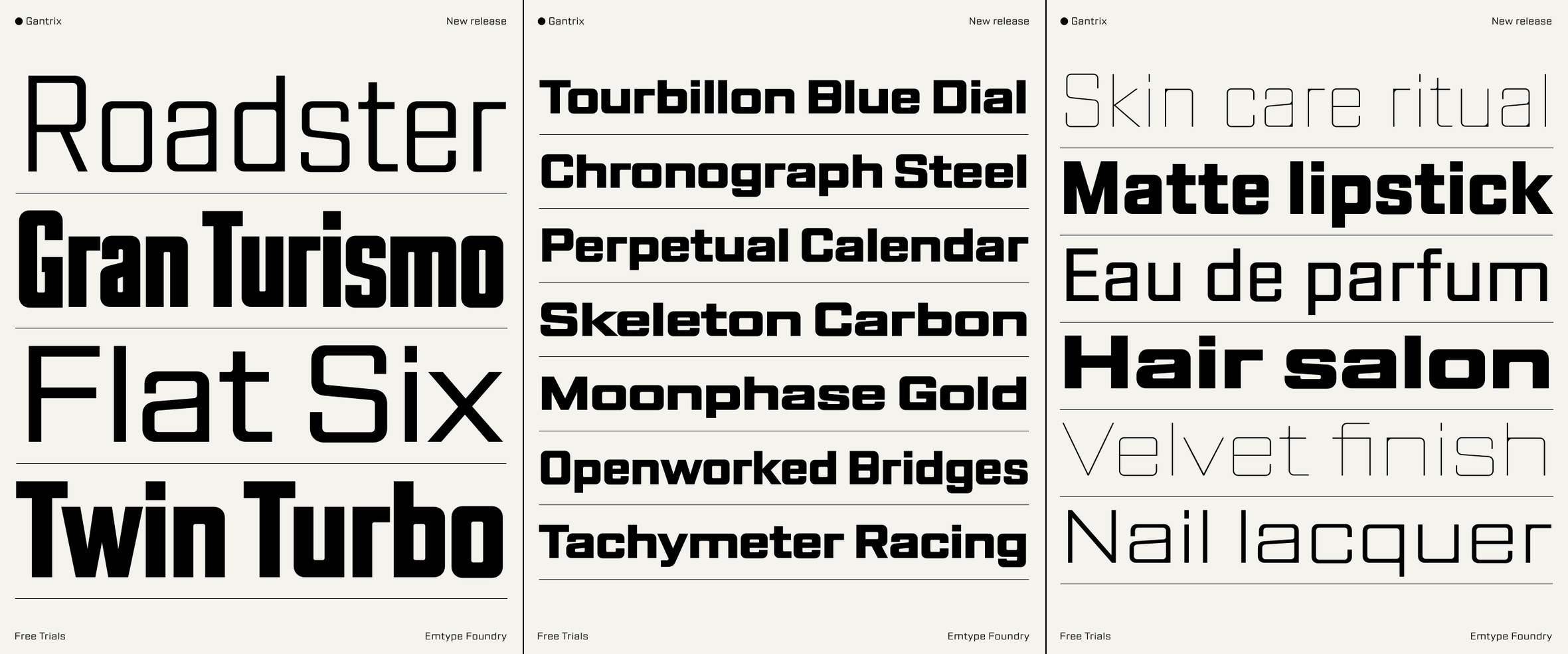
Cars, watches and beauty with the same family.
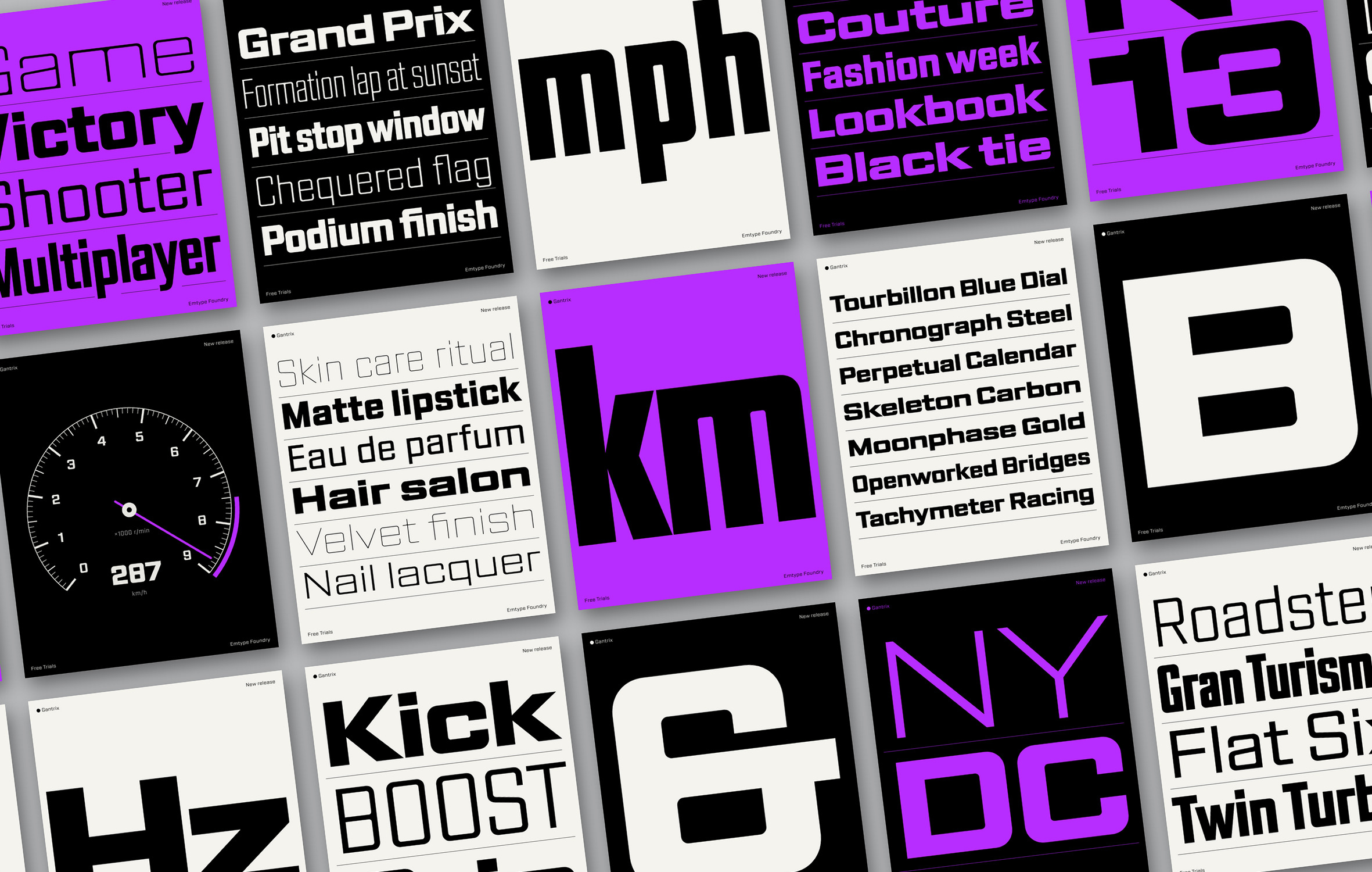
Sport, music, space, automotive and gaming: one family, many tones.
What is in the fonts: character set and OpenType features
Every style shares the same character set, with support for more than 290 Latin-script languages. OpenType features include tabular figures, fractions, numerators and denominators, superiors and inferiors, ordinals, standard and discretionary ligatures, the classic joints of stylistic set 1 and alternate ampersands. The family is delivered as 49 static OpenType fonts and one variable font, with webfonts in WOFF and WOFF2.
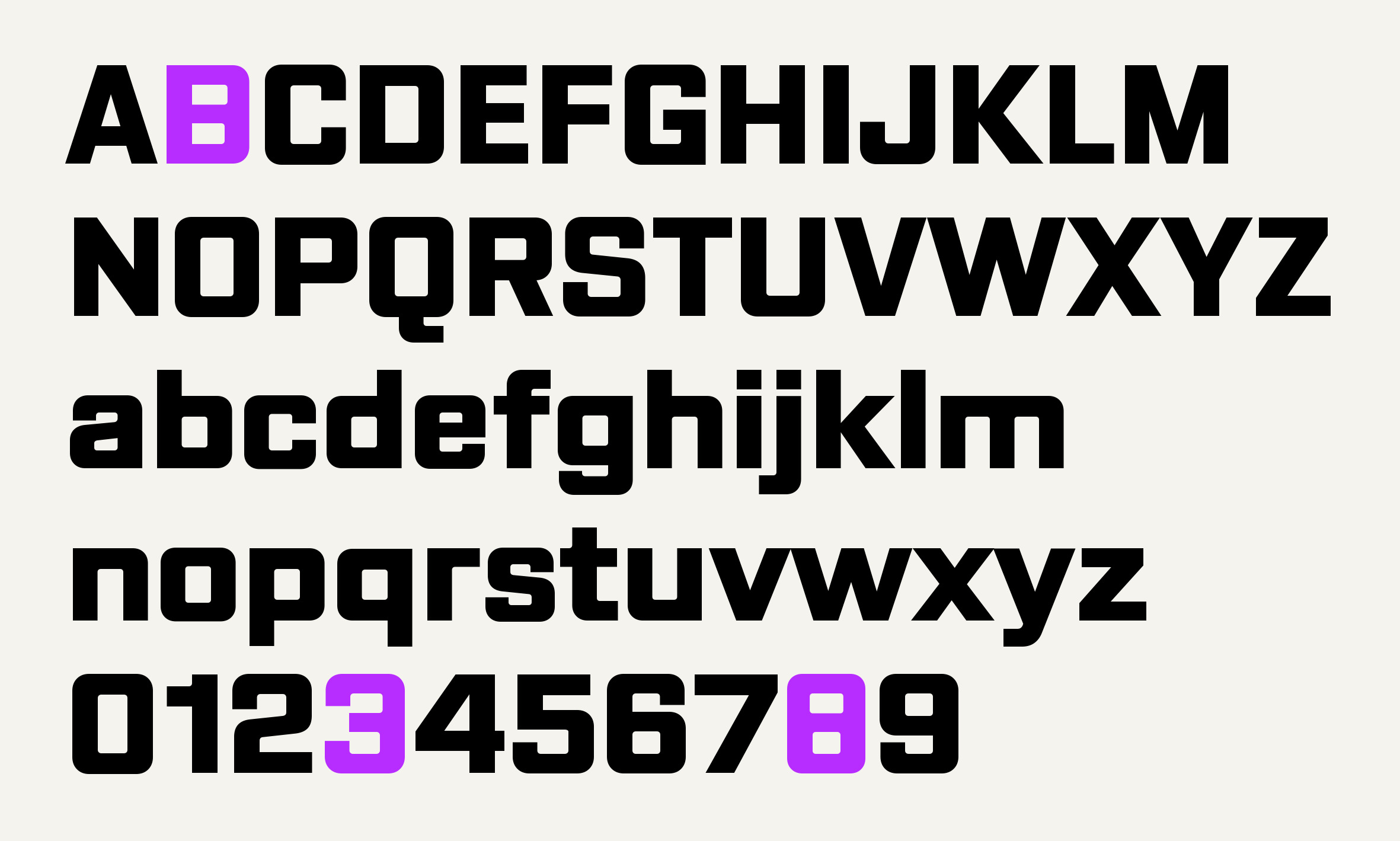
Gantrix basic character set.
The Gantrix minisite lets you move through both axes of the variable font and try your own text, and the PDF specimen shows every width and weight in headlines and text.
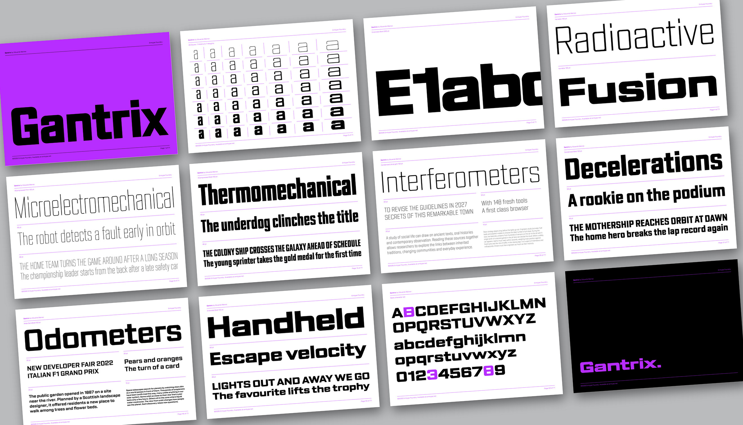
Pages from the Gantrix PDF specimen.
Gantrix comes in 50 styles, including a variable font. Free trials are available.