


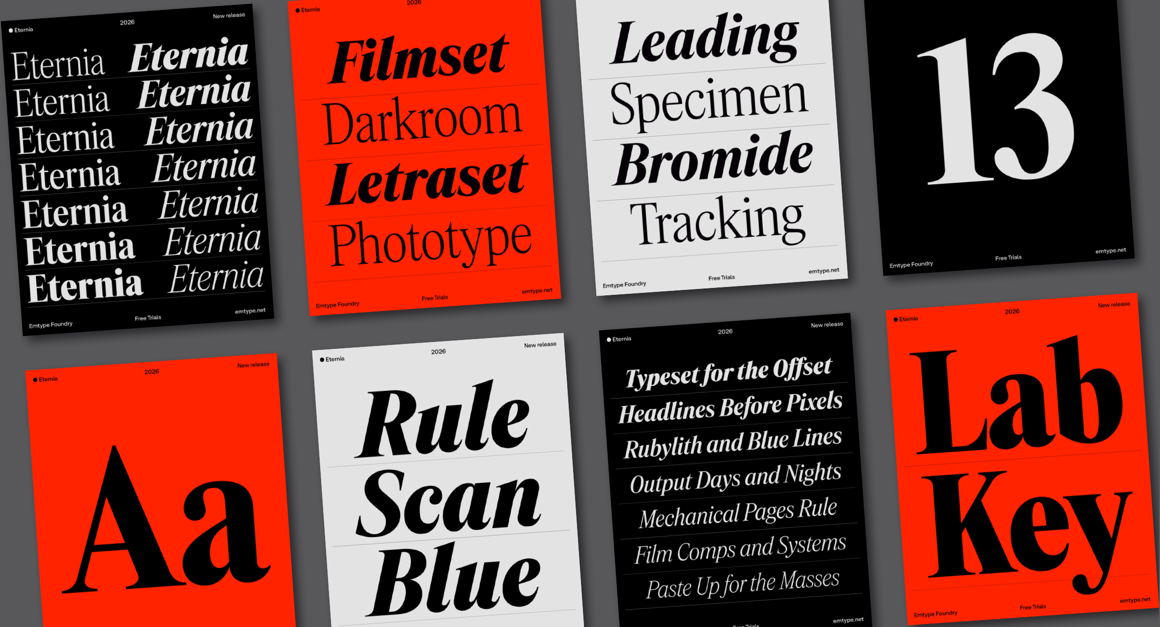
Eternia is inspired by the visual world of technology magazines, newspaper supplements, and advertising typography from the 1970s and 1980s. Its tall proportions and semi-condensed width give it a compact, vertical presence, while its controlled contrast and slightly tight spacing recreate the density and texture of headlines from that period. The result feels familiar without becoming nostalgic, a typeface that could have existed decades ago and still feel relevant today.
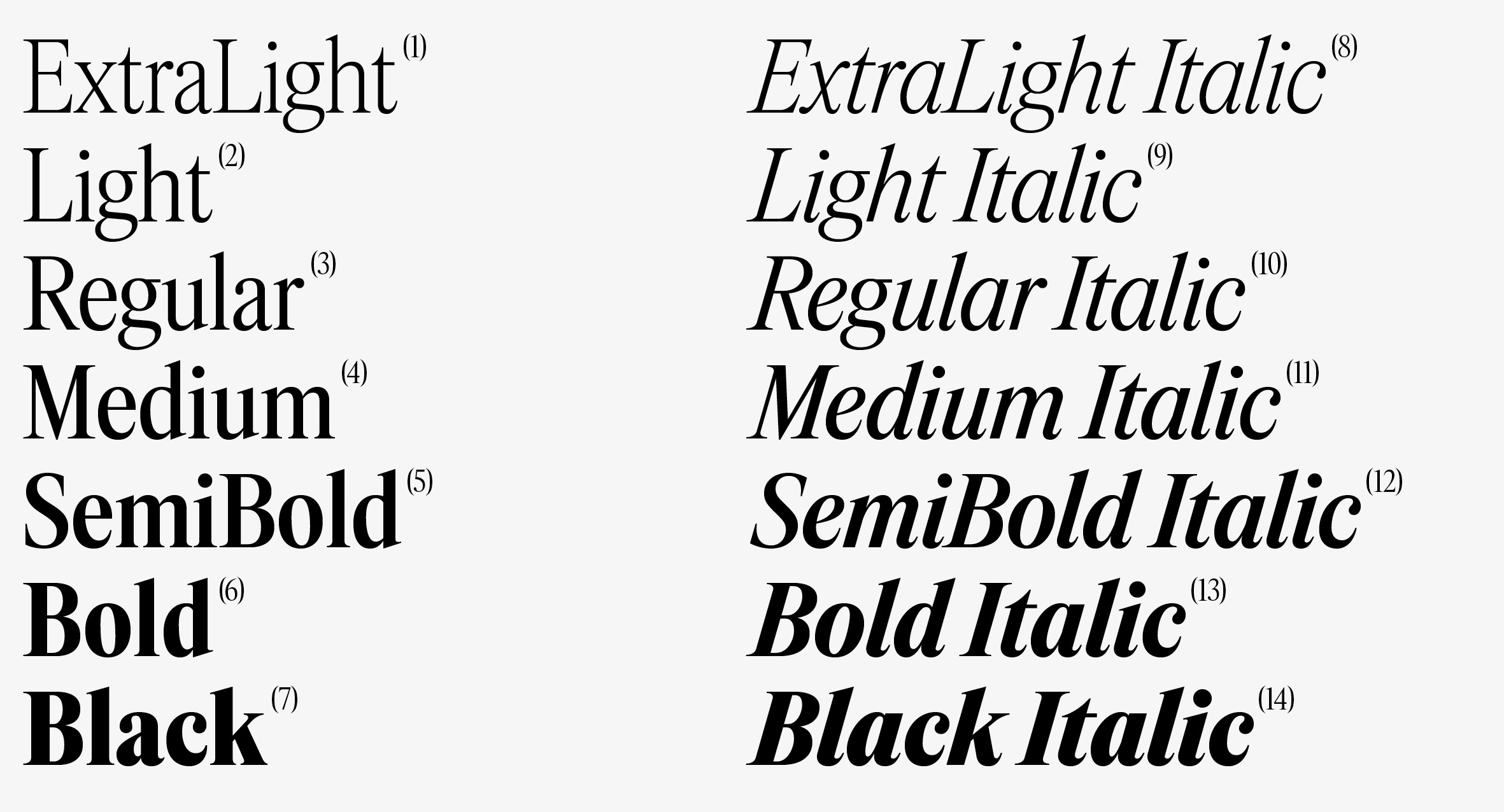
The family has 14 styles, 7 weights plus matching italics.
Eternia began in 2024 as a personal project, a way to return to a kind of design I had not worked on for some time. In recent years, almost everything I had designed was sans serif, either for clients or for my catalogue. Serif typefaces had moved into the background, except for the occasional custom project. Starting Eternia was a way to reconnect with that interest.
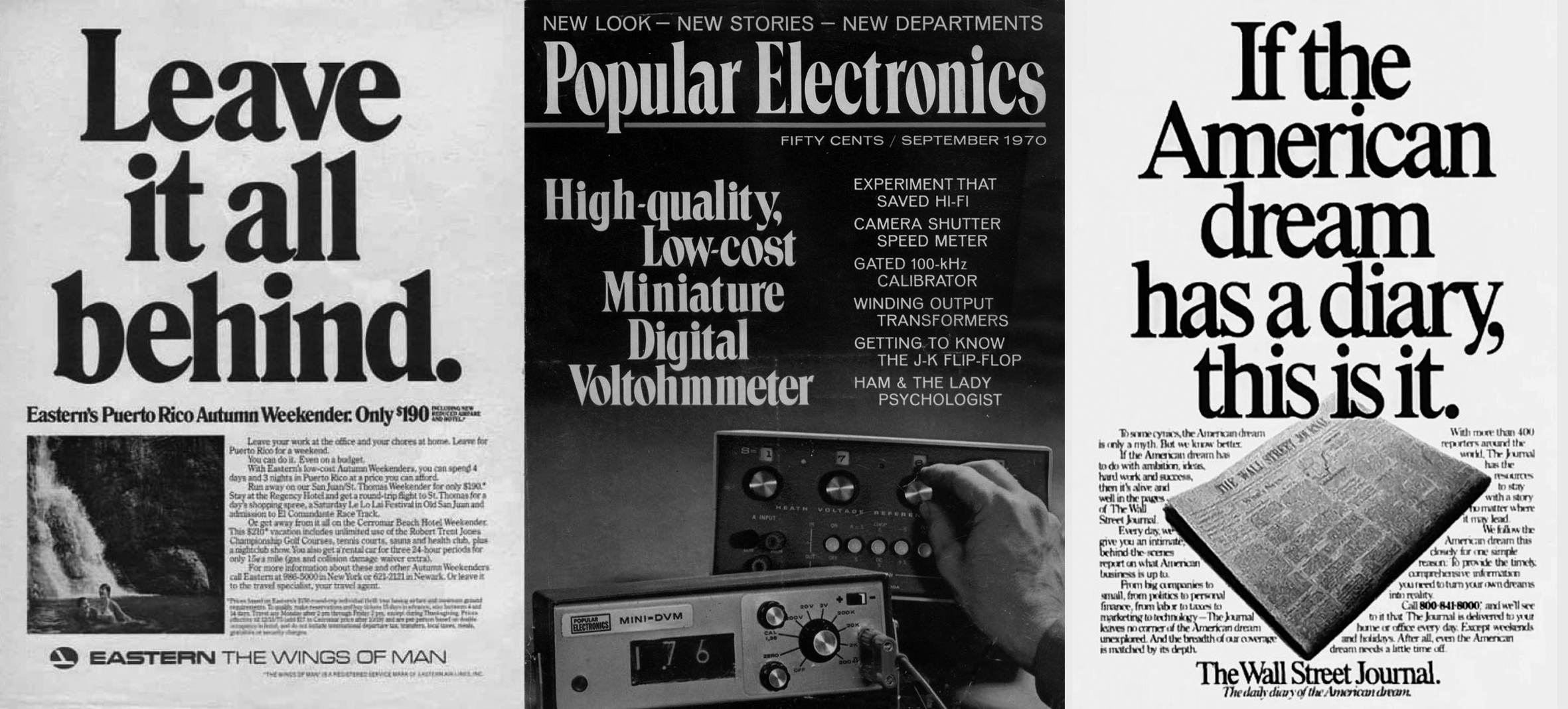
A selection of early technology publications, advertisements, and printed materials from the 1970s and 1980s, documenting the rise of personal computing and including examples that inspired the project.
Its references come from the visual world of technology magazines, newspaper supplements, and advertising typography from the 1970s and 1980s. In its overall feel, it has a slight connection to Times, but its terminals are closer to Plantin, especially in letters like C, S, and s. Its proportions are also closer to Apple Garamond, tall, semi-condensed, and with a clear vertical presence. Times, Plantin, Garamond, Century Schoolbook, and others are not direct models, but part of a wider editorial serif tradition that informed the design. You can sense that period in the typeface, but without nostalgia, seen instead through a contemporary lens.
It is a narrow space to inhabit, something that feels new yet looks as if it has always existed, but in type design the variations and ideas are endless. There is always room, however small, for new angles and unexplored ground.
The design changed significantly at an early stage. Eternia first began with fairly standard text proportions, which made it feel too close to many existing typefaces in the same genre. I decided to explore other directions, not only through different terminals and details, but also through taller proportions that pushed it more clearly toward display and headline use. That decision changed the meaning of the whole project. It is a narrow space to inhabit, something that feels new yet looks as if it has always existed, but in type design the possibilities are endless. There is always room, however small, for new ideas and new directions.
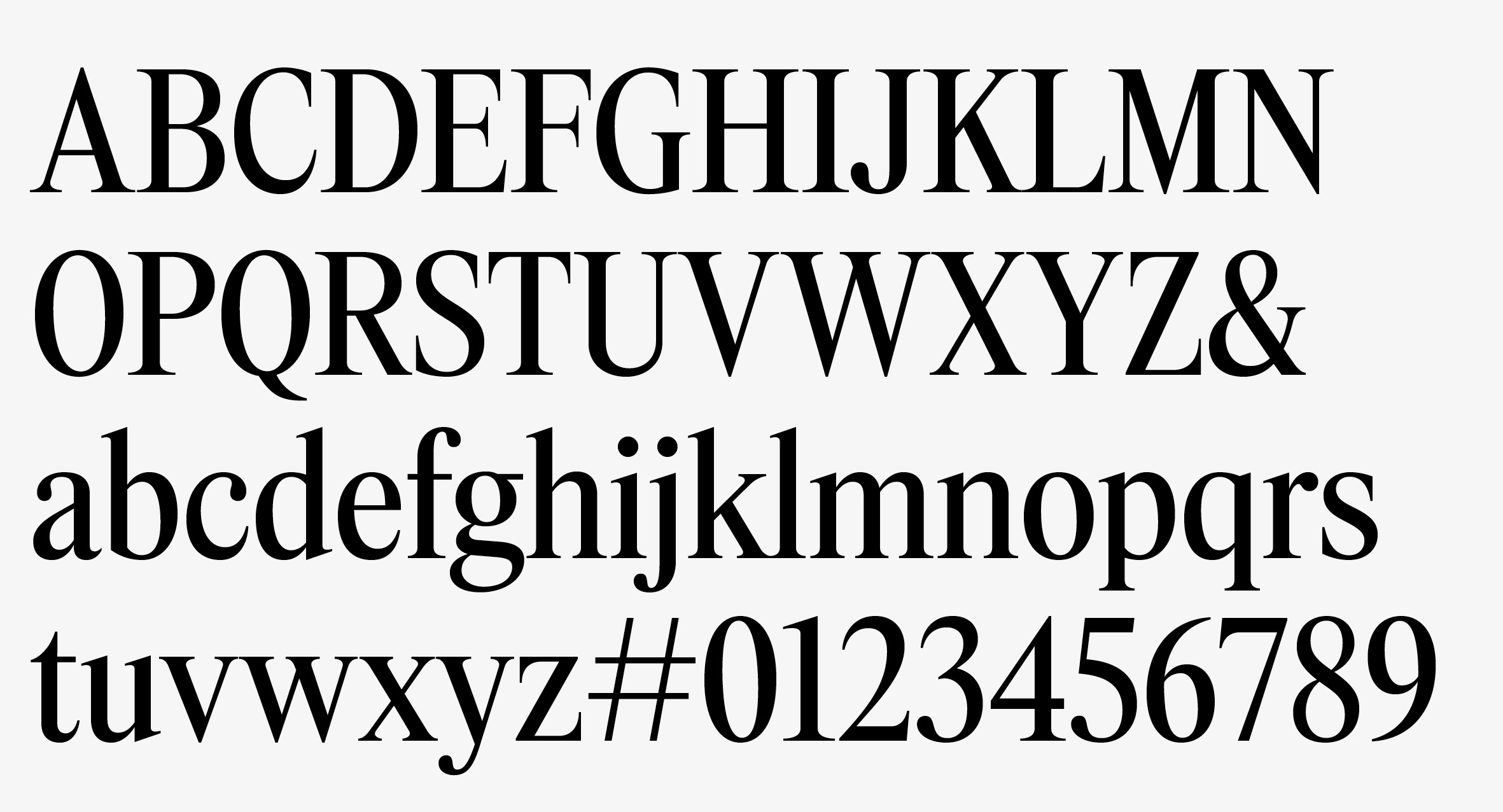
Eternia basic character set.
The contrast is noticeable, but not extreme. The goal was to achieve a crisp appearance without losing stability at smaller display sizes or in lighter weights on screen. The spacing is slightly tight, deliberately so, helping to recreate the density and compactness of headlines from 1970s and 1980s magazines. All stroke endings and terminals are cut at 90 degrees, a defining detail that gives the design a more rational, precise, and contemporary tone. The result is not heavy or oppressive, but compact enough to feel connected to that visual world.
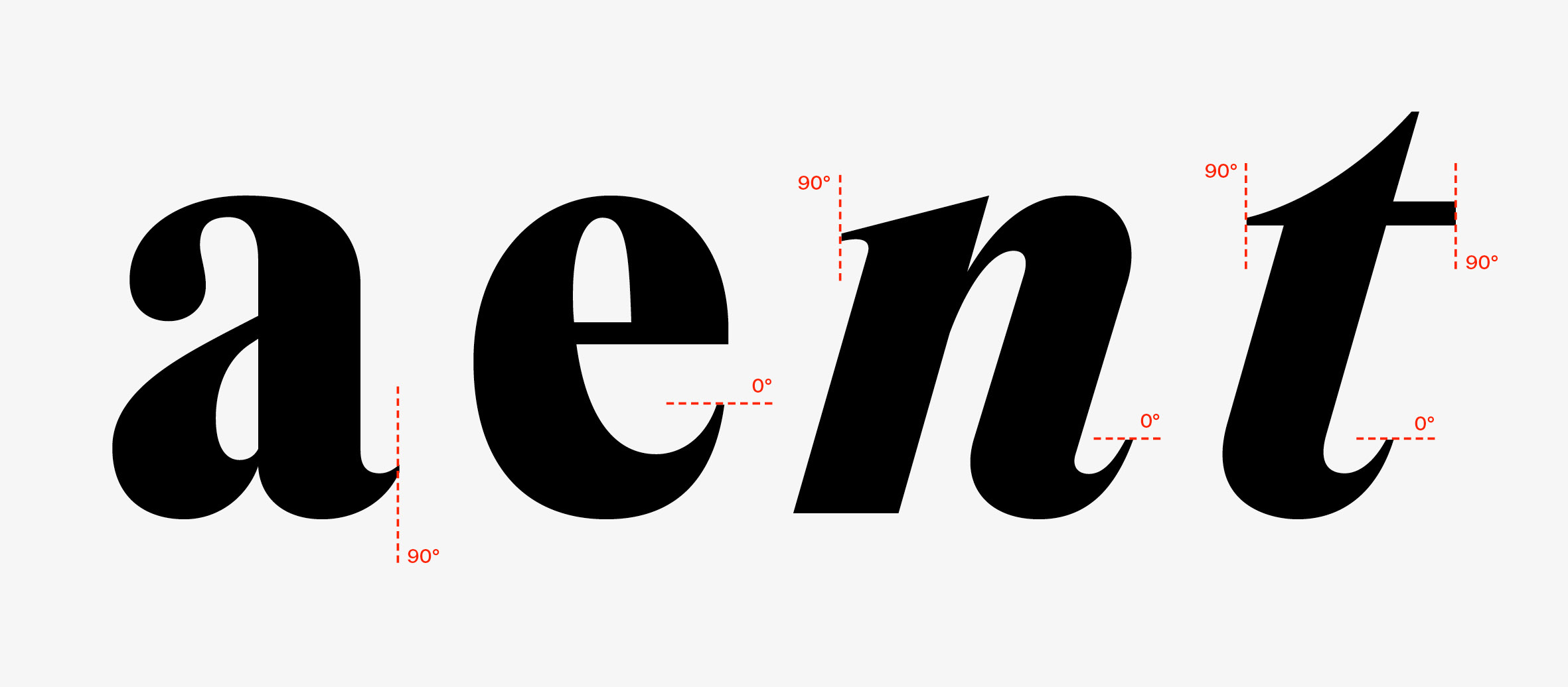
The stroke endings and terminals are consistently cut along horizontal and vertical axes, reinforcing the design’s rational and contemporary tone.
Naming a typeface has become one of the most time-consuming parts of the process. For years I followed a personal rule: the name had to describe the typeface and contain enough distinct characters to work as a small specimen on its own. Today, almost every name is already taken, and that rule is becoming harder to follow. Now the main priority is simply that the name feels right for the design. Eternia tries to express the sense of permanence and broad relevance the typeface aims for, something that could have existed decades ago and could still feel right decades from now.
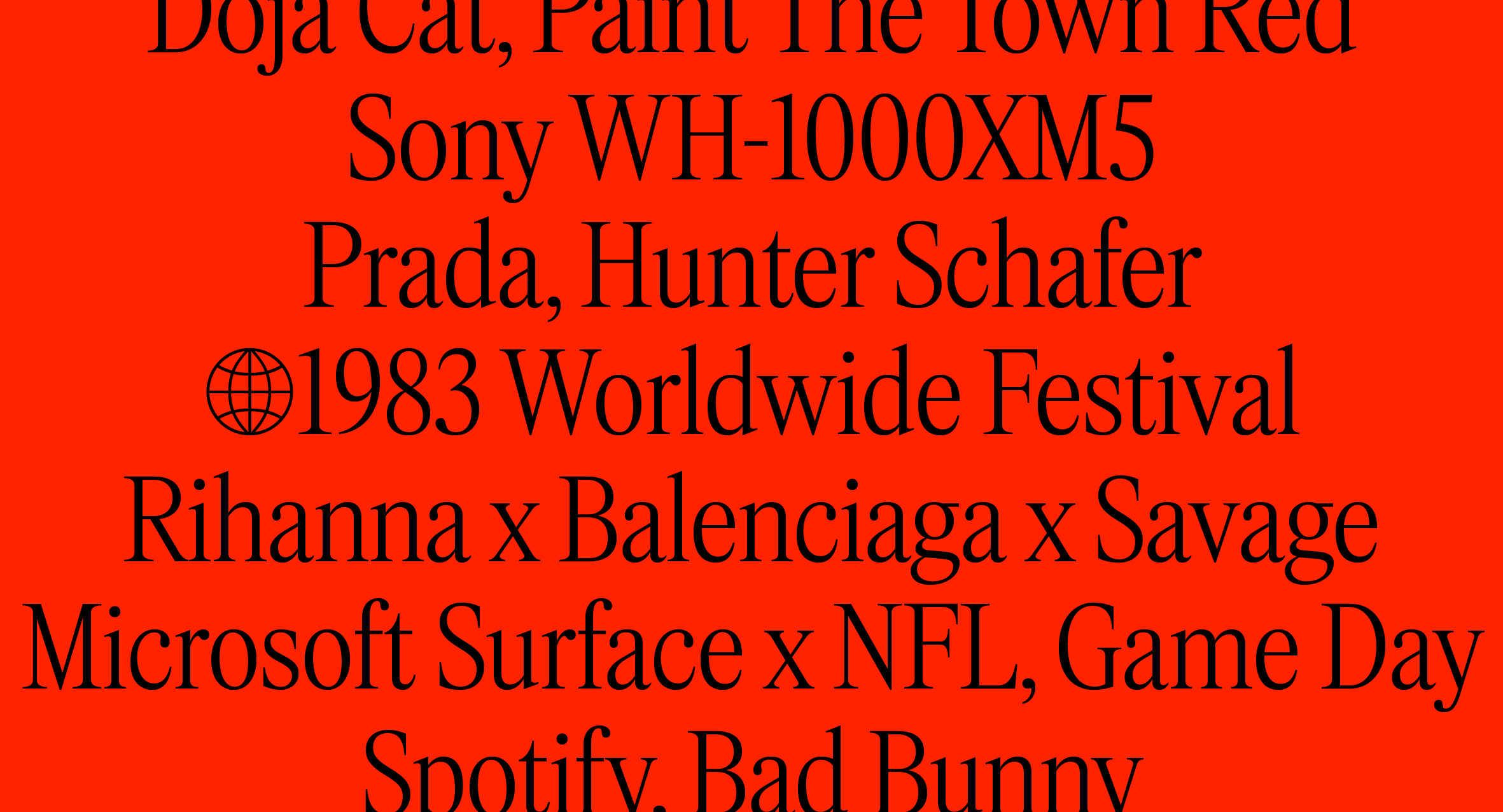
Designed for modern brands, editorial contexts, and digital environments.
The family includes 14 static styles, 7 weights with matching italics, as well as 2 variable fonts, Roman and Italic. The lightest and heaviest styles are mainly intended for display use, while the middle weights are more flexible across different applications. Together, they form a versatile system suited to modern brands, editorial contexts, and digital environments.