Steradian is an exploration of the geometric genre and although it has a geometric base, the widths between letters are not much different across the weights, something common of the style. That is due to the process, in which the proportions of the heavier weights paved the way for the lighter ones. It also has a series of details that make Steradian stand out and gives it a special touch. Some of its main features are the double-story ‘a’, its closed apertures and some of the capitals have a distinct personality (such as the G and Q)...
Steradian is an exploration of the geometric genre and although it has a geometric base, the widths between letters are not much different across the weights, something common of the style. That is due to the process, in which the proportions of the heavier weights paved the way for the lighter ones. It also has a series of details that make Steradian stand out and gives it a special touch. Some of its main features are the double-story ‘a’, its closed apertures and some of the capitals have a distinct personality (such as the G and Q).
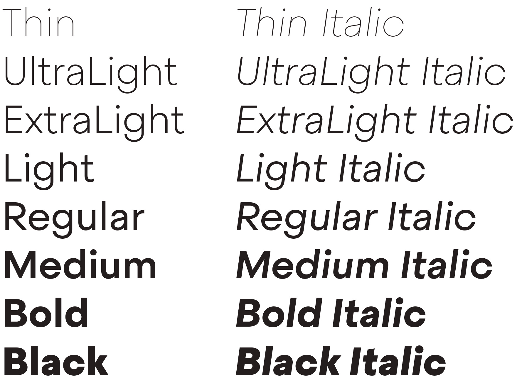
The family has 16 styles, 8 weights plus matching italics.
From a historical point of view, this font owes more to the history of typography than any other font in our catalogue. I wanted to do my own geometric version, but how different it could be? The geometric style is a consolidated style with specific rules and little space for innovation. Sometimes the differences depend on some key characters, the style of the numbers and currency set, or even marginal signs like ‘section’. Steradian is inspired by classic geometric typefaces whilst trying to add a twist to this overcrowded genre. It is a moderate typeface: moderate width proportions, moderate vertical proportions and moderate x height too.
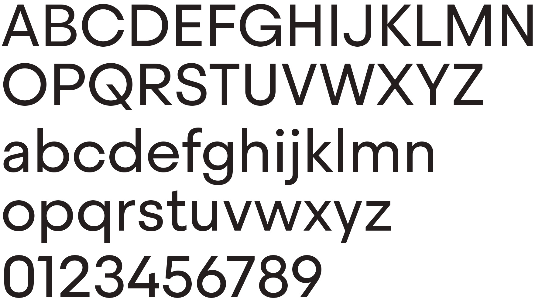
Steradian basic character set.
All of the round letters are derived directly from the circle, but the shapes are not slave to pure geometry. There are many different shades and variations across the family, adapting the original geometric form to multiple widths and weights. As with many typefaces of its style, it has a pseudo geometric approach with lots of adjustments that make it look more refined. On the one hand the light weights are based on a perfect geometric circle while the heavy weights are more expanded in order to allocate more weight to the letters. In terms of weight, strict geometry has inescapable limits.
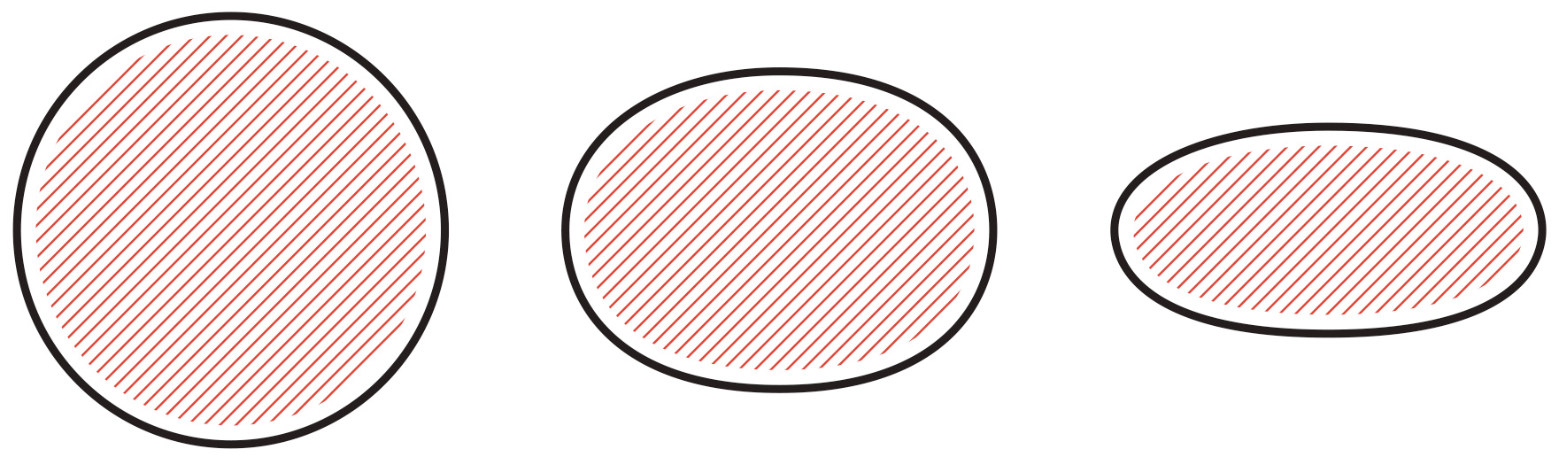
Variation on the original circular shape across the family.
The proportions were worked out from the heavy weights, and thanks to a ‘flexible geometry’, the light weights did not suffer the extreme change in proportions that is typical of the geometric style. I tried to find a balance between pure geometry and proportions which resulted in a hybrid font. For example the top and bottom curves of the lowercase ‘s’ are a little bit flat in appearance compared with the ‘o’, but this is all part of the charm of the typeface.
Inspired by classic geometric typefaces whilst trying to add a twist to this overcrowded genre.
Some of the characters have distinctive features. In capital letters, ‘G’ has a notorious notch on the right bottom, and capital ‘Q’ has a prominent diagonal. Steradian has a double-story ‘a’ and closed apertures, like in ‘c’ or ‘e’. Some characters have diagonals cuts, like the ‘t’ or the Futura style ‘1’. Finally, letters like ‘t’, ‘j’ and ‘f’ have a sharp endings more typical of the English sans style.
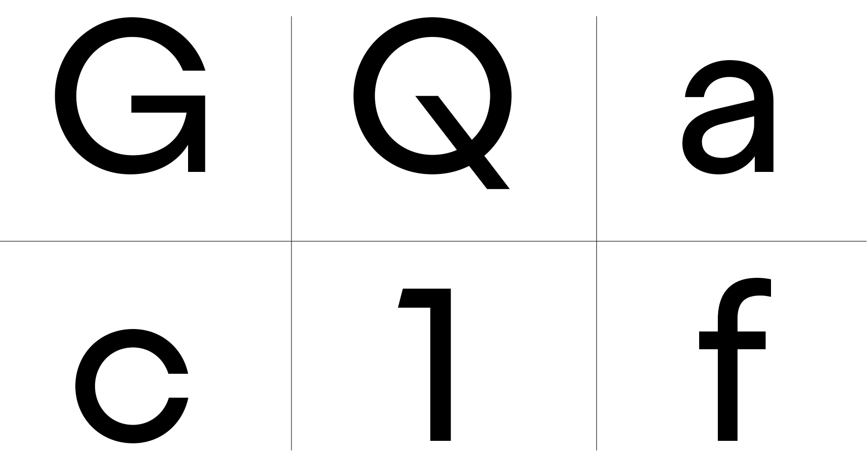
Detail of some charecteristic features.
There is a more traditional ‘G’ and ‘a’ as alternate characters that turns it into a more classic geometric typeface. During the process I normally design a lot of alternatives for many glyphs just to decide which ones work best, or which combination is more original or adequate for a specific purpose. At the end of the process I edit and reduce all of the alternatives to the essential. For example I had several versions of the ‘Q’ but in the final version there is no alternative because this particular letter contributes a peculiar flavor to the family.
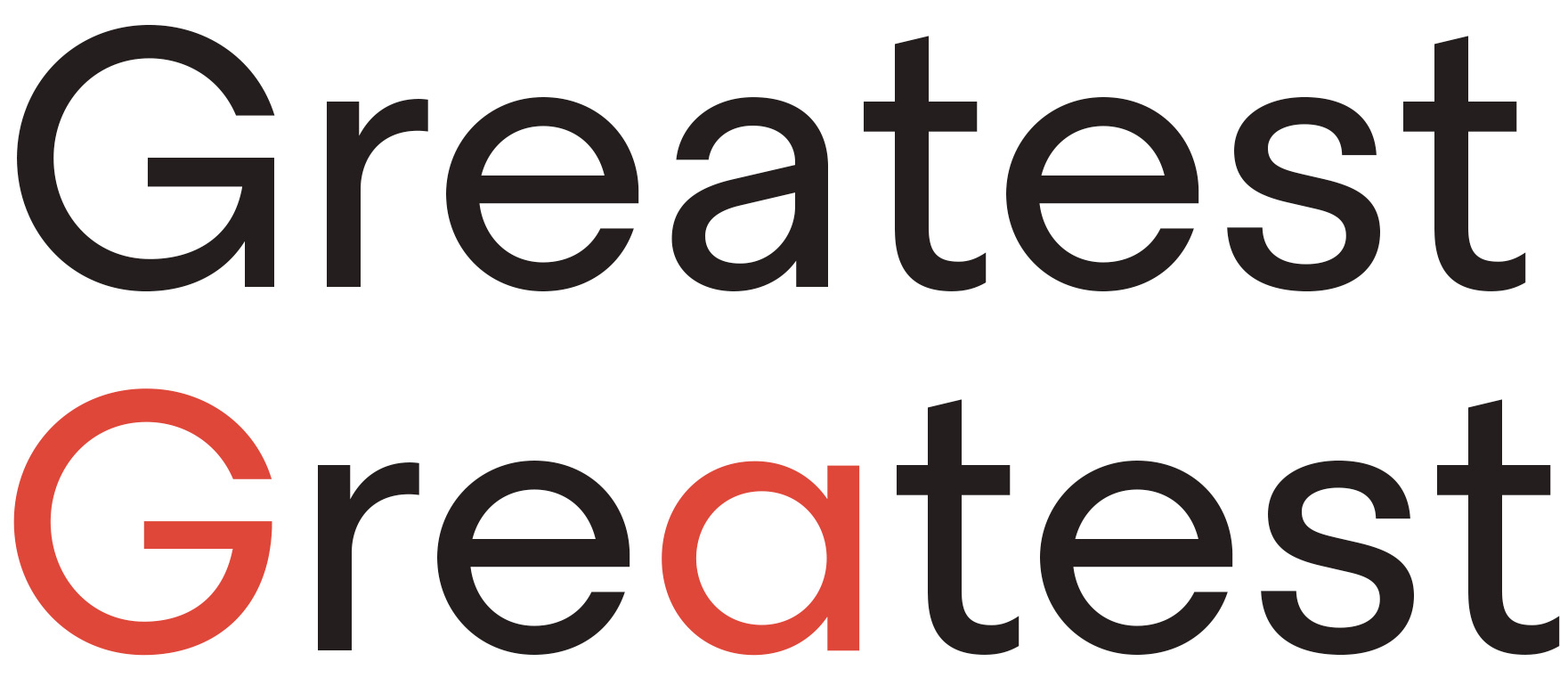
Alternative characters.
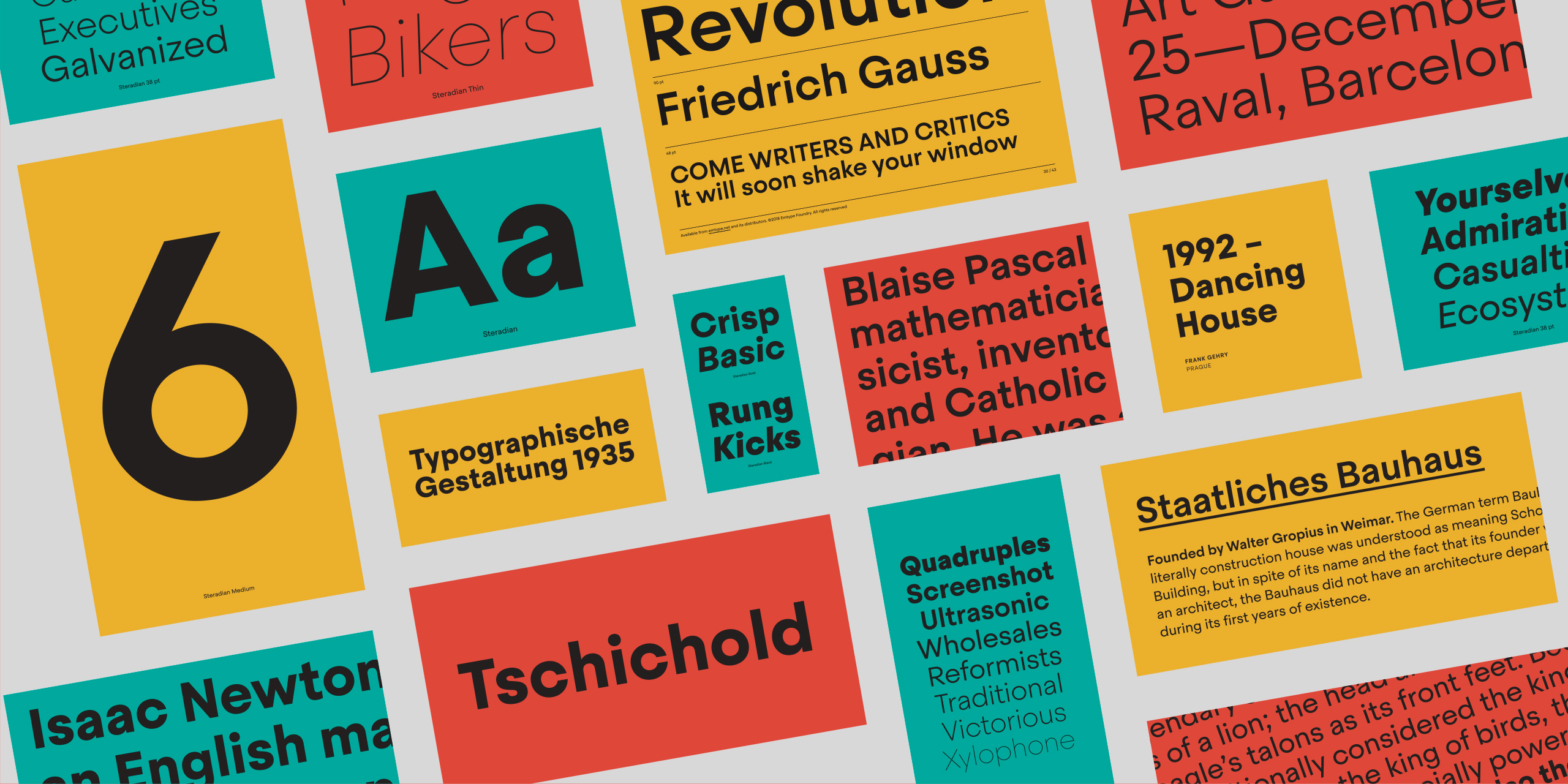
Its personality has a clean and modern voice that transmits a contemporary message, ideal for use in editorial and branding. Its close apertures however make it unadvisable for use in smaller sizes but ideal for intermediate and larger scales, where it shows off all of its idiosyncrasies and distinctive text texture. Steradian is a hybrid geometric sans typeface. Most of the letters have a classical architecture but others are unexpected yet matching. It is intended for use in a wide variety of applications and topics where it will add its distinctive touch.
View Steradian