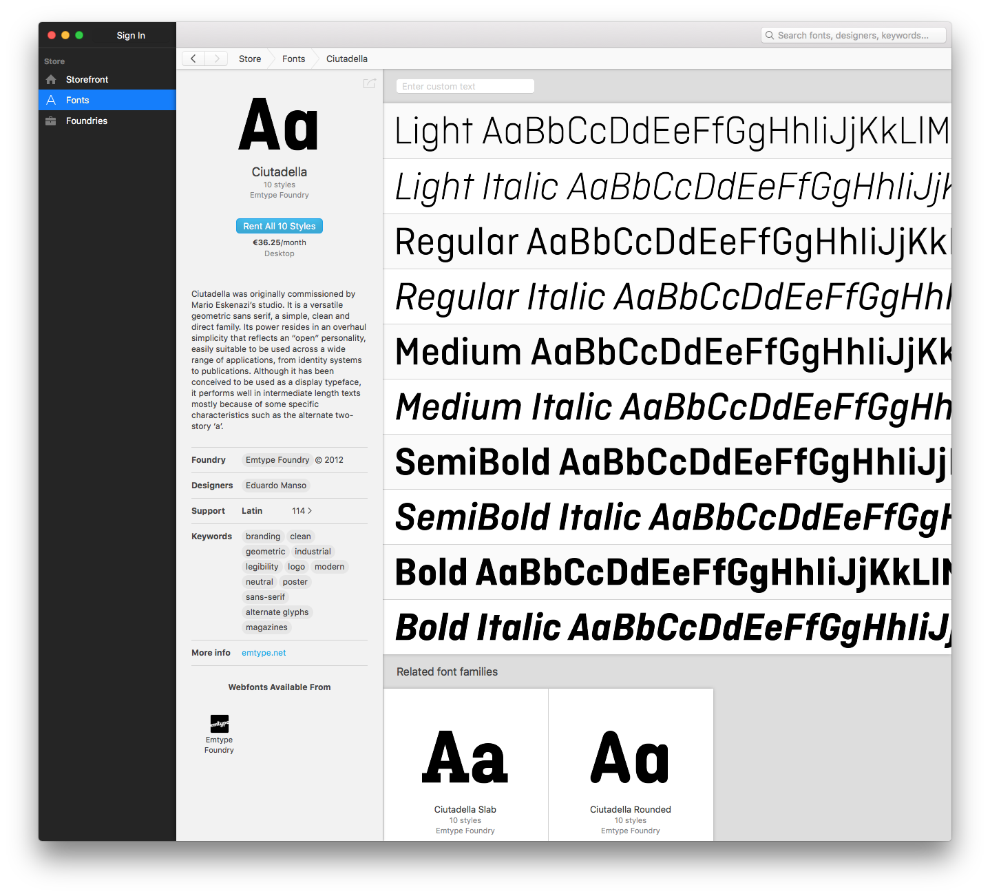
Ciutadella was originally commissioned by Mario Eskenazi’s studio and released in 2012. Conceived as a versatile geometric sans serif, it is a simple, clean and direct family whose strength lies in its clarity and approachable personality. Although primarily designed as a display typeface, it has consistently performed well in medium-length texts thanks to structural decisions such as the alternate two-storey a. Over the years, Ciutadella has been widely adopted by leading brands and institutions worldwide, with notable in-use examples including Qantas Airways, Berlinale, Swimming Canada or Tomorrow X Together, among many others...
Ciutadella was originally commissioned by Mario Eskenazi’s studio and released in 2012. Conceived as a versatile geometric sans serif, it is a simple, clean and direct family whose strength lies in its clarity and approachable personality. Although primarily designed as a display typeface, it has consistently performed well in medium-length texts thanks to structural decisions such as the alternate two-storey a. Over the years, Ciutadella has been widely adopted by leading brands and institutions worldwide, with notable in-use examples including Qantas Airways, Berlinale, Swimming Canada or Tomorrow X Together, among many others.
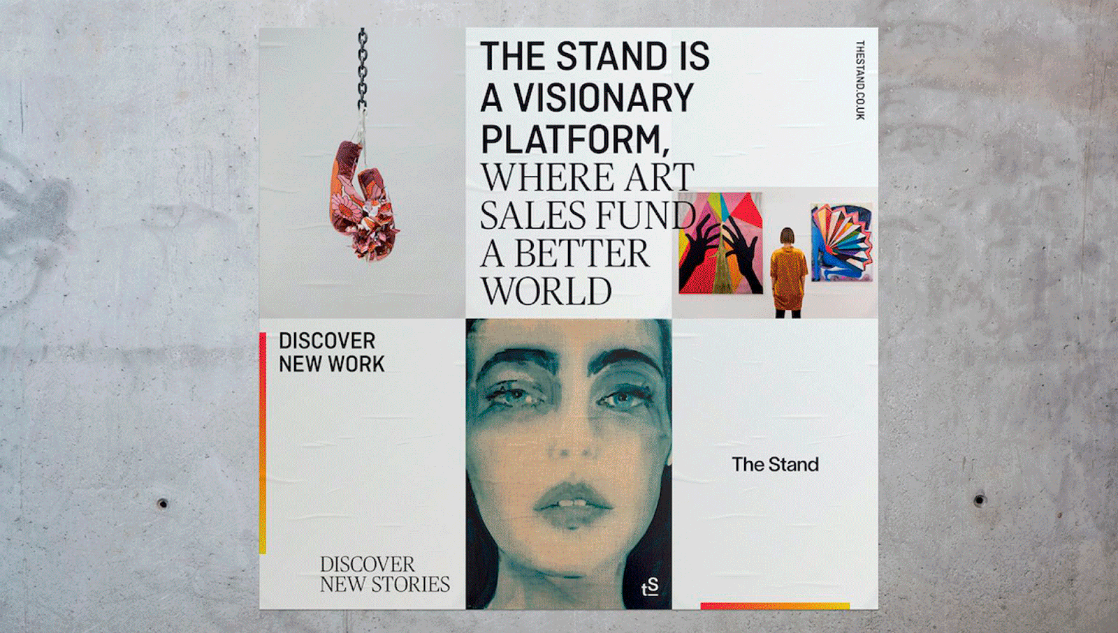
Ciutadella in use, selected examples.
This update (Version 3) does not aim to redesign the typeface but to consolidate it, refining minor drawing decisions, stabilising behaviour and expanding the system while preserving its original character.
This major update further develops Ciutadella into a more versatile and comprehensive type system.
The weight range has been extended with the addition of ExtraLight, ExtraLight Italic, ExtraBold and ExtraBold Italic, improving hierarchy control in identity systems, editorial layouts and interface environments while maintaining visual coherence across the family. Ciutadella is now provided as two long-awaited variable fonts, Roman and Italic, offering continuous weight control and improved integration into responsive and digital environments.
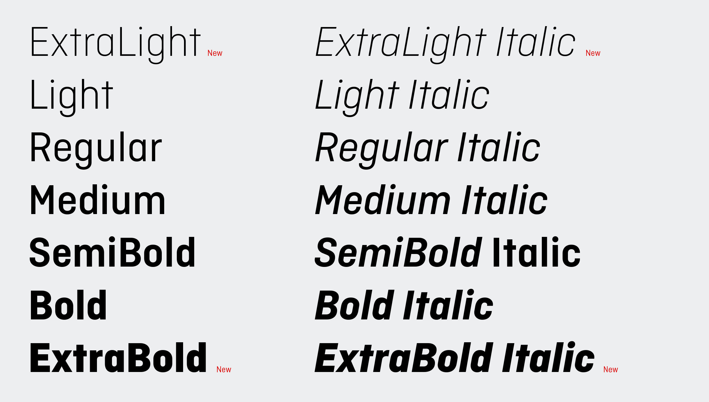
The family consists of 16 styles: 7 weights with matching italics and 2 variable fonts.
Particular attention was given to backward compatibility. Spacing remains approximately 99% identical to previous releases to minimise text reflow in existing documents. Only minimal corrections were introduced to resolve legacy inconsistencies affecting marginal characters such as ligatures, Đ (Dcroat), Ŀ (Ldot) and some fractions, together with a limited number of specific kerning improvements. Even minimal changes may cause some reflow and should be reviewed in production documents. Vertical metrics were revised to achieve more reliable vertical centring and consistent line spacing across UI, web and mixed-typeface environments.
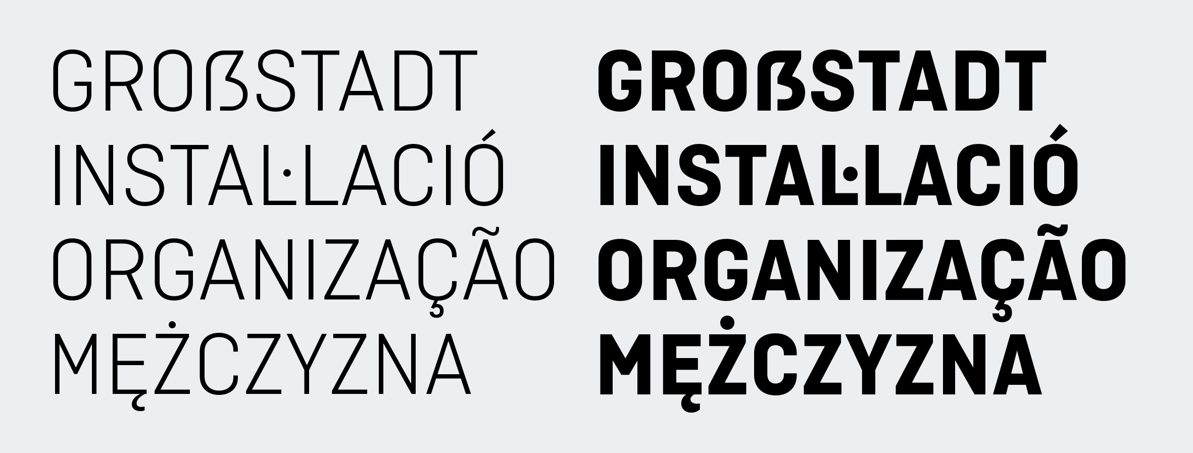
Capital sharp S (ẞ), Catalan Lgeminada (L·L), cedilla and ogonek.
Several glyphs were refined, including a new ogonek construction, a more traditional cedilla, a revised a.alt with a larger bowl and normalisation of discretionary features. Character coverage has been expanded with the addition of the capital sharp S (ẞ) and the Catalan Lgeminada (L·L) and lgeminada (l·l). OpenType features are now properly labelled for interface compatibility, including named stylistic alternates such as Alternative “a”, “t” and “ampersand”.
This update is provided as a free upgrade for Ciutadella customers who purchased directly from Emtype.net. To access it, simply download the updated files again from your account.
View Ciutadella Family / PDF