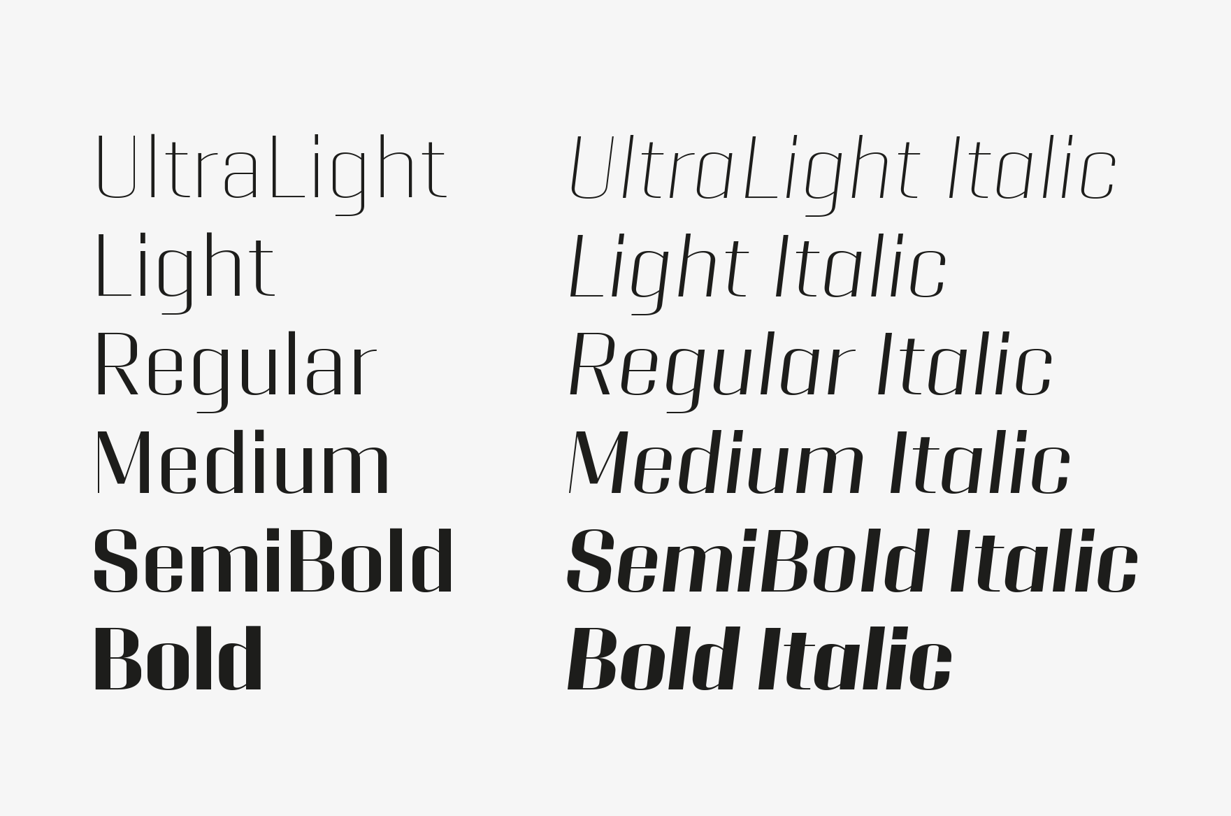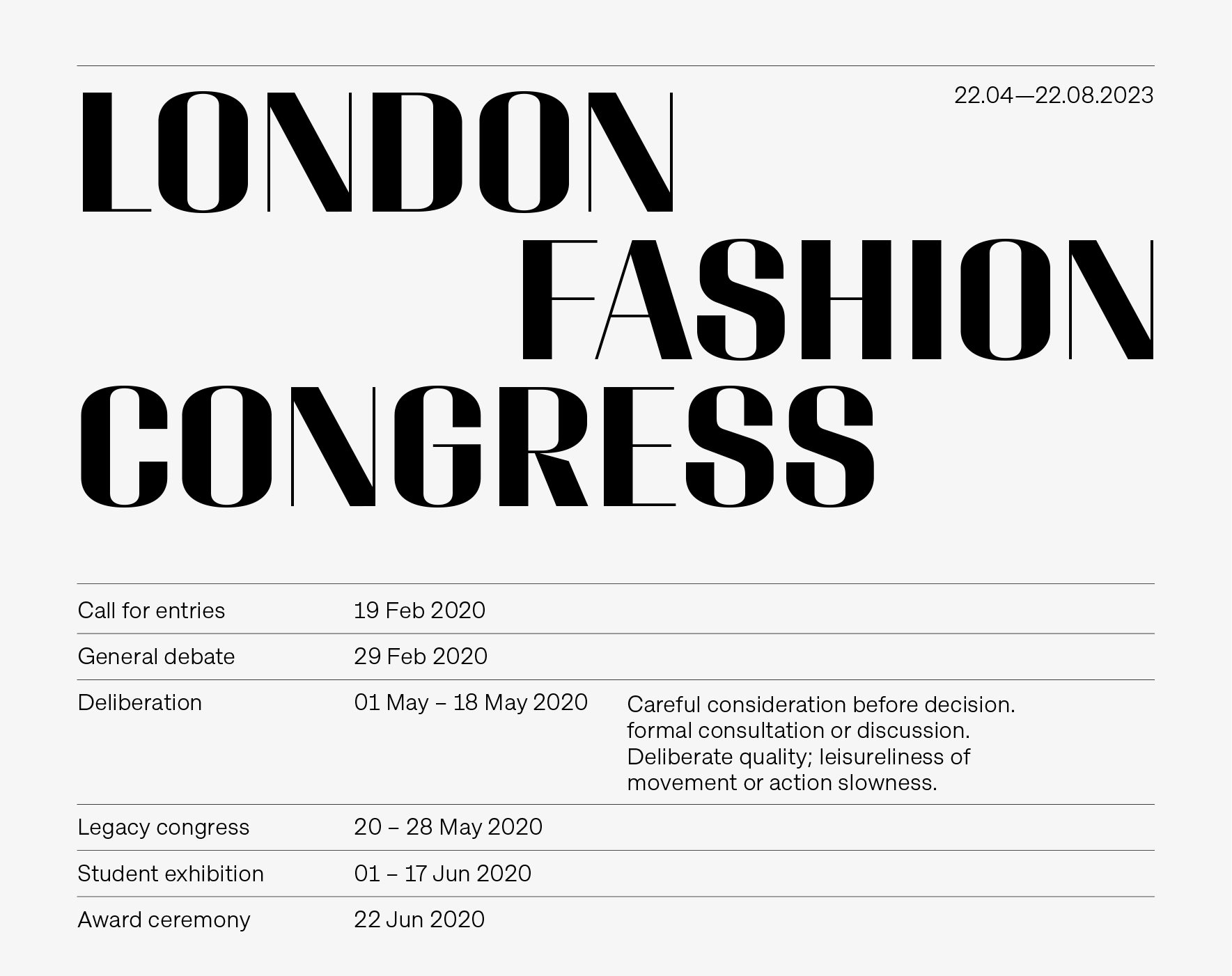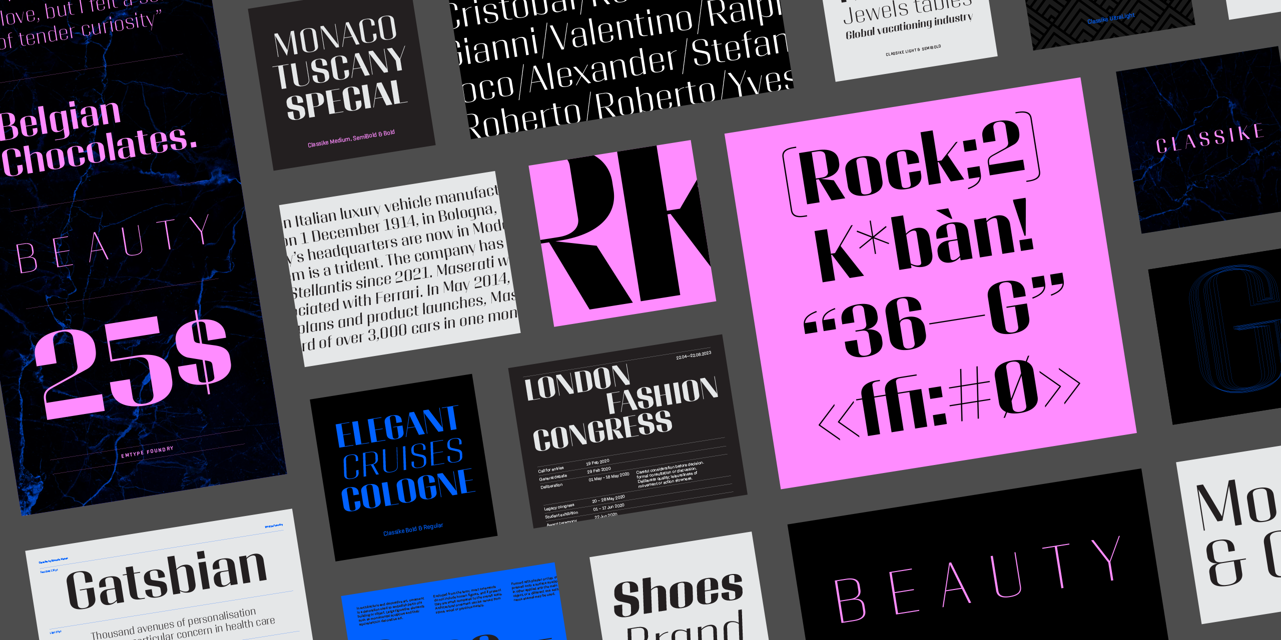
Classike is a high contrast squarish display typeface. Inspired by the Art Déco period from a modern perspective. Refined and elegant yet with a mechanical vibe, it is ideal for pairing with any functional font, it works especially well with Geogrotesque, from which it inherited its proportions and soul. Classike adds an exclusive touch and helps enrich your graphic voice...
Classike is a high contrast squarish display typeface. Inspired by the Art Déco period from a modern perspective. Refined and elegant yet with a mechanical vibe, it is ideal for pairing with any functional font, it works especially well with Geogrotesque, from which it inherited its proportions and soul. Classike adds an exclusive touch and helps enrich your graphic voice.


Basic characters of Classike Regular.


Inspiration

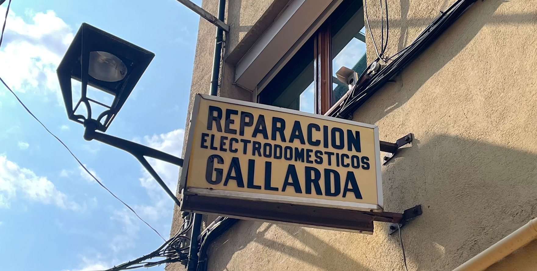
It is inspired by the Art Déco period and street signs typography. While traveling, I noticed that many signs combine squarish sans typefaces with high contrast styles of the same typeface. Those typefaces, sometimes lettering, thanks to the contrast, were more elegant and refined but had the same structure and conceptual essence as the squarish sans. 


One of the sources of inspiration; a traditional sign in Pugicerdà, Catalunya.


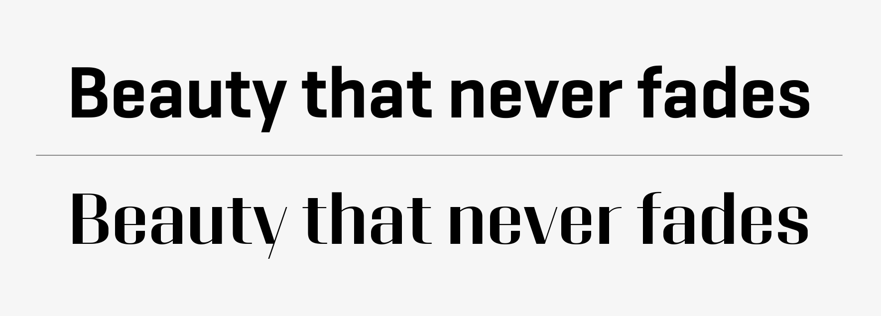
Classike inherits the proportions of Geogrotesque Sharp. I thought it was a solid starting point to create a high contrast sans. In the beginning we did several proofs to see how far we could push the contrast, but we finally opted for a moderate solution to make it usable in a wider range of situations. Despite this, it still looks luxurious and elegant. 


Comparisson between Geogrotesque Sharp and Classike, both in SemiBold.


In the beginning we did several proofs to see how far we could push the contrast, but we finally opted for a moderate solution to make it usable in a wider range of situations.


Details

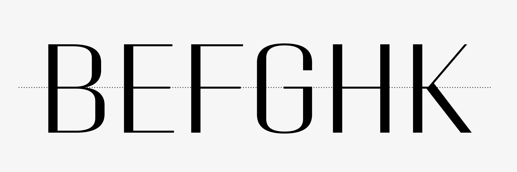
Apart from the high contrast that adds most of the charm, there are less visible details like the middle bar that has been aligned in several letters such as, B, E, F, G, K and H and the numbers 3 and 8. It is reminiscent of the hand painted street signs, where the letter artist would use only a few alignment lines for all letters. These regular proportions emphasised the Art Déco look of the family. 


Detail of the middle bar alignment in several letters.


It is common for many alternates to appear during the typeface design process, however, more is not always better. Too many alternates can lead to chaos and confusion for the user. So, the work of the type designer is also about editing, choosing which alternates are really useful and make sense for the project. Classike comes with just two alternates, M and R. Not a lot, evidently, but just enough to expand possibilities without deviating from the concept.


M and R with its alternate versions.


Naming

The naming deserves its own chapter. Nowadays, it’s extremely time-consuming to find a name that meets all the conditioning factors that a good font name needs. Asides from anything else it should be memorable, euphonic and short (for technical reasons). Most importantly, it must express the spirit of the font and show its best face; the name is like a mini specimen and most of the time it is the only touchpoint of your font with potential customers. On top of all this, the key aspect and the most difficult to achieve today is that it must be unused by any other font. With over 200k available fonts and counting (Between commercial and free fonts), it is becoming increasingly harder to do this. A good solution for the overload of names is to use a foundry prefix. I could use EMT for instance, but that would be a shortcut and as I didn’t do this from the beginning, I prefer to continue with the tradition and keep the names clean. This pushes us to find or invent original names that avoid any unfortunate coincidence. That is why Classike is not simply called Classique, in the proper french way.


Showcase of Classike working together with Approach.


Usage

Pairing with Geogrotesque is obviously easy due to its origin, but also with any functional sans. Above you can find a combination example with Approach. As a general rule, I design typefaces with a specific use in mind, it could be a very large list or short and specific. In this case, Classike was meant to be used in elegant situations so I wrote down the tentative usage in order to focus on the style. Among others, that list includes: Luxury resorts, lifestyle, heritage, wineries, private spaceships, cruises, Italian cars, classic bikes, cinema magazines, musicals, architecture, credits of mystery movies, perfumes, etc. These lists are useful but not always matched with the real usage of our fonts once published. The family include a Variable Font that adds all the advantages of the format (All in one file, low size, custom styles, etc). Although Variable Fonts are not fully established in the market yet, it is ready and waiting for that moment. In clonclusion, we are really looking forward to see all of your fantastic uses of Classike :)


View Classike


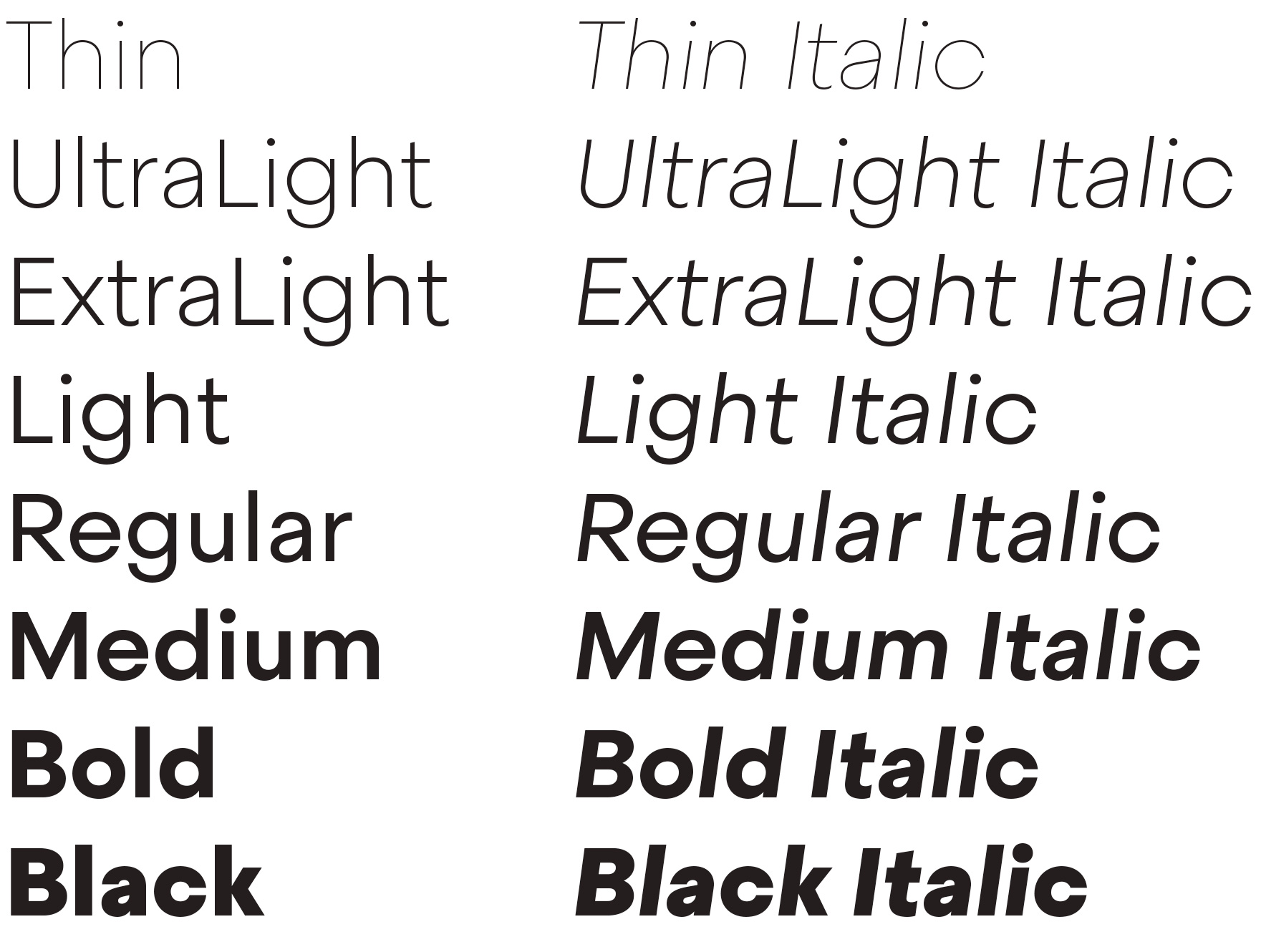
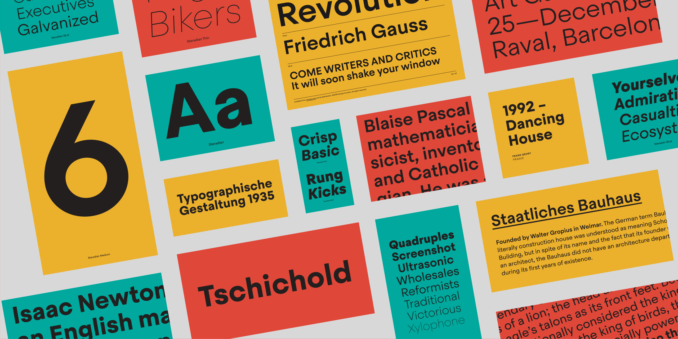
Steradian is an exploration of the geometric genre and although it has a geometric base, the widths between letters are not much different across the weights, something common of the style. That is due to the process, in which the proportions of the heavier weights paved the way for the lighter ones. It also has a series of details that make Steradian stand out and gives it a special touch. Some of its main features are the double-story ‘a’, its closed apertures and some of the capitals have a distinct personality (such as the G and Q)...
Steradian is an exploration of the geometric genre and although it has a geometric base, the widths between letters are not much different across the weights, something common of the style. That is due to the process, in which the proportions of the heavier weights paved the way for the lighter ones. It also has a series of details that make Steradian stand out and gives it a special touch. Some of its main features are the double-story ‘a’, its closed apertures and some of the capitals have a distinct personality (such as the G and Q). 


The family has 16 styles, 8 weights plus matching italics.


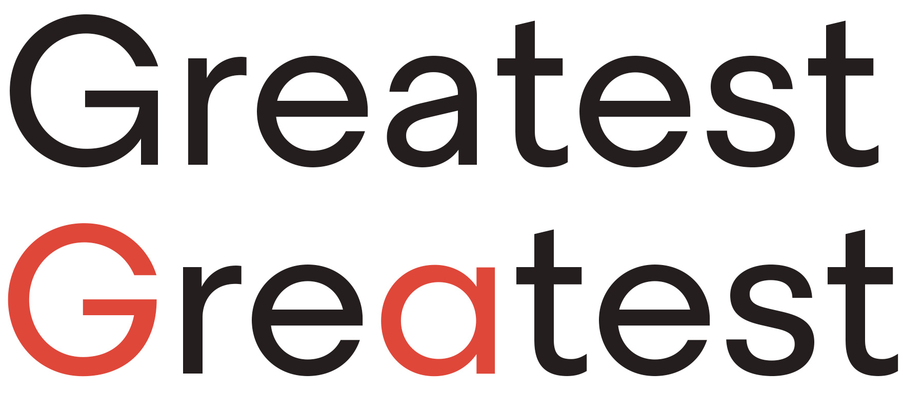
From a historical point of view, this font owes more to the history of typography than any other font in our catalogue. I wanted to do my own geometric version, but how different it could be? The geometric style is a consolidated style with specific rules and little space for innovation. Sometimes the differences depend on some key characters, the style of the numbers and currency set, or even marginal signs like ‘section’. Steradian is inspired by classic geometric typefaces whilst trying to add a twist to this overcrowded genre. It is a moderate typeface: moderate width proportions, moderate vertical proportions and moderate x height too.  


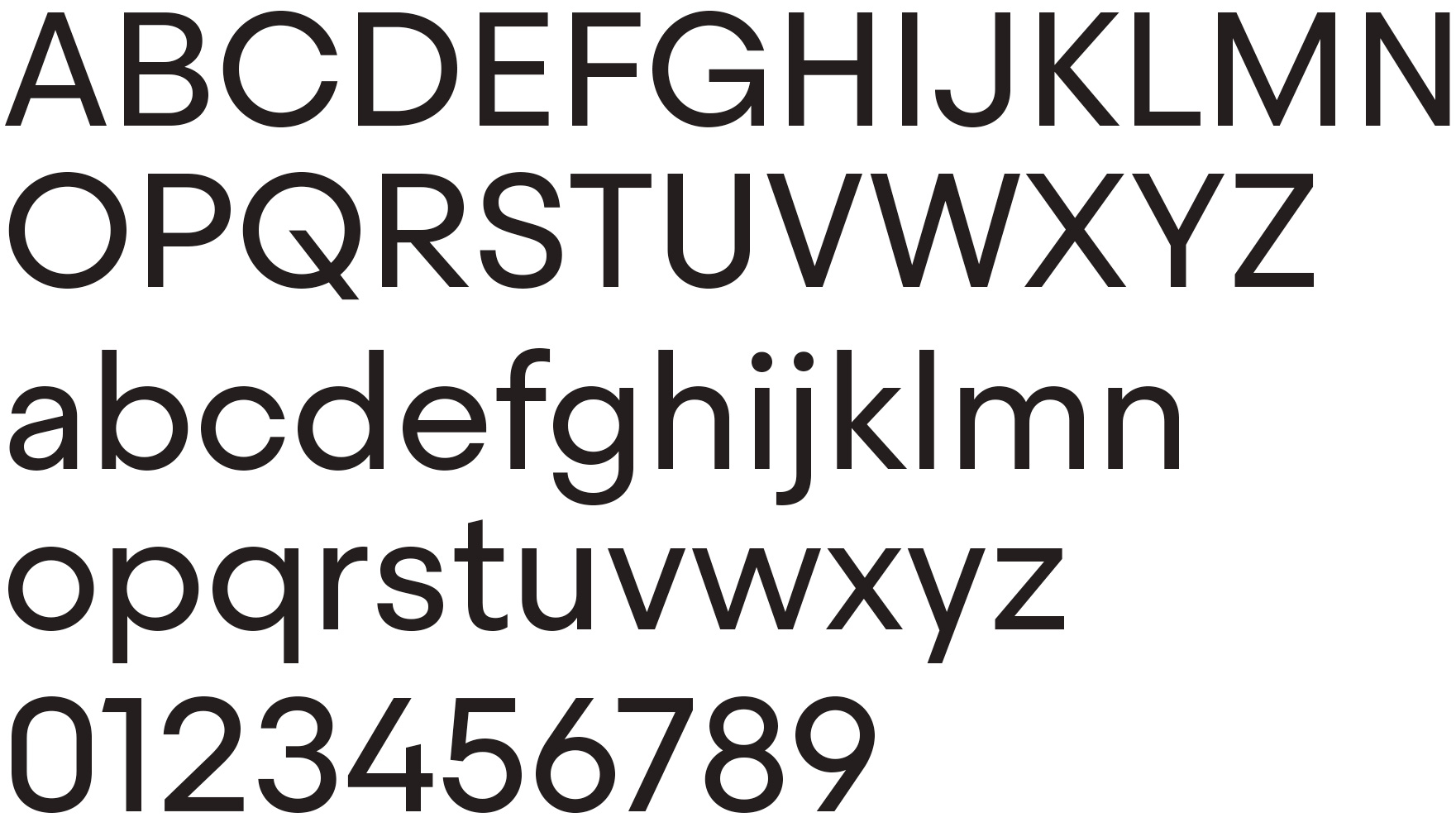
Steradian basic character set.


All of the round letters are derived directly from the circle, but the shapes are not slave to pure geometry. There are many different shades and variations across the family, adapting the original geometric form to multiple widths and weights. As with many typefaces of its style, it has a pseudo geometric approach with lots of adjustments that make it look more refined. On the one hand the light weights are based on a perfect geometric circle while the heavy weights are more expanded in order to allocate more weight to the letters. In terms of weight, strict geometry has inescapable limits.  


Variation on the original circular shape across the family.


The proportions were worked out from the heavy weights, and thanks to a ‘flexible geometry’, the light weights did not suffer the extreme change in proportions that is typical of the geometric style. I tried to find a balance between pure geometry and proportions which resulted in a hybrid font. For example the top and bottom curves of the lowercase ‘s’ are a little bit flat in appearance compared with the ‘o’, but this is all part of the charm of the typeface.  


Inspired by classic geometric typefaces whilst trying to add a twist to this overcrowded genre.


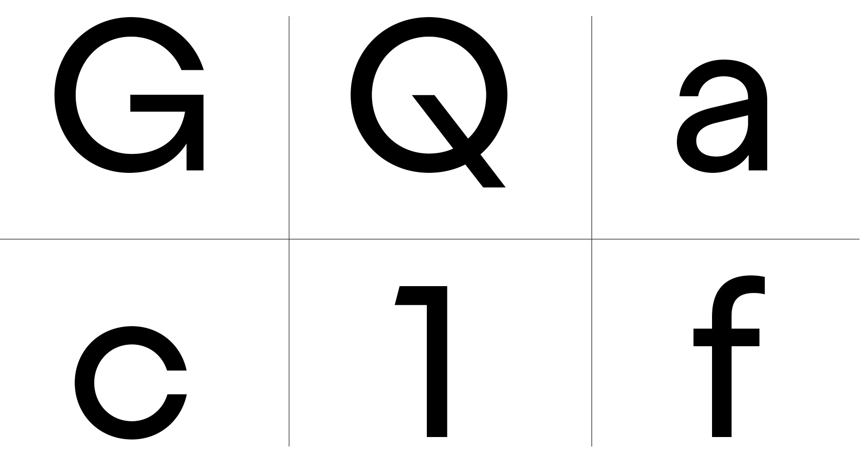
Some of the characters have distinctive features. In capital letters, ‘G’ has a notorious notch on the right bottom, and capital ‘Q’ has a prominent diagonal. Steradian has a double-story ‘a’ and closed apertures, like in ‘c’ or ‘e’. Some characters have diagonals cuts, like the ‘t’ or the Futura style ‘1’. Finally, letters like ‘t’, ‘j’ and ‘f’ have a sharp endings more typical of the English sans style. 


Detail of some charecteristic features.


There is a more traditional ‘G’ and ‘a’ as alternate characters that turns it into a more classic geometric typeface. During the process I normally design a lot of alternatives for many glyphs just to decide which ones work best, or which combination is more original or adequate for a specific purpose. At the end of the process I edit and reduce all of the alternatives to the essential. For example I had several versions of the ‘Q’ but in the final version there is no alternative because this particular letter contributes a peculiar flavor to the family.


Alternative characters.


Its personality has a clean and modern voice that transmits a contemporary message, ideal for use in editorial and branding. Its close apertures however make it unadvisable for use in smaller sizes but ideal for intermediate and larger scales, where it shows off all of its idiosyncrasies and distinctive text texture. Steradian is a hybrid geometric sans typeface. Most of the letters have a classical architecture but others are unexpected yet matching. It is intended for use in a wide variety of applications and topics where it will add its distinctive touch. 


View Steradian


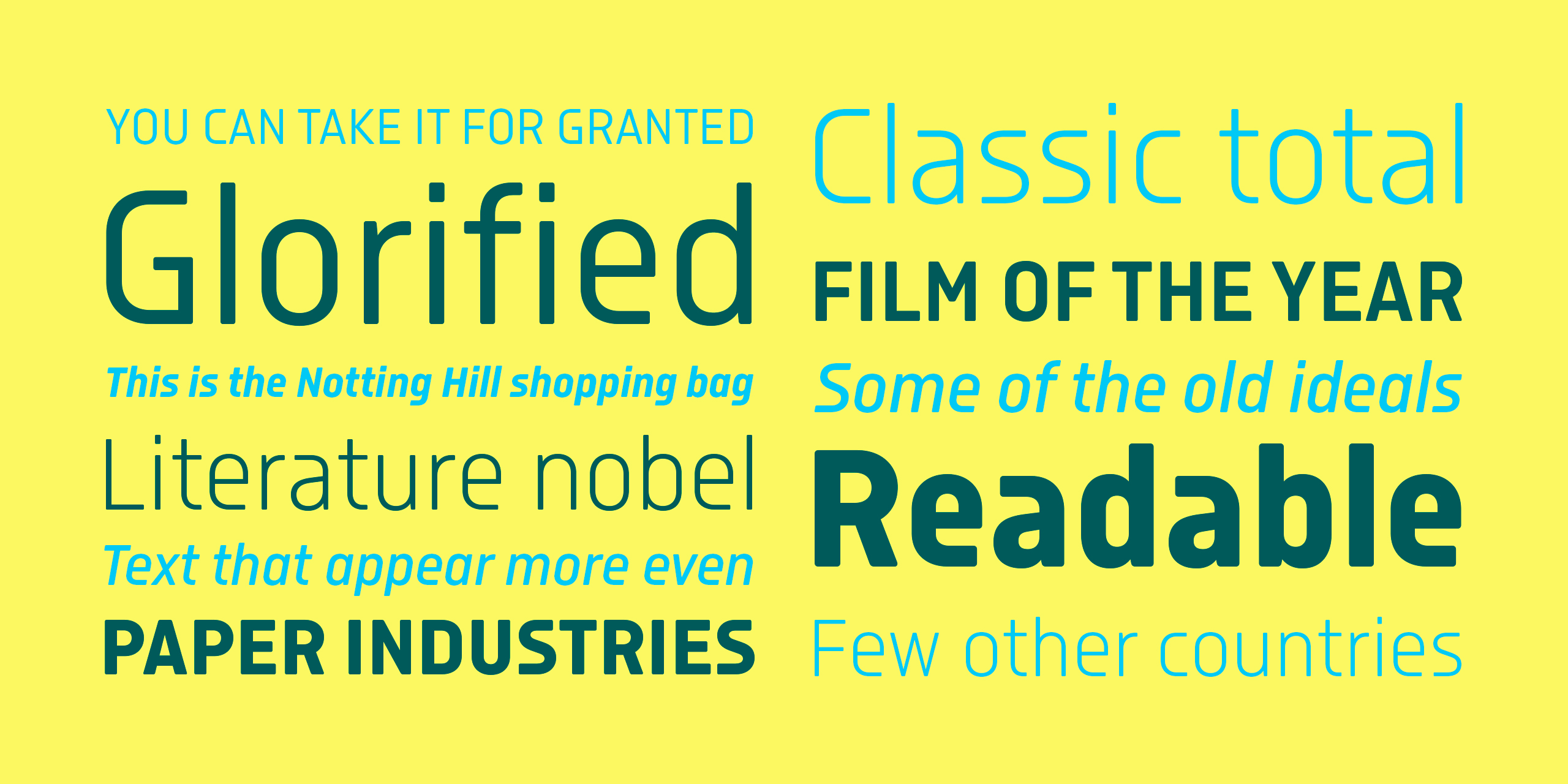
Isotonic started out as a spin-off with the idea of creating a text oriented version of Ciutadella, It has since taken on a life of its own. Building on a foundation that has proven to work very well, we decided to open the counters and increase the x height. Even though it is not strictly a text font, it works surprisingly well in body sizes and screens. The soft corners gives charm, closeness and an appropriate voice for sports, science, tech, economy etc...
Isotonic started out as a spin-off with the idea of creating a text oriented version of Ciutadella, It has since taken on a life of its own. Building on a foundation that has proven to work very well, we decided to open the counters and increase the x height. Even though it is not strictly a text font, it works surprisingly well in body sizes and screens. The soft corners gives charm, closeness and an appropriate voice for sports, science, tech, economy etc.

Word comparisson between the original Ciutadella and the new Isotonic


Isotonic is a close relative of Ciutadella, slightly condensed in comparison. It shares the same structure but has some text features that makes the font more legible: open counters in several letters (a, c, e, s, 2, 3, etc), double-story letter ‘a’ , and a higher x-height. There are some more distinguishing details like the squarish i and j dots, the quotation marks or the subtly rounded corners across the family.

Detail comparisson of the soft corners and the x height with Ciutadella


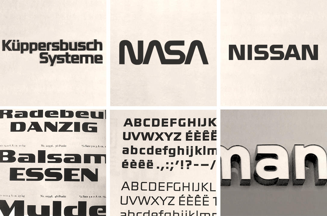
Straight terminals are a recurring resource among techno or futuristic fonts and logos. This is not a new idea, we can see early examples of it in the  XX century with typefaces like Gigant (circa 1900), in the work of Adrian Frutiger with his Element Grotesk, Küppersbusch Systeme logo or the Electricity de France typeface and logo. We could also look at the NASA logo from 1975 or the Nissan logo drawn by Matthew Carter in 1983. Nevertheless, Isotonic is not inspired by any specific typeface, the main idea is to apply straight terminals to a fully functional, multipurpose typeface with a wide range of styles and potential uses.


Several examples of fonts and logos showing similar features across the past century: Küppersbusch Systeme logo (1980) and Electricity de France typeface (1967 - 1968) images are from Osterer, Heidrun, and Philipp Stamm. Adrian Frutiger - Typefaces: the Complete Works. Birkhauser, 2014. NASA logo by Richard Danne, 1974 and Nissan logo by Matthew Carter, 1983. The Gigant font is from Genzsch & Heyse Schriftgiesserei Proben Von Schriften Und Initialen. Hamburg-München: Genzsch & Heyse, 1913. The last example is from the signboard of Chalamanch bookshop in La Pobla de Segur, Catalonia (circa 1980).


The collateral effect of the straight counters is that the typeface becomes hard and mechanical in appearance. We counteracted this effect by using soft corners, striking a balance between mechanical and softness thereby giving a friendly touch to the whole system. 


Even though it is not strictly a text font, it works surprisingly well in body sizes and screens.


This family has a modern, present-day style but maintains a versatility of use. Isotonic has a unusual personality that distinguishes it from others without being completely new, strange or out of place. Some of its shapes are uncommon for a text face but not uncomfortable, in fact, there are dozens of design applications to which Isotonic is well suited like branding, magazines and web.

Selection of characters with open counters


It is available in Open Type format and includes Ligatures, Tabular Figures, Fractions, Numerators, Denominators, Superiors and Inferiors. It supports Central and Eastern European languages. The type family consists of 10 styles, 5 weights (Light, Regular, Medium, SemiBold and Bold) plus italics.


View Isotonic typeface


Note: All product and company names mentioned in this article are trademarks or registered trademarks of their respective holders. Use of them does not imply any affiliation with or endorsement by them. 

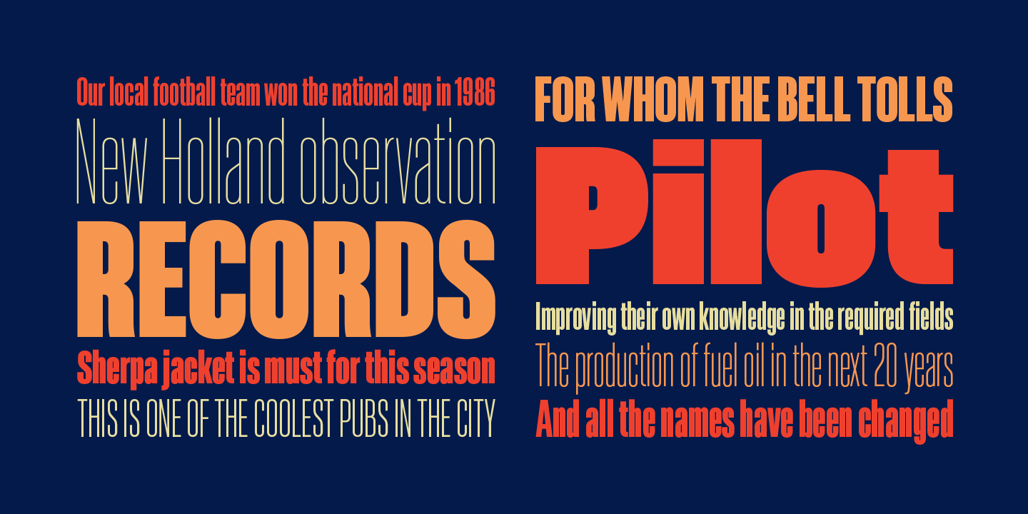
Akkordeon is a display font family roughly inspired by grotesques from the XIX and XX centuries. It is not conceived as a family of constant width but has a variable breadth from narrow to expanded, offering a wide gradation of weights. Akkordeon is designed to be used in short texts such as magazine titles, banners, cover books, charts, advertising, branding and any situation where a compact, solid and powerful font is required... 

Akkordeon is a display font family roughly inspired by grotesques from the XIX and XX centuries. It is not conceived as a family of constant width but has a variable breadth from narrow to expanded, offering a wide gradation of weights. Akkordeon is designed to be used in short texts such as magazine titles, banners, cover books, charts, advertising, branding and any situation where a compact, solid and powerful font is required. 


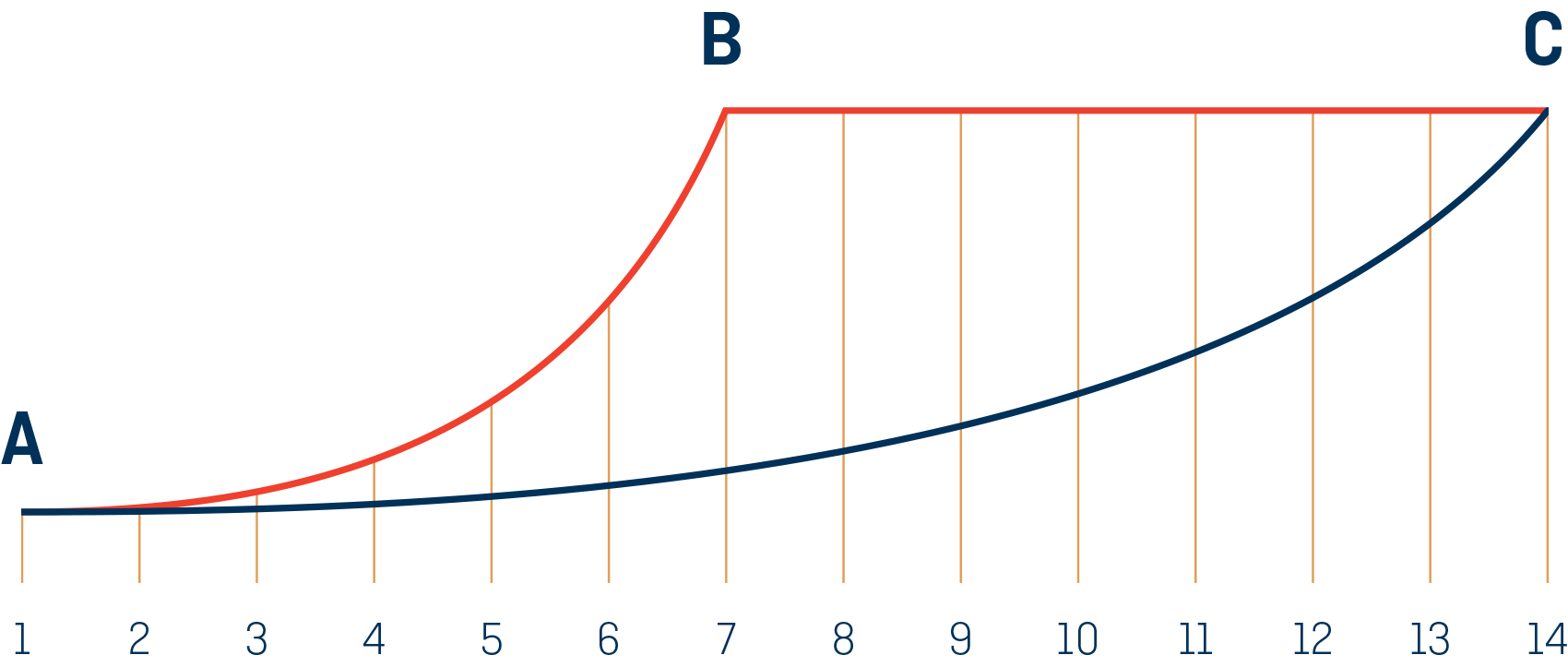
The increase of width and visual weight in Akkordeon is not linear. The width, shown in blue, it is progressive across the gradient: while the visual weight, shown in red, becomes almost constant in the bolder styles.


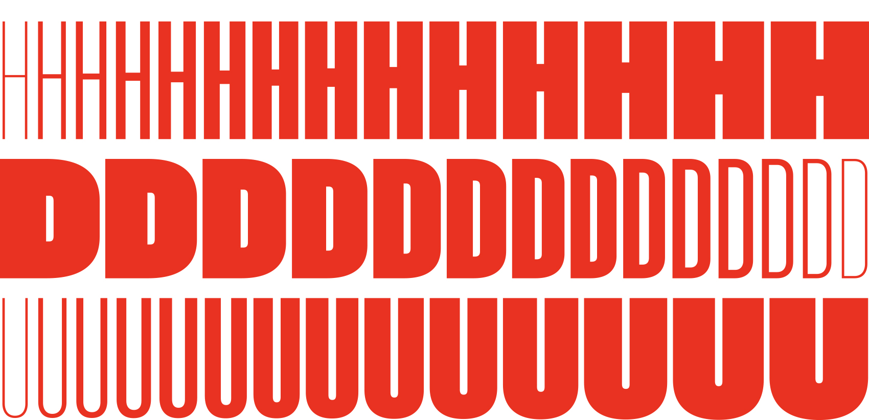
Akkordeon is not structured as a typical typographic family where weight and width go separately, Akkordeon does not differentiate between one and the other. The name of the family, Akkordeon (accordion in German) tries to reflect that same idea of flexibility. As a result, the names of the styles also escape the standard nomenclature, they are structured in numbers from one to fourteen to show both the change of weight and width. As the letters increase in weight it stops being condensed in order to accommodate the extra weight. Heavy weights contain an unusual amount of black making them the right choice when impact and force is needed. However the lightest and more condensed weights are subtle and elegant.


A sample of the letters evolution across the weights. From the compressed thin to the expanded bold in fourteen subtle but significant steps. 


In the early XX century the idea of type family was more flexible and less defined than now. Nowadays it is a common thing to create a range of weights between light and bold and in some cases width variations from condensed to expanded. In the past, however, the number of styles of a family and their characteristics were defined by changing needs during different years or even decades mixing width and weight freely. 


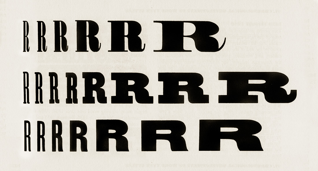
Examples of width and weight increase in a series from American Wood Type: 1828-1900: Notes on the Evolution of Decorated and Large Types and Comments on Related Trades of the Period. New York: Da Capo, 1969 by Rob Roy Kelly.


It is not conceived as a family of constant width but has a variable breadth from narrow to expanded, offering a wide gradation of weights.


According to Rob Roy Kelly, in some traditional wood types, a width increase was usually accompanied by a weight increase. Varying the width of the styles as they gained weight, a great versatility was achieved because this range of styles easily adapted to changing length texts. These expanding type designs were more popular in the United States than in Europe and there are many turn of the century examples of sprawling series much less systematically designed than later families. 


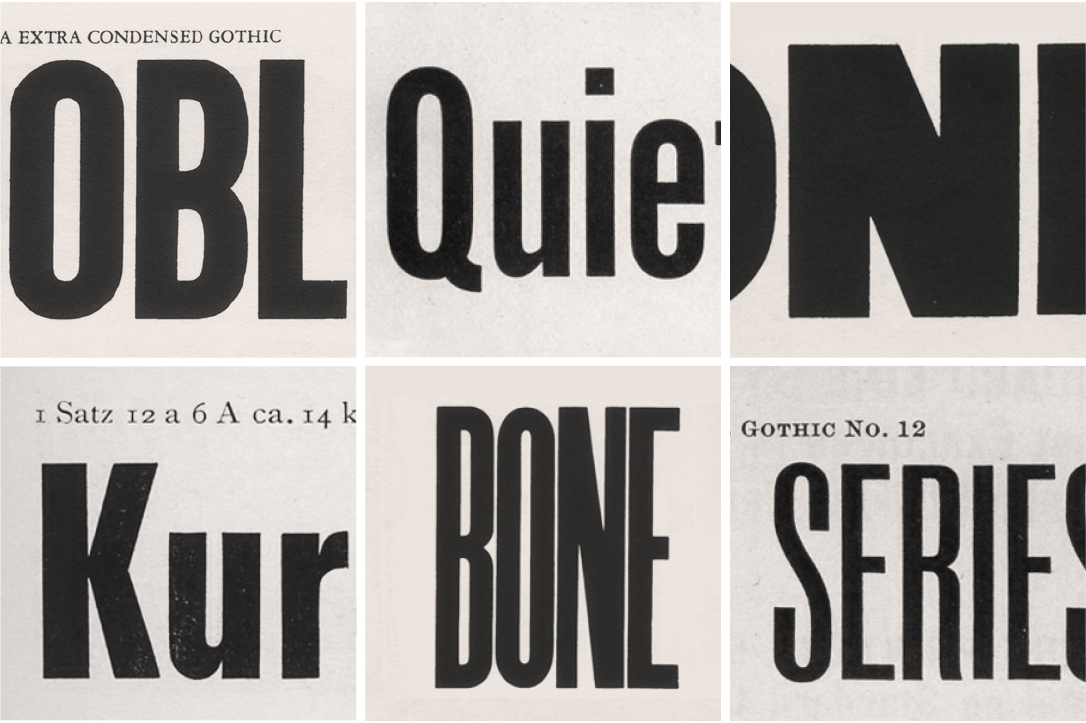
Several grotesques from the XIX and XX centuries that were a source of inspiration for several details in the letters and numbers shapes. The images are from Rob Roy Kelly’s American Wood Type:1828-1900. New York: Da Capo, 1969. American Type Founders Company Specimen Book and Catalogue 1923. New Jersey: ATF, 1923. Genzsch & Heyse Schriftgiesserei Proben Von Schriften Und Initialen. Hamburg-München: Genzsch & Heyse, 1913. Inland Type Foundry Pony Specimen Book. Sant Louis: Inland, 1907.


In Akkordeon, the weight becomes massive in some styles. Although it starts as a very thin and condensed font, there comes a moment that the increment of weight implies expansion. We decided not to be restrained by the original width but to widen the shapes so as to accommodate an extra amount of black. Combined with adaptive flat sides across the weights, this family achieves its heavy weights without losing its identity and without becoming a caricature of itself.


Detail of the adaptive flat sides, reducing the segment as the weight increases. We have used a design space including the five masters above in order to have more control of every detail across the whole system.


Thanks to a path that is not often explored, and having some characters with an untamed touch, Akkordeon becomes somewhat special. With that particular approach and family structure, a very rich palette was created, the light weights work as real space saving fonts and the bolder ones become strong for headlines. Akkordeon is specially designed for use in combination with text fonts to generate contrast, like similar typefaces were used it in the past for traditional shows, fair and circus posters and more.


Some characters with turn of the century grotesques influence 


The type family consist of 14 weights and it is available for Desktop, Webfont, ePub, App and Server with support for Central and Eastern European languages. Akkordeon is a versatile display font that offers a wide range of weights as well as creative options.


View Akkordeon  /  View Akkordeon Slab


Typography is a key factor in any graphic identity, but when we talk about a journal this takes special relevance. A newspaper is virtually done only with typography, it could be done without pictures, but not without words. A custom typeface gives cohesion to all the elements of an identity and when we use the font, no matter the application, we are strengthening the brand. Periódico (newspaper in spanish), was originally commissioned by Alfredo Triviño for the spanish daily newspaper ABC. Inspired by old spanish typographic engravings, mostly from the second half of the XVIII century, we picked out the most relevant details of spanish typography as the source of inspiration, and instead of making a revival or an interpretation of these models, we started from scratch to create a truly original font family...

Typography is a key factor in any graphic identity, but when we talk about a journal this takes special relevance. A newspaper is virtually done only with typography, it could be done without pictures, but not without words. A custom typeface gives cohesion to all the elements of an identity and when we use the font, no matter the application, we are strengthening the brand. Periódico (newspaper in spanish), was originally commissioned by Alfredo Triviño for the spanish daily newspaper ABC. Inspired by old spanish typographic engravings, mostly from the second half of the XVIII century, we picked out the most relevant details of spanish typography as the source of inspiration, and instead of making a revival or an interpretation of these models, we started from scratch to create a truly original font family. 


The goal was to achieve a very distinctive family, functional and versatile while still reminiscent of the old spanish typography. Before starting to draw, we began to thoroughly investigate what is understood by the term ‘Spanish typography’. At the very first stages of the design process, we came up with a classic semi-condensed serif. It was elegant but not very distinctive. It was mandatory to push up the envelope a little bit, to step back from the fonts used in rest of the spanish newspapers.


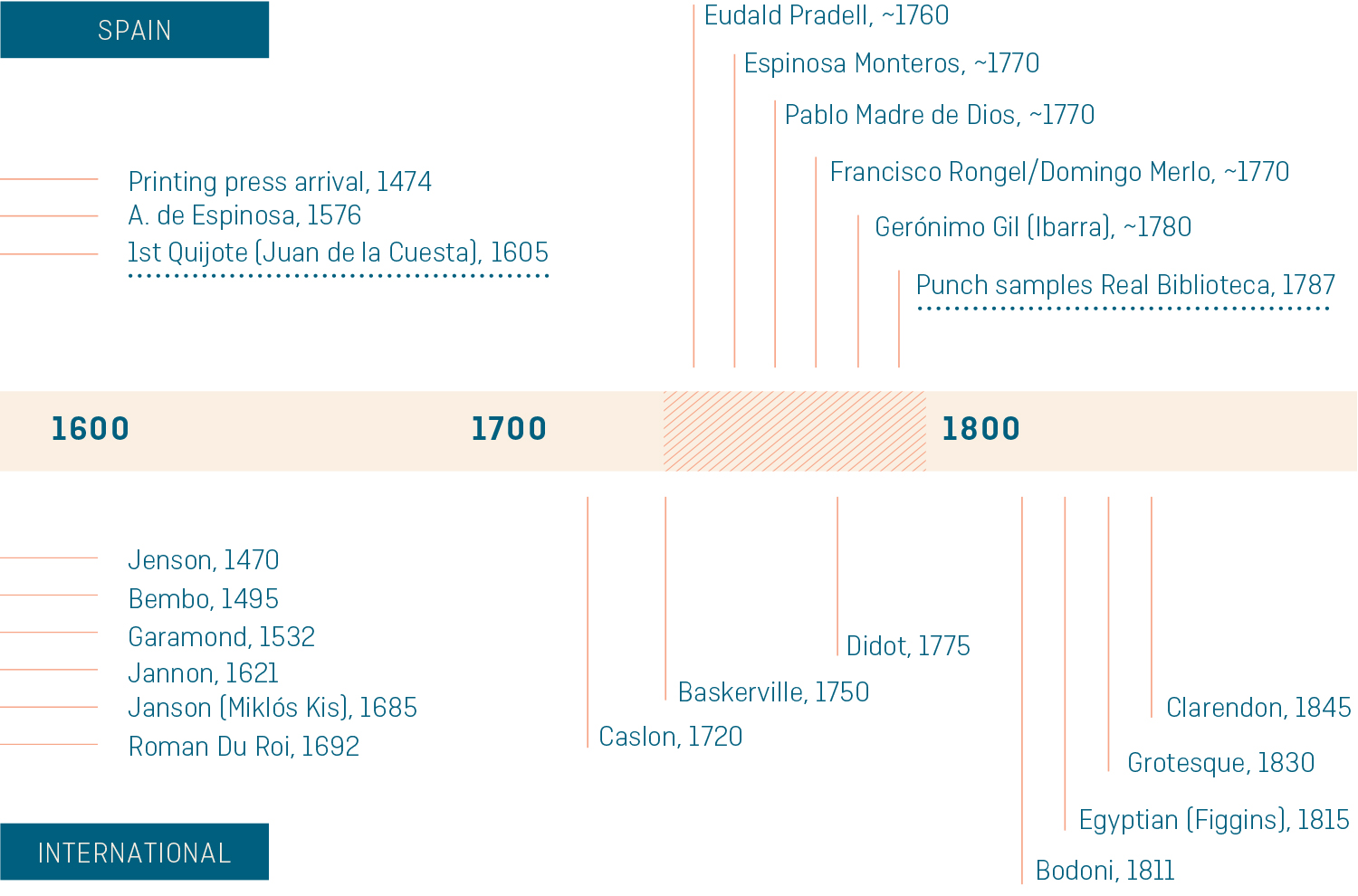
The timeline above shows the most relevant events in typography history, comparing the activity between Spain and the rest of the world. It starts before 1500 and ends in mid 18th century, and the main period for the spanish typography was the second half of the XVIII century. Before and after that moment the type-related events in Spain were sparse.


There were specific needs to meet, so we took a more daring and bespoke approach. Trying to design a refined yet differential typeface, modern and contemporary but keeping a link with the Spanish typographic past. With that idea in mind, the proportions, the contrast, and the serifs were changed to create a genuine newspaper-ready font, evolving and updating the shapes from the past without copying them literally.


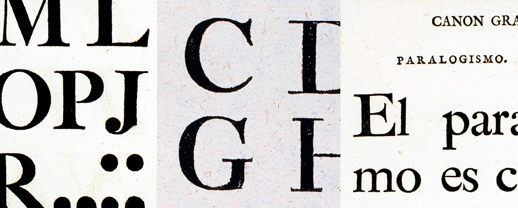
The first and the third image are taken from “Muestras de los punzones y matrices de la letra que se funde en el obrador de la Imprenta Real”. Madrid: Imprenta Real, 1799. The center image is from “Carácteres de la Imprenta Real en 1788”. Madrid: Imprenta Real, 1788.


As a result, the letters ‘a’ and ‘g’ are probably the most distinctive of the Periódico family. The shape of the bowl in the letter ‘a’  with the top arch in a diagonal position is very characteristic of old spanish types. In Periódico we emphasize this detail by applying it to many other letters (like ‘u’, ‘j’ and ‘t’) up to a point that it became the ‘leitmotiv’ of this family.

Selection of formal principles from historical references. All these design details define the system and give cohesion. 


Although we have borrowed many details from the old spanish typography, (like the nail, present in the letters ‘U’  ‘G’ or ‘J’, which we worked on and evolved in order to be applied to other letters) we have also left behind several others. One example is the tilde of the ‘ñ’ engraved by Gerónimo Gil, a very distinctive element of spanish typography that was intentionally omitted for being to atypical for use in a contemporary font. 


The goal was to achieve a very distinctive family, functional and versatile while still reminiscent of the old spanish typography.


The formal finish of serifs and terminals is something that gives great personality to any typeface, so we came up with plenty of alternatives in order to find the exact shape we wanted; sober, elegant and contemporary. Even though the serifs are geometric, the upper terminals have a curve with very similar dynamics to the arch in the ‘a’ or the notch in the ‘j’  The terminals in the capitals follow the same style but in this case the inspiration comes from Pradell's Missal, which on the other hand has been influenced by the types engraved by Johann Michael Fleischman in the Netherlands.


A preliminary poster version for really large sizes. Finally this weight was not developed because its use would be very restricted.


Eighteenth-century types were mostly used for printing books and so they have very generous proportions (large ascendents and descendants) and high contrast, but today these characteristics do not work well in newspapers as the news world demands more space-saving fonts. The adaptation of the type's proportions for newspaper use was one of the most interesting parts of the project, specially the time taken to find the perfect balance between the x height and legibility. 


Formal principle that guides the design, to create a palette of repeating shapes that are interrelated. The idea was to create a formal system that could be transferred to each element of the font.

Directly derived from the ‘a’, this corner is present in different parts of several letters, giving Spanish flavor to the whole thing.

Comparison between Periódico Text and Periódico Display. The display version is slightly different, it has more contrast and a tighter spacing.


Regarding the styles, one might argue that as so many variables are needed this gives many more choices to the designers, giving them more tools to do their job well. It's a matter of probabilities so we create a really complete typographic palette to choose from. For that reason, Periódico is presented in 30 different styles, 10 fonts for text (from Light to Bold) and 20 fonts for display sizes (from Thin to Ultra Black); this family results in an extensive system capable of solving all the needs of a large publication.


View Periódico


Cookies preferences

Required cookies
Strictly essential to ensure the correct functioning of the website.
Analytical cookies
Allow us to know how users interact with the website and to improve its performance.