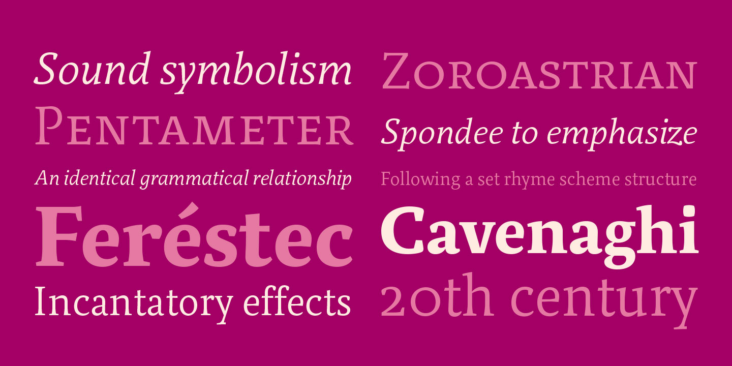
A ‘relato' (short story in Spanish) is a written piece in narrative form that does not have enough pages to be considered a novel and so few to be defined as a traditional tale. We liked the idea of creating a typeface for medium length texts. It gave us the chance to create a more personal font and released us from the burden of traditional text types. The first Relato sketches were made in late 2003, the idea was to make an individual type with unique features, reflecting a human quality while respecting the characteristics of the text typefaces. The purpose here was to make neither a font with a Latin feel, nor one with the coldness of a clean and austere language. Relato has little contrast and a muscular structure which favors its use in texts. In display sizes, it has a lot of details that gives it personality. The formal principle of the serif, the variety of terminal, and the combinations of curves with semi straights give Relato a human flavor.

The serif of Relato are inspired by Albrecht Dürer model but have a slightly more elaborate structure, but as in the original model, all the cuts correspond to segments of circles.
Inspiration came from a variety of traditional calligraphic styles, such as lowercase inspired by the humanistic calligraphy and the uppercase in Renaissance Roman Capitals, especially in studies done by Albrecht Dürer circa 1510. It must be said that the proportions had to be balanced because the Dürer system is too artificial and lacks the sensitivity of the human eye. But even so, Relato has a decidedly contemporary look, due to it is also based on ideals about type design.
A relato, short story in Spanish, is a written piece in narrative form that does not have enough pages to be considered a novel and so few to be defined as a traditional tale.
In text sizes the general proportions define the personality of the font, while in display sizes it is the terminal strokes, the serif that provides character. In this regard, Dürer studies also served as inspiration to build the serif palette. Although construction has a geometric origin, this is only anecdotal; the final result conveys certain informality rather than rationality. Although variety is one of the most remarkable qualities of this typeface, unity can be achieved even with disparate elements, different terminals and mixture of curves. This is essential to achieve a dynamic and lively font.


Terminal strokes palette to control the formal variety. Details of the letters.

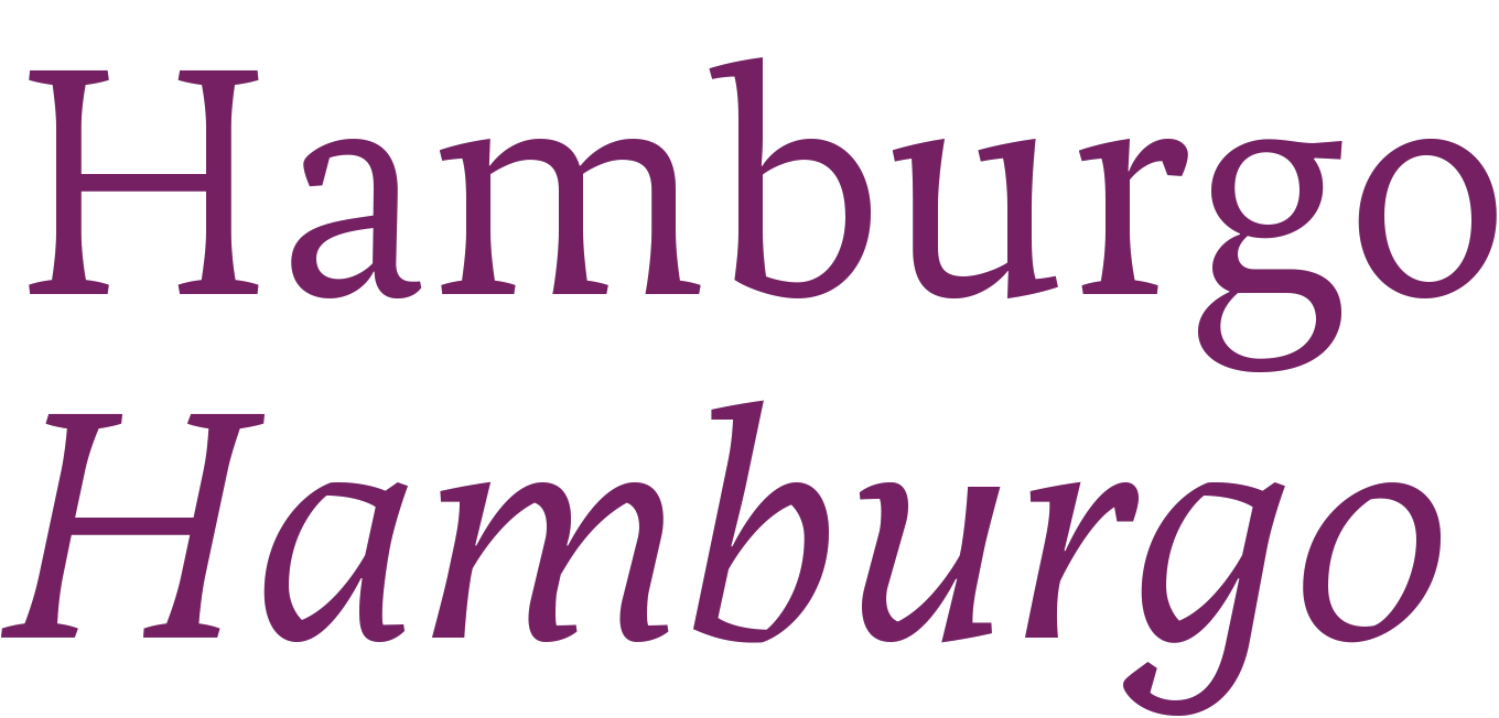
Comparison between roman and italic.
The texture of Italic differs from the Roman as the construction is based on broken lines. Apart from its unique rhythm, the structure of the Italic does not reveal any special features at text sizes, however upon closer inspection some details appear (the broken lines being the most obvious). When used at display sizes there is a special dynamic with some aggressive and even spicy touches.

Contrast in the strokes joint.
The bold weights increase the contrast at the junction of the lines to improve legibility on small bodies and strengthen their personality in display sizes. As in Bohemia the weight difference is noticeable, but for the average reader it is hard to appreciate the subtle differences of weight. The contrast is a crucial factor, although there is very little difference between the horizontal and vertical lines (it is a typeface of low contrast) the area where the arc is born is highly contrasted and no black mass is formed (as in past century Dutch fonts). The weight increase was performed in a manual mode without using any automatism. This method control of the shape in a sensitive way, some areas fatten a lot and others perhaps just a little.

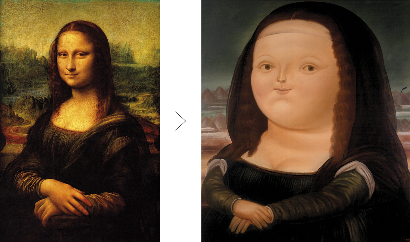
Interpretation of Mona Lisa by Fernando Botero.
Something similar happens with the work of artist Fernando Botero. There seems to be a direct relationship between the way his characters are made and how bold is built. Botero does not fatten everything equally, but uses his sensitivity to keep some details stylized. So despite being fat, his characters do not look misshapen, they maintain the original essence. The Relato Serif family consists on Regular, Italic, Small Caps, Semibold and Bold.
In 2016, more than ten years after its release, Relato Serif has been updated, it now supports Central and Eastern European languages, some characters were adjusted, Ligatures were added as well as Tabular Figures, Fractions, Numerators, Denominators, Superiors and Inferiors.


