


Vaya Tipo!
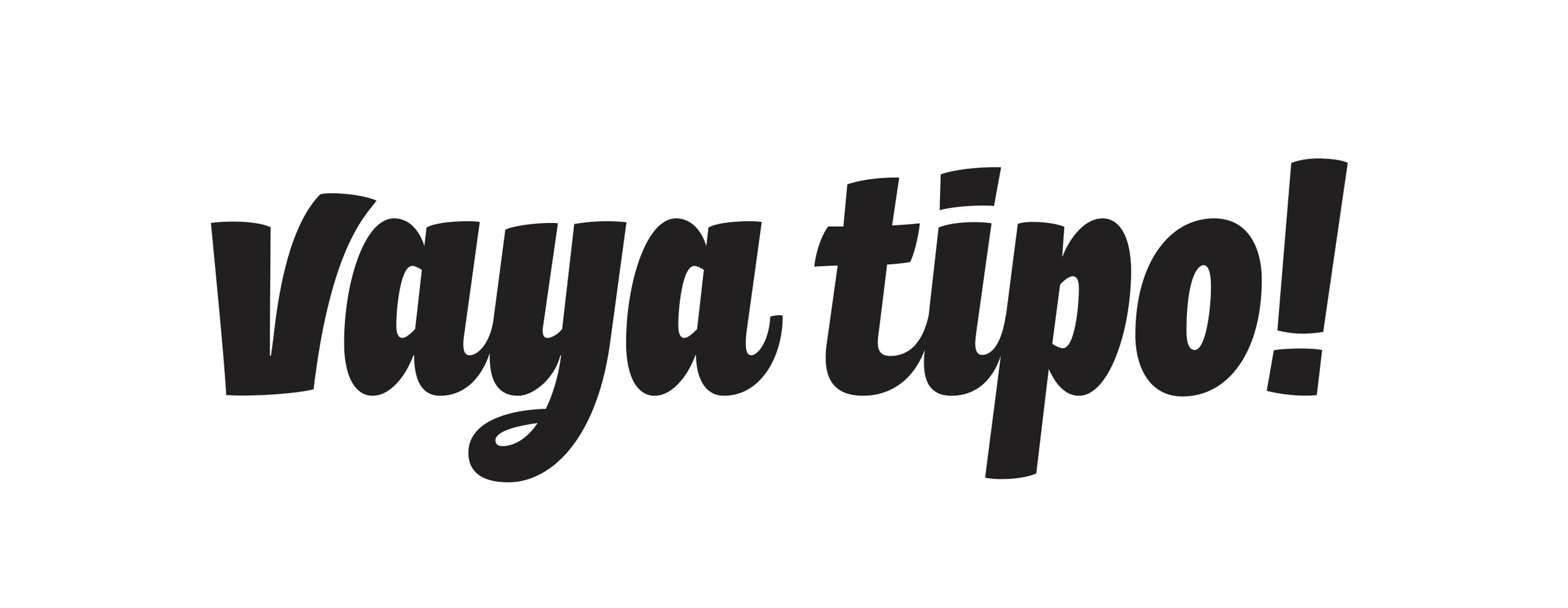
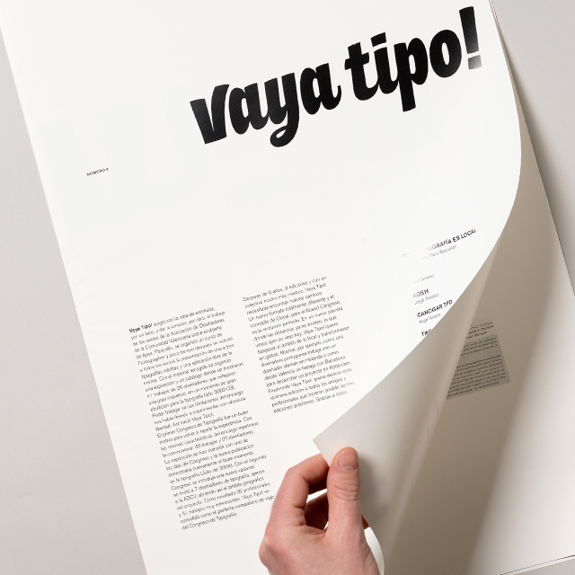
Nameplate for Vaya Tipo! magazine in 2008. The magazine was turning from being a summary of typographic specimens into a new one with much more texts and a different format. They asked for an image change, reflecting the new course, a magazine with a certain freshness but with professionalism. The solution was a quasi typographic lettering, transmitting a moderate freshness.

Design team: Ángel Álvarez, Dídac Ballester, Luis Eslava, Víctor Palau, Gloria Martínez, Juan Martínez.
Photography: Josep Gil